

Skip to content
All AI Kits
Design system Paid source14 components

Webflow-inspired Visual Flow

An unofficial, original Webflow-inspired product system with 14 evidence-backed elements for Flowframe's focused workflow language.

Includes DESIGN.md, tokens.json, full CSS, Tailwind v4 token mapping and matching UI specimens. Preview for free; protected guidance and style downloads require Starter or Super. Framework installation and theme support are verified only where listed.

Theme support:
Unverified
Installation:
No verified installation path listed

Delivered component specimen

Publish site ↗ Preview +
0
140
Design foundations

Inspect the kit's typography, palette, icons, spacing and motion.

Style identity

Visual Flow

An original web-building system shaped by Webflow's current build, publish, and optimize story: editorial scale on the marketing canvas, a precise blue action accent, and dense product surfaces built from reusable visual structure.

Reference style: adaptive light and dark
Visit website

Typography

Font families

WF Visual Sans Variable

Observed Webflow page family for navigation, hero display, section headings, controls, and body copy.

WF Visual Sans Variable, Arial, ui-sans-serif, system-ui, sans-serif
Weights
100–900 variable; use 400 body, 600 labels, 700–800 emphasis
Sizes
12–72px
Line height
0.94–1.6
Tracking
-0.08em to 0

Fallback: Arial, ui-sans-serif, system-ui, sans-serif

WFVisualSans-Mono

Observed technical labels, code-like metadata, keyboard hints, and measurement accents.

WFVisualSans-Mono, Inconsolata, SFMono-Regular, monospace
Weights
200–900 variable
Sizes
10–14px
Line height
1.35–1.6
Tracking
0.02em to 0.12em

Fallback: Inconsolata, SFMono-Regular, monospace

Inconsolata

Observed fallback monospace for technical and code-oriented content.

Inconsolata, SFMono-Regular, monospace
Weights
400, 700
Sizes
11–14px
Line height
1.4–1.6
Tracking
0

Fallback: SFMono-Regular, monospace

Palette

Core colors

Ink canvas

#111111

Dark marketing and product canvas

Light canvas

#f7f7f4

Warm light page background

Panel

#ffffff

Primary content surface in light mode

Raised panel

#292929

Hover, selected, and product control surface in dark mode

Webflow blue

#4353ff

Primary action, active state, link, and focus

Signal lime

#d9ff72

Secondary proof accent and positive differentiation

Success

#26c281

Published or healthy state

Warning

#f4b34a

Pending or attention state

Danger

#e25757

Destructive or failed state

Type scale

Responsive hierarchy

RoleSizeWeightLine heightTracking
Display72px6000.94-0.08em
Hero mobile48px6000.98-0.065em
Section heading48px6001.02-0.06em
Product heading24px7001.2-0.03em
Body large18px4001.55-0.01em
Body16px4001.50
Interface label13px6001.350
Technical metadata12px5001.450.04em

Spacing & shape

Layout rhythm

Density
structured product density with generous marketing pauses
Base unit
4px
Max width
1200px
Section gap
96px
Card padding
24px
Element gap
8px

System metrics

Radius

Control 6pxButton 10pxCard 16pxLarge frame 24pxPill 999px

Spacing

1 4px2 8px3 12px4 16px6 24px

Motion

Control 120msHover 180msReveal 420msEase cubic-bezier(0.2, 0.8, 0.2, 1)

Elevation

Quiet panel

0 1px 0 rgba(0,0,0,.04)

Default card separation on the editorial canvas

Product frame

0 18px 42px rgba(16,16,16,.14)

Focused builder frame or preview surface

Focus ring

0 0 0 3px rgba(67,83,255,.34)

Keyboard focus and selected state reinforcement

Surfaces & shape

Warm light canvas

#f7f7f4

Primary light page background

White work surface

#ffffff

Cards and builder panels

Dark canvas

#111111

Dark-mode page background

Dark raised surface

#292929

Dark-mode controls and selected rows

Guidelines

Do

  • Keep a single strong next action visible in each product surface.
  • Use the blue accent for interaction and the lime accent for proof, not decoration.
  • Align marketing type, visual canvas frames, and product panels to one content rail.
  • Use mono labels for technical states, dimensions, and keyboard hints.
  • Make light and dark surfaces equally intentional with visible one-pixel boundaries.

Don't

  • ×Do not copy the Webflow wordmark, logo, source screenshots, or proprietary page copy.
  • ×Do not turn a focused element into a full builder dashboard.
  • ×Do not use gradients as a substitute for hierarchy.
  • ×Do not rely on blue or green alone to communicate state.
  • ×Do not compress the mobile layout below a readable 16px body size.

Imagery

Use original CSS diagrams, restrained interface frames, abstract grid lines, and evidence-oriented charts. Avoid bundled customer logos, live Webflow screenshots, and decorative stock imagery.

Layout

Use a 1200px rail with 24px desktop and 16px mobile gutters. Split hero compositions collapse below 900px; bento cards become one column below 650px; preserve visible section rules and let dense tables scroll horizontally.

Assigned collection

Webflow-inspired Interface Elements

14 published components in collection order

Components

Built from the same system

These working component previews are supplied with the kit. Open a component to inspect its code; the reference screenshots show the original website.

Open collection
Publish site ↗ Preview +
0
140
Project name Create brief
0
120
⌕ ⌘ K
0
115
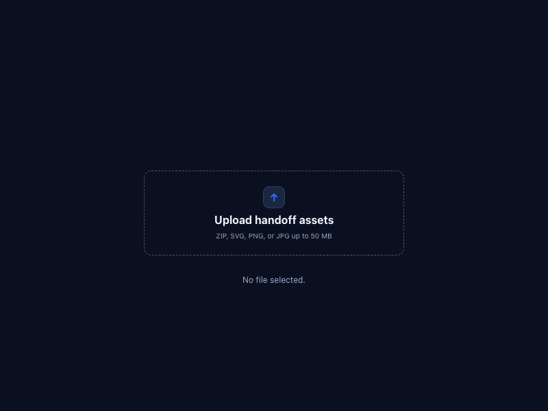
↑ Upload handoff assets ZIP, SVG, PNG, or JPG up to 50 MB No file selected.
0
117
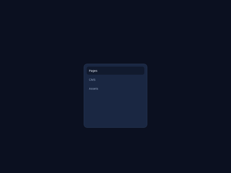
Pages CMS Assets Page Home Published 2 hours ago
0
141
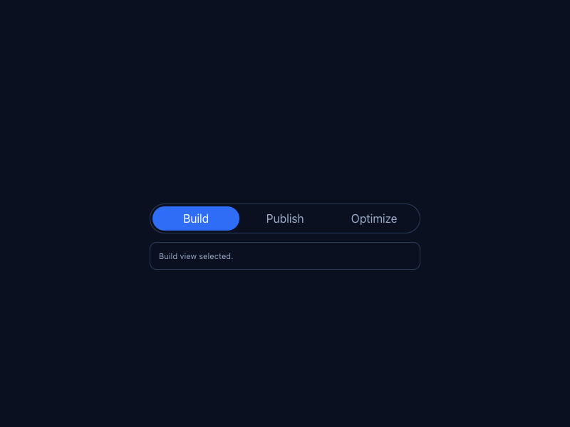
Build Publish Optimize Build view selected.
0
121
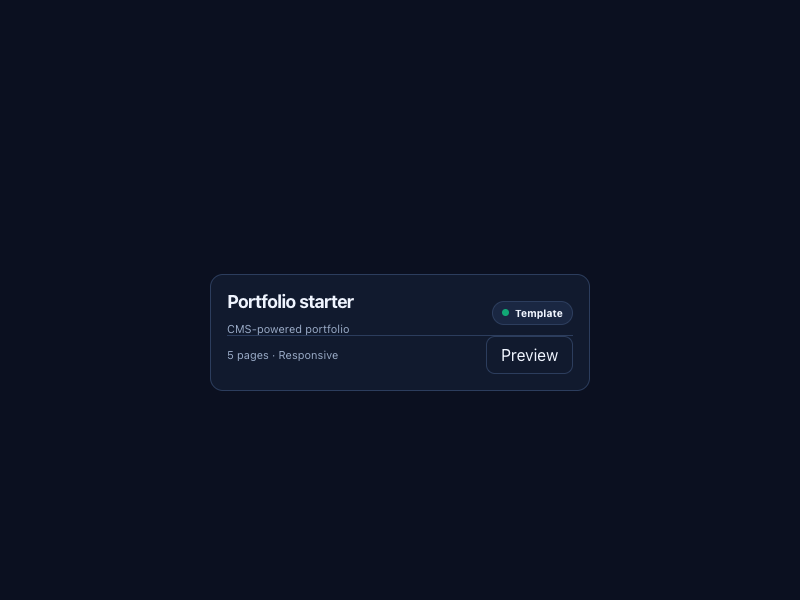
Portfolio starter CMS-powered portfolio Template 5 pages · Responsive Preview
0
122
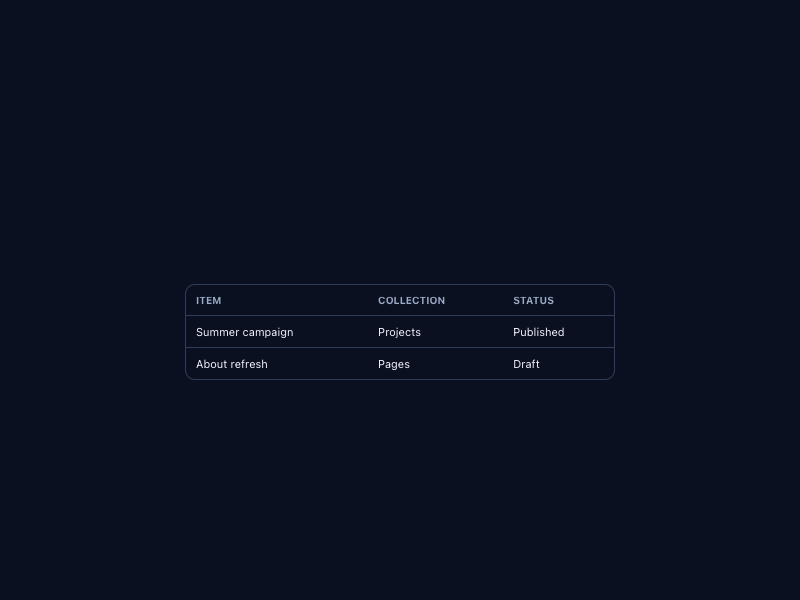
Item Collection Status Summer campaign Projects Published About refresh Pages Draft
0
104
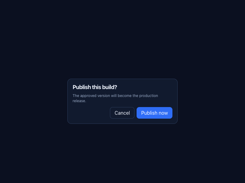
Publish this build? The approved version will become the production release. Cancel Publish now
0
108
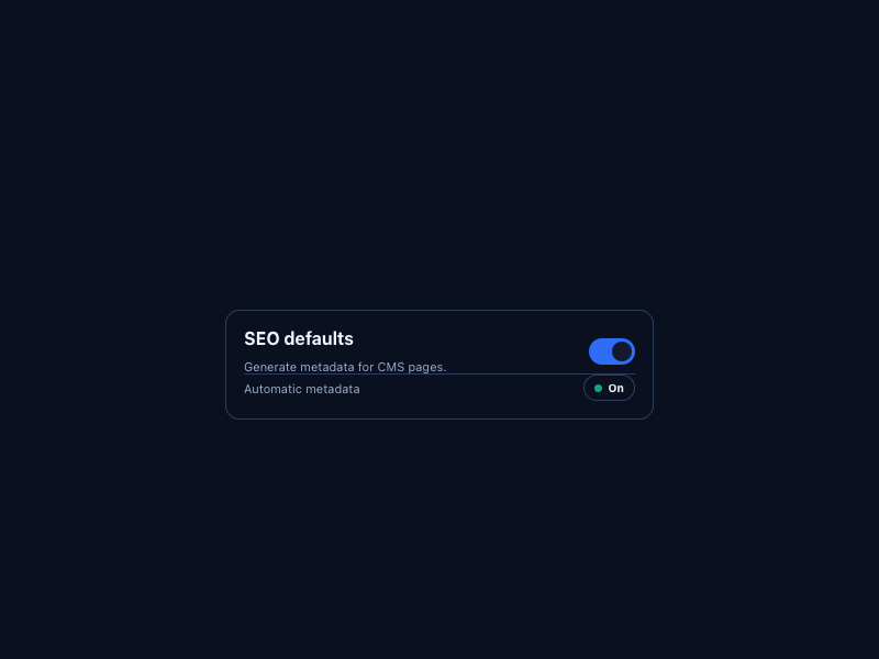
SEO defaults Generate metadata for CMS pages. Automatic metadata On
0
102
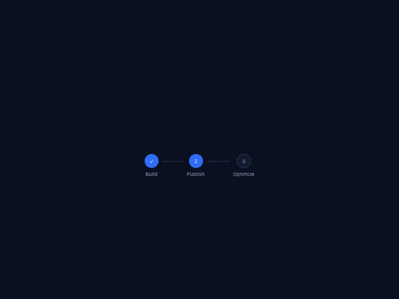
✓ Build 2 Publish 3 Optimize
0
109
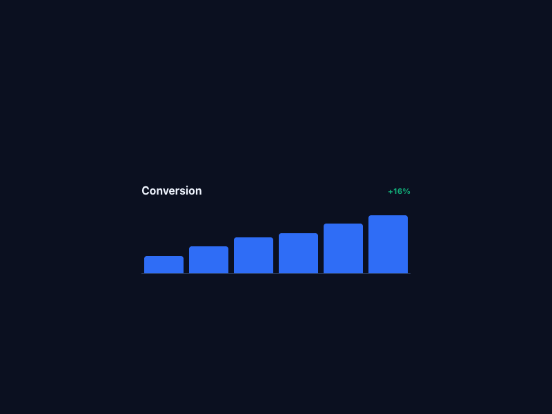
Conversion +16%
0
105
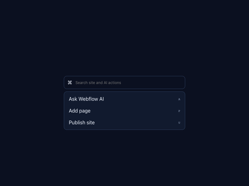
⌘ Ask Webflow AI A Add page P Publish site U
0
114
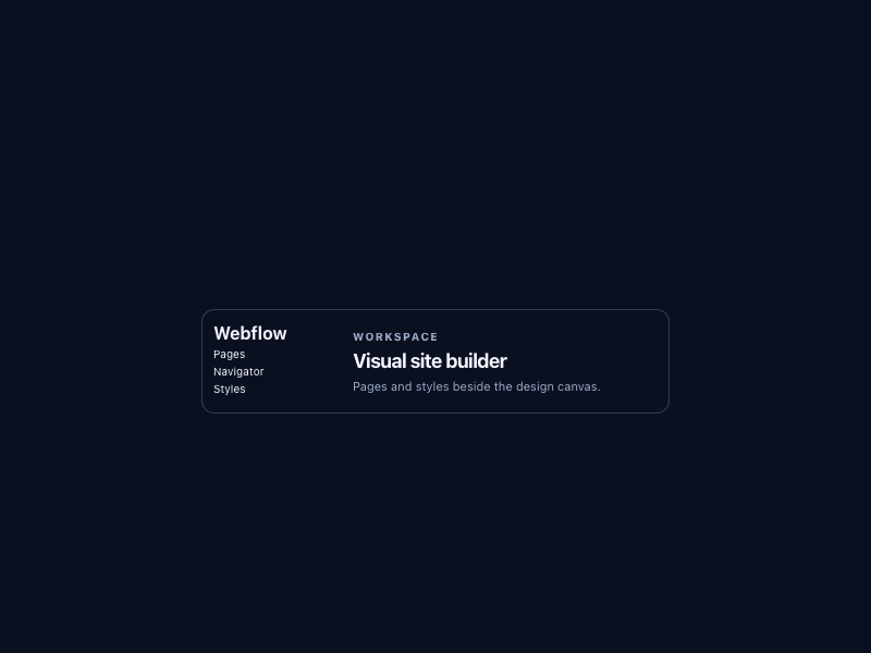
Webflow Pages Navigator Styles Workspace Visual site builder Pages and styles beside the design canvas.
0
117

More AI Kits

Published AI Kit Protected source files for Starter and Super members
Webflow-inspired Visual Flow AI Kit - Frontend Forever