

Skip to content
All AI Kits
Design system Paid source13 components

Next.js-inspired Black Grid

An original, unofficial Next.js-inspired system for framework onboarding, documentation discovery, feature explanation, and full-stack web product surfaces. It retains only 13 focused elements supported by Next.js's live site.

Includes DESIGN.md, tokens.json, full CSS, Tailwind v4 token mapping and matching UI specimens. Preview for free; protected guidance and style downloads require Starter or Super. Framework installation and theme support are verified only where listed.

Theme support:
Unverified
Installation:
No verified installation path listed

Delivered component specimen

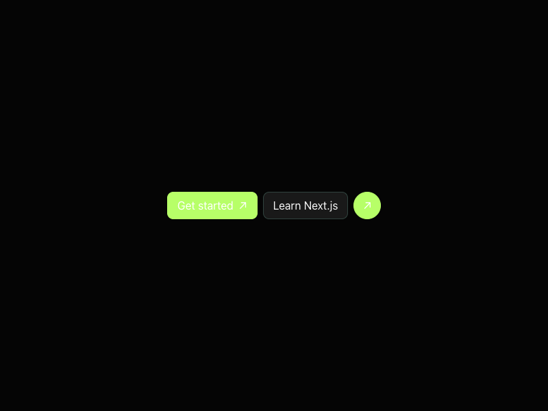
Get started ↗ Learn Next.js ↗
0
125
Design foundations

Inspect the kit's typography, palette, icons, spacing and motion.

Style identity

Black Grid

A restrained framework-onboarding system where docs discovery, a first command, feature proof, and nested layout ideas sit inside a near-black technical grid.

Reference style: Near-black canvas, hairline construction rules, Geist type, high-contrast copy,
Visit website

Typography

Font families

Geist Sans

Body, hero, navigation, cards, and controls observed on nextjs.org.

GeistSans, GeistSans Fallback, ui-sans-serif, system-ui, sans-serif
Weights
400,500,600,700
Sizes
16px,32px,48px,72px
Line height
26.4px,40px,52.8px,72px
Tracking
0,-1.28px,-2.4px,-3.6px

Fallback: ui-sans-serif, system-ui, -apple-system, Segoe UI, sans-serif

Geist Mono

create-next-app command, keyboard hints, technical metadata, and code cues.

GeistMono, GeistMono Fallback, ui-monospace, SFMono-Regular, Menlo, monospace
Weights
400,500,600
Sizes
12px,13px,14px
Line height
18px,20px,22px
Tracking
0,0.02em

Fallback: ui-monospace, SFMono-Regular, Menlo, monospace

Palette

Core colors

Grid canvas / light

#f4f4f4

Quiet neutral documentation field.

Grid canvas / dark

#000000

Observed black homepage canvas.

Surface / light

#ffffff

Feature and command surface.

Surface / dark

#101010

Raised technical panel.

Ink / light

#111111

Primary type on light.

Ink / dark

#ededed

Observed primary homepage type.

Action green / light

#75b632

Primary action on light.

Action green / dark

#b7ff68

Primary action and focus on dark.

Link blue

#8ab4ff

Documentation/link signal.

Hairline

#303030

Technical grid and panel rule.

Muted copy

#a8a8a8

Secondary type on dark.

Type scale

Responsive hierarchy

RoleSizeWeightLine heightTracking
Hero desktop72px60072px—
Hero mobile48px60052.8px—
Feature32px60040px—
Body16px40026.4px—
UI14px50020px—
Command13px50020px—

Spacing & shape

Layout rhythm

Density
Base unit
Max width
Section gap
Card padding
Element gap

Iconography

Minimal geometric line icons and external-arrow primitives aligned to the Geist system.

1.5px to 2px; preserve the compact 16px to 20px silhouette. stroke · 16px / 20px / 24px

Use currentColor, pair symbols with labels for important actions, and preserve optical alignment.

System metrics

Radius

Sm 6pxValue 6pxMd 10pxValue 10pxLg 16px

Spacing

1 4pxValue 4px2 8pxValue 8px3 12px

Motion

Fast 150msValue 150msStandard 250msValue 250msEasing ease-out

Guidelines

Do

  • Give Docs/search a first-class place beside onboarding actions.
  • Use Geist-like tight display type with generous breathing room.
  • Show the create-next-app command as a useful copyable surface.
  • Make grid rules supplementary; content must remain readable without them.

Don't

  • ×Do not create a noisy dashboard from the feature list.
  • ×Do not use acid green for every link or decorative line.
  • ×Do not make the grid or construction marks the main content.
  • ×Do not copy Next.js or Vercel copy, logo geometry, screenshots, or assets.

Imagery

Prefer original CSS grid geometry, neutral diagrams, and tiny code cues. Do not use Next.js logos, screenshots, site illustrations, or Vercel assets.

Layout

Center the first framework promise and two actions, then expand into feature tiles and proof. Keep docs search in the header; at 390px stack hero, command, and features in one readable axis.

Assigned collection

Black Grid Interface Elements

13 published components in collection order

Components

Built from the same system

These working component previews are supplied with the kit. Open a component to inspect its code; the reference screenshots show the original website.

Open collection
Get started ↗ Learn Next.js ↗
0
125
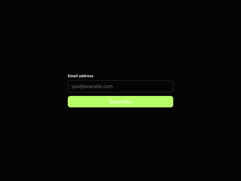
Email address Subscribe
0
132
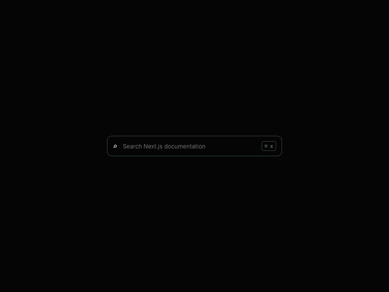
⌕ ⌘ K
0
117
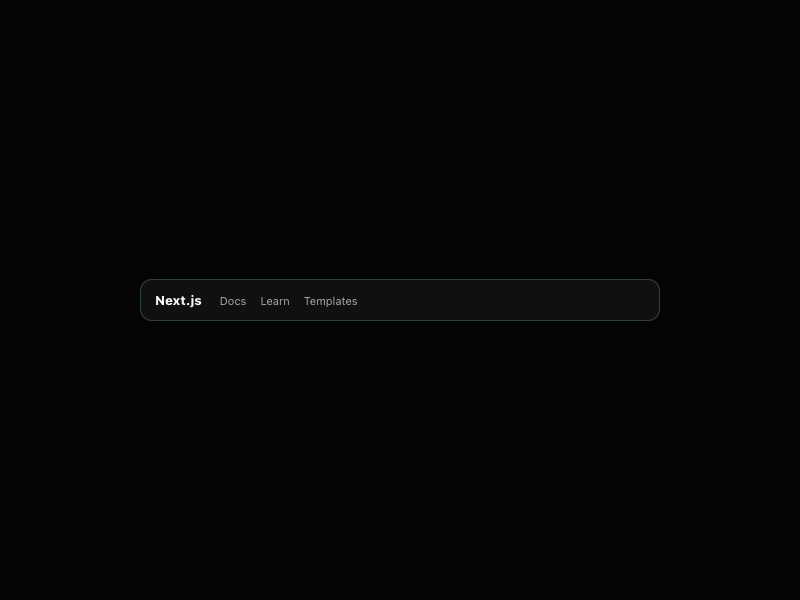
Next.js Docs Learn Templates
0
121
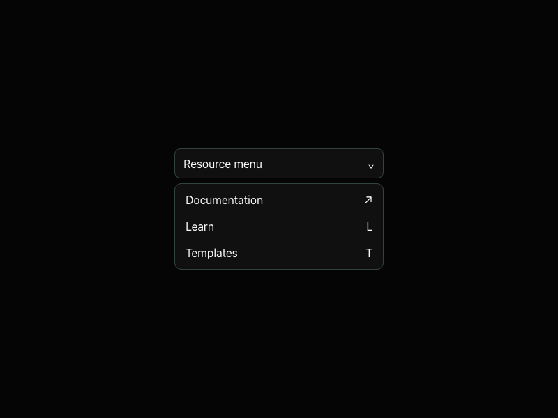
Resource menu ⌄ Documentation ↗ Learn L Templates T
0
121
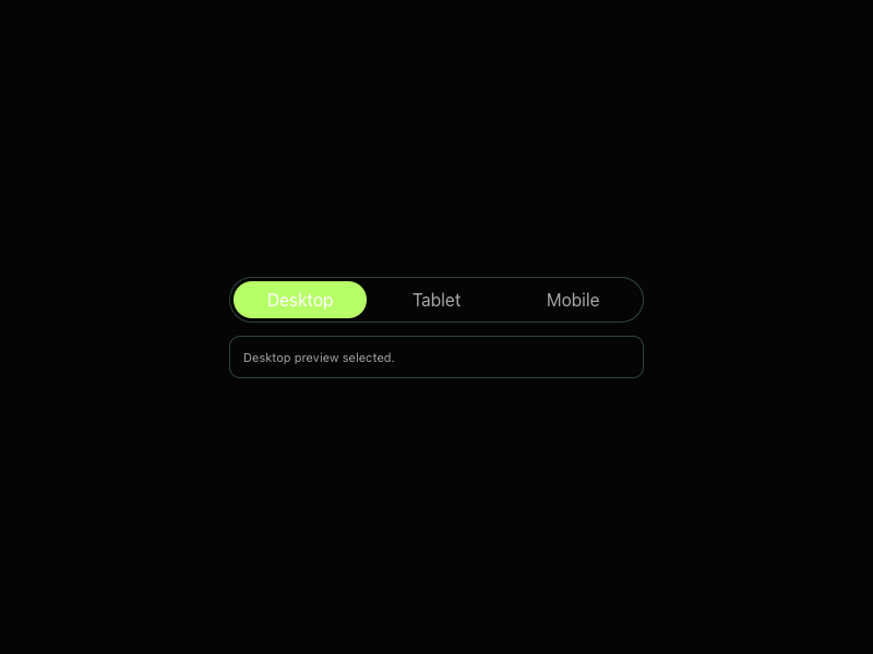
Desktop Tablet Mobile Desktop preview selected.
0
120
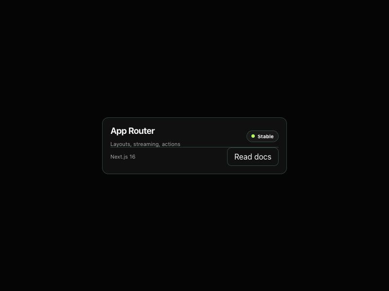
App Router Layouts, streaming, actions Stable Next.js 16 Read docs
0
111
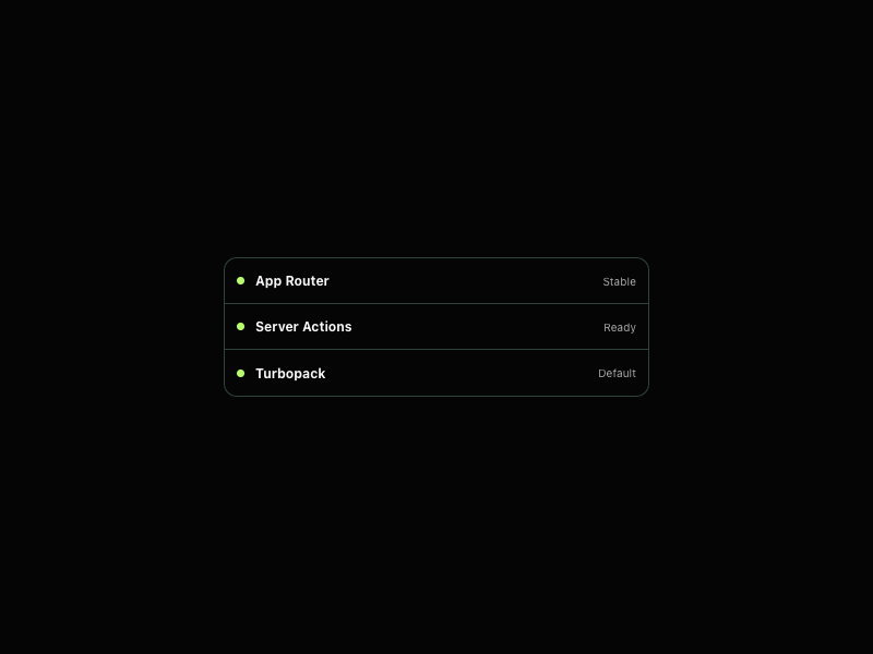
App Router Stable Server Actions Ready Turbopack Default
0
119
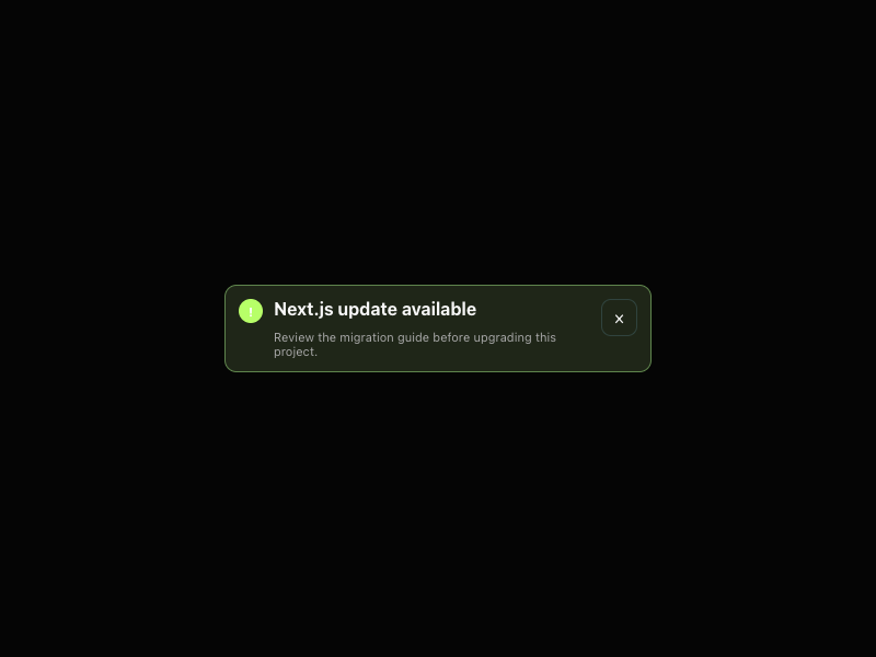
! Next.js update available Review the migration guide before upgrading this project. ×
0
130
Next.js 16 Stable Turbopack
0
121
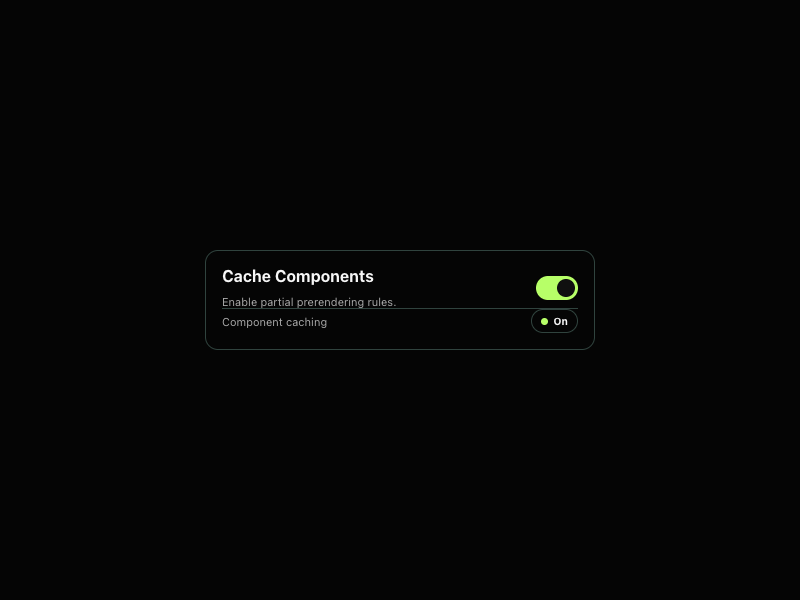
Cache Components Enable partial prerendering rules. Component caching On
0
102
⌘ Create Next.js app C Start dev server D Build production B
0
128
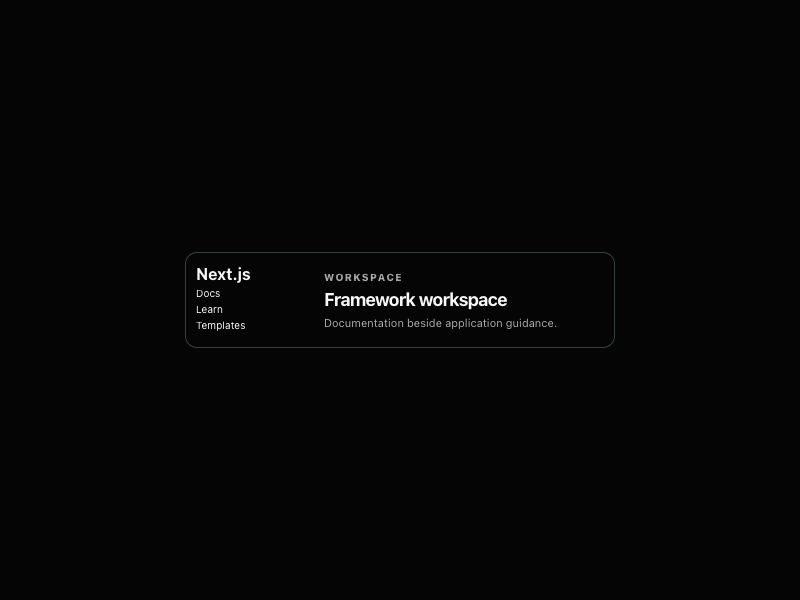
Next.js Docs Learn Templates Workspace Framework workspace Documentation beside application guidance.
0
118

More AI Kits

Published AI Kit Protected source files for Starter and Super members