Style identity
Orbit Treasury
A dark premium finance-operations study for business banking, cards, treasury, payments, and intelligent controls.
Reference style: Dark-first premium fintech with indigo data surfaces, warm highlights, and restr14 focused, original elements for Orbit Treasury.
Includes DESIGN.md, tokens.json, full CSS, Tailwind v4 token mapping and matching UI specimens. Preview for free; protected guidance and style downloads require Starter or Super. Framework installation and theme support are verified only where listed.
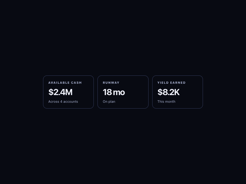
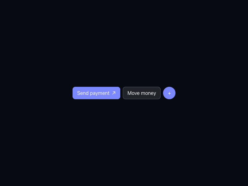
Delivered component specimen
HTML/CSS · JavaScript
 Frontend Forever
Inspect the kit's typography, palette, icons, spacing and motion.
Style identity
A dark premium finance-operations study for business banking, cards, treasury, payments, and intelligent controls.
Reference style: Dark-first premium fintech with indigo data surfaces, warm highlights, and restrTypography
Arcadia
Observed live-site body, navigation, controls, and business copy
arcadia, "arcadia Fallback", Inter, ui-sans-serif, system-ui, sans-serifFallback: Inter, ui-sans-serif, system-ui, sans-serif
Arcadia Display
Observed live-site hero and section headlines
arcadiaDisplay, "arcadiaDisplay Fallback", Inter, ui-sans-serif, system-ui, sans-serifFallback: Inter, ui-sans-serif, system-ui, sans-serif
Inter
Business copy, controls, data labels, and trust detail
Inter, ui-sans-serif, system-ui, sans-serifFallback: ui-sans-serif, system-ui, sans-serif
System Mono
Balances, IDs, rates, and compact data labels
ui-monospace, SFMono-Regular, Menlo, Monaco, Consolas, monospaceFallback: ui-monospace, SFMono-Regular, Menlo, monospace
Palette
canvas / light
#f6f7fblight page backdrop
surface / light
#fffffflight card/control surface
border / light
#dae0eflight hairline separation
text / light
#141825light primary text
muted / light
#616b82light supporting text
accent / light
#6475fflight action signal
accent2 / light
#f3ad9alight secondary action signal
canvas / dark
#080a12dark page backdrop
surface / dark
#141827dark card/control surface
border / dark
#343c5edark hairline separation
text / dark
#f3f5ffdark primary text
muted / dark
#a9b2d1dark supporting text
accent / dark
#7b88ffdark action signal
accent2 / dark
#f3ad9adark secondary action signal
Success
#26a269positive completion
Warning
#d99b35caution
Type scale
| Role | Size | Weight | Line height | Tracking |
|---|---|---|---|---|
| Hero | clamp(42px, 3.43vw, 49px) | 480 | 54px | normal |
| Section | clamp(34px, 2.92vw, 42px) | 480 | 48px | normal |
| Lead | 20px | 400 | 30px | 0 |
| Body | 16px | 400 | 24px | 0 |
| Metric | 32px | 600 | 36px | -0.05em |
| Data | 12px | 500 | 18px | -0.01em |
Spacing & shape
Iconography
Use currentColor symbols with text labels for payments, cards, search, and security; keep amounts and permissions primary.
System metrics
Radius
Spacing
Motion
Elevation
Soft
0 4px 16px rgba(15,23,42,.08)quiet surface separation
Lifted
0 18px 48px rgba(15,23,42,.14)focused proof surface
Surfaces & shape
Canvas
#f6f7fb / #080a12page backdrop
Surface
#ffffff / #141827card and control surfaces
Accent
#6475ff / #7b88ffaction and status emphasis
Guidelines
Imagery
Use original orbit lines, card silhouettes, approval flows, receipts, and small data plots; never embed Mercury photography, logos, product screens, or partner marks.
Layout
A dark premium startup-banking shell with compact product navigation, broad hero, business-banking and cards proof, finance-ops modules, security, and responsive stacked data surfaces.
Assigned collection
14 published components in collection order
Components
HTML/CSS · JavaScript
Frontend ForeverHTML/CSS · JavaScript
Frontend ForeverHTML/CSS · JavaScript
Frontend ForeverHTML/CSS · JavaScript
Frontend ForeverHTML/CSS · JavaScript
Frontend ForeverHTML/CSS · JavaScript
Frontend ForeverHTML/CSS · JavaScript
Frontend ForeverHTML/CSS · JavaScript
Frontend ForeverHTML/CSS · JavaScript
Frontend ForeverHTML/CSS · JavaScript
Frontend ForeverHTML/CSS · JavaScript
Frontend ForeverHTML/CSS · JavaScript
Frontend ForeverHTML/CSS · JavaScript
Frontend ForeverHTML/CSS · JavaScript
Frontend ForeverMore AI Kits
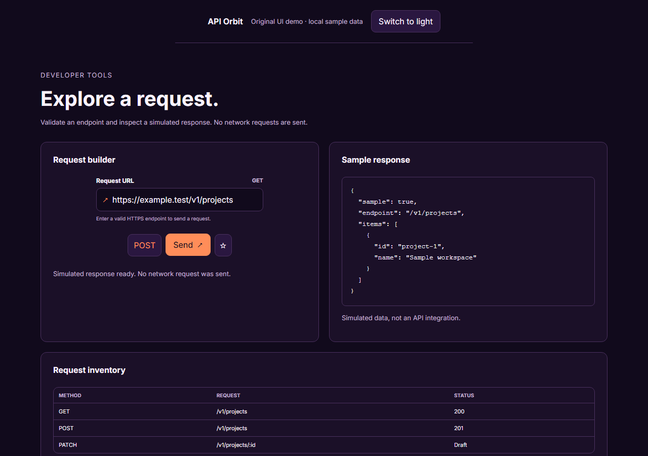
An unofficial, original Postman-inspired interface study with 14 focused specimens supported by the live product and content experience.
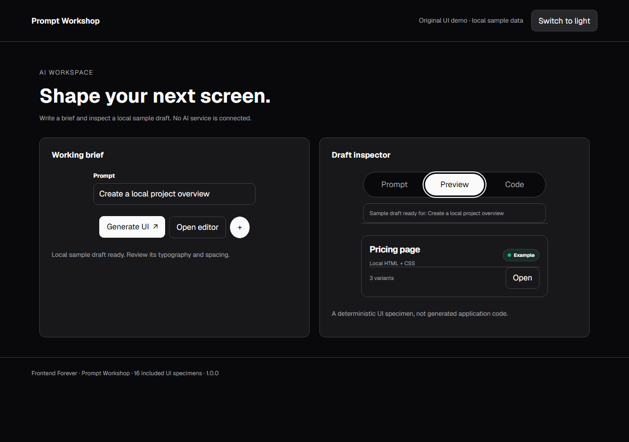
An unofficial, original v0-inspired Prompt Workshop system grounded in 16 retained, evidence-backed interface patterns.
13 focused, original elements for Borderless Ledger.
A high-contrast studio language for a platform that moves between creative production, developer workflows, robotics, research, and enterprise. The system uses a dark stage, warm action color, and compact cross-platform wayfinding without copying Runway's wordmark, content, or media. Responsive previews and 8 evidence-backed interface elements.
An original, unofficial Observable-inspired system for reactive notebooks, executable explanations, and data visualization surfaces. It retains only 11 focused elements supported by Observable's live notebook and chart workflows.
A friendly builder language for moving from prompt to app: vivid purple/green accents, a prominent idea field, artifact type selection, parallel execution, built-in infrastructure, team plans, agent chat, and a clear publish handoff. It is an original study without Replit's logo, pixel font, testimonials, screenshots, or protected copy. Responsive previews and 14 evidence-backed interface elements.