
Style identity
Quiet product velocity
A dark, precise product language for routing work from intake through planning, agent execution, review, and monitoring.
Reference style: adaptive dark-firstAn unofficial, original Linear-inspired system for product operations and agent-assisted delivery, narrowed to the patterns visibly supported by the current reference.
Includes DESIGN.md, tokens.json, full CSS, Tailwind v4 token mapping and matching UI specimens. Preview for free; protected guidance and style downloads require Starter or Super. Framework installation and theme support are verified only where listed.
Delivered component specimen
HTML/CSS · JavaScript
 Frontend Forever
Inspect the kit's typography, palette, icons, spacing and motion.
Style identity
A dark, precise product language for routing work from intake through planning, agent execution, review, and monitoring.
Reference style: adaptive dark-firstTypography
Inter Variable
Display, navigation, product UI, and body copy
"Inter Variable", "SF Pro Display", -apple-system, system-ui, "Segoe UI", Roboto, Oxygen, Ubuntu, Cantarell, "Open Sans", "Helvetica Neue", sans-serifFallback: "SF Pro Display", -apple-system, system-ui, "Segoe UI", Roboto, sans-serif
Berkeley Mono
Issue IDs, commands, timestamps, metrics, and technical metadata
"Berkeley Mono", ui-monospace, "SF Mono", Menlo, monospaceFallback: ui-monospace, "SF Mono", Menlo, monospace
Palette
Light canvas
#f7f7f8Page background in light mode
Light surface
#ffffffCards and raised product frames
Dark canvas
#08090bPage background in dark mode
Dark surface
#111214Cards and editor frames in dark mode
Primary text
#17181bHigh-contrast content
Muted text
#686a74Supporting copy and inactive labels
Accent
#7c5cffPrimary action and selected state
Accent strong
#aa9bffFocus ring and display signal
Positive
#38c793Healthy, live, or ready state
Warning
#e6ad45Attention or pending state
Danger
#ef6a72Blocked or destructive state
Type scale
| Role | Size | Weight | Line height | Tracking |
|---|---|---|---|---|
| Display | clamp(44px, 6vw, 76px) | 650 | 0.98 | -0.07em |
| Section heading | clamp(32px, 4vw, 52px) | 620 | 1.03 | -0.055em |
| Product heading | 24px | 650 | 1.15 | -0.035em |
| Body large | 18px | 400 | 1.55 | -0.01em |
| Body | 15px | 400 | 1.55 | 0 |
| Interface | 13px | 550 | 1.4 | -0.005em |
| Metadata | 11px | 500 | 1.4 | 0.02em |
Spacing & shape
Iconography
Use currentColor, reserve filled dots for status, and pair command icons with readable labels.
System metrics
Radius
Spacing
Motion
Elevation
Flat frame
1px border, no shadowDefault cards and sections
Menu
0 16px 42px rgba(0,0,0,.18)Floating menus and command surfaces
Dialog
0 24px 80px rgba(0,0,0,.30)Drawers and focused overlays
Surfaces & shape
Canvas
#f7f7f8 / #08090bPage and element background
Surface
#ffffff / #111214Cards and panels
Raised
#f0f0f2 / #1a1b1fSelected rows and nested frames
Soft
#e8e8ec / #25262bQuiet fills and navigation rails
Guidelines
Imagery
Use original CSS art, abstract geometry, and authored product frames. The two ordered screenshots are explicitly requested live reference media; do not use them inside component source or as decorative imagery.
Layout
Use one aligned content rail, generous section rhythm for marketing proof, compact product frames for workflow evidence, and a single-column mobile stack below 840px. Preserve readable gutters and let tables scroll rather than clip.
Assigned collection
17 published components in collection order
Components
HTML/CSS · JavaScript
Frontend ForeverHTML/CSS · JavaScript
Frontend ForeverHTML/CSS · JavaScript
Frontend ForeverHTML/CSS · JavaScript
Frontend ForeverHTML/CSS · JavaScript
Frontend ForeverHTML/CSS · JavaScript
Frontend ForeverHTML/CSS · JavaScript
Frontend ForeverHTML/CSS · JavaScript
Frontend ForeverHTML/CSS · JavaScript
Frontend ForeverHTML/CSS · JavaScript
Frontend ForeverHTML/CSS · JavaScript
Frontend ForeverHTML/CSS · JavaScript
Frontend ForeverHTML/CSS · JavaScript
Frontend ForeverHTML/CSS · JavaScript
Frontend ForeverHTML/CSS · JavaScript
Frontend ForeverHTML/CSS · JavaScript
Frontend ForeverHTML/CSS · JavaScript
Frontend ForeverMore AI Kits
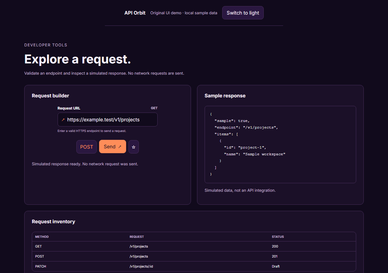
An unofficial, original Postman-inspired interface study with 14 focused specimens supported by the live product and content experience.
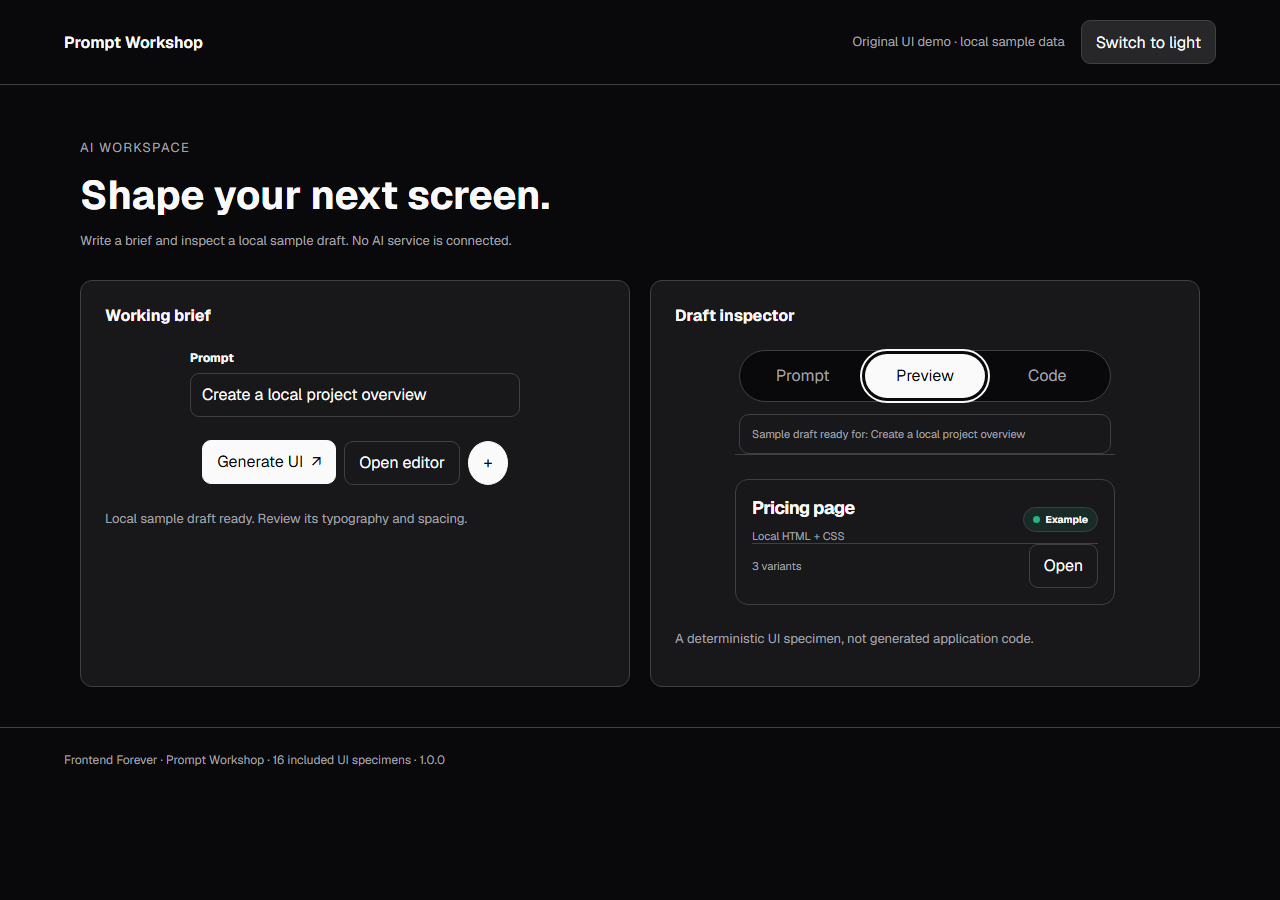
An unofficial, original v0-inspired Prompt Workshop system grounded in 16 retained, evidence-backed interface patterns.
13 focused, original elements for Borderless Ledger.
A high-contrast studio language for a platform that moves between creative production, developer workflows, robotics, research, and enterprise. The system uses a dark stage, warm action color, and compact cross-platform wayfinding without copying Runway's wordmark, content, or media. Responsive previews and 8 evidence-backed interface elements.
An original, unofficial Observable-inspired system for reactive notebooks, executable explanations, and data visualization surfaces. It retains only 11 focused elements supported by Observable's live notebook and chart workflows.
A friendly builder language for moving from prompt to app: vivid purple/green accents, a prominent idea field, artifact type selection, parallel execution, built-in infrastructure, team plans, agent chat, and a clear publish handoff. It is an original study without Replit's logo, pixel font, testimonials, screenshots, or protected copy. Responsive previews and 14 evidence-backed interface elements.