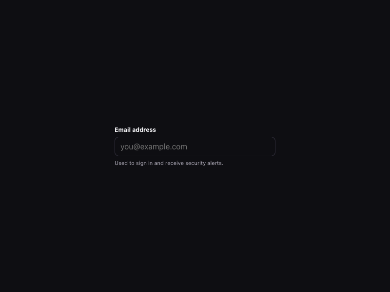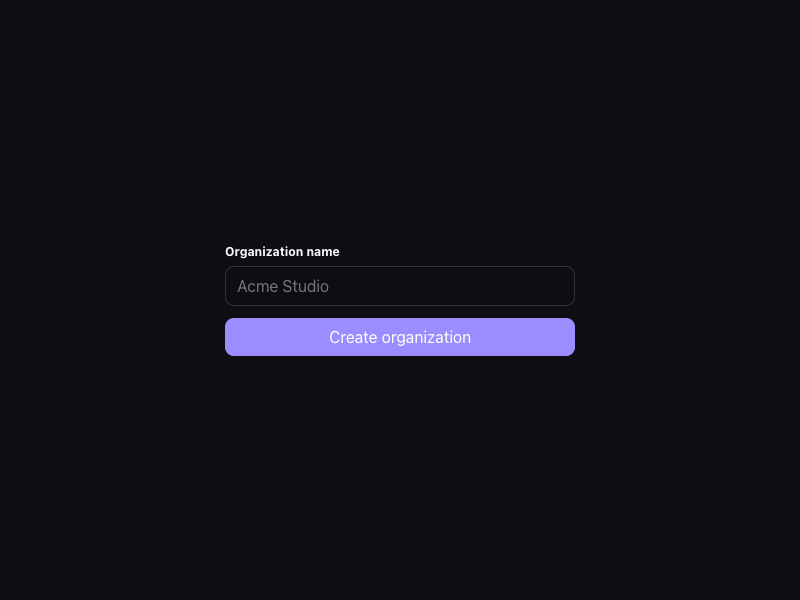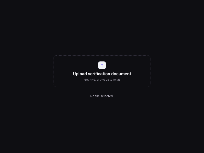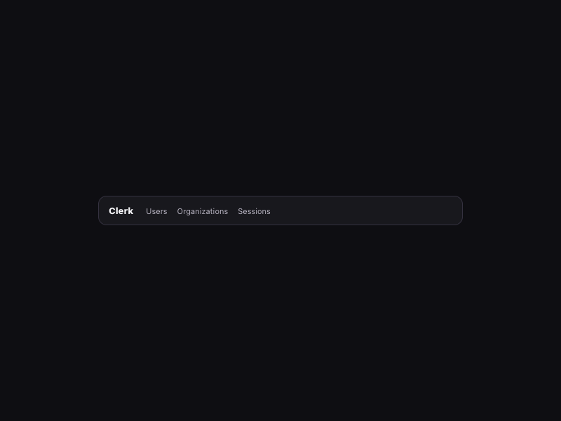
Style identity
Identity Atlas
A polished identity component study for sign-in, profiles, organizations, and security workflows.
Reference style: Light-first lavender SaaS component tour with dark-mode-ready surfaces13 focused, original elements for Identity Atlas.
Includes DESIGN.md, tokens.json, full CSS, Tailwind v4 token mapping and matching UI specimens. Preview for free; protected guidance and style downloads require Starter or Super. Framework installation and theme support are verified only where listed.
Delivered component specimen
HTML/CSS · JavaScript
 Frontend Forever
Inspect the kit's typography, palette, icons, spacing and motion.
Style identity
A polished identity component study for sign-in, profiles, organizations, and security workflows.
Reference style: Light-first lavender SaaS component tour with dark-mode-ready surfacesTypography
Suisse
Primary product-tour typography and component copy
suisse, "suisse Fallback", ui-sans-serif, system-ui, sans-serifFallback: "suisse Fallback", ui-sans-serif, system-ui, sans-serif
Söhne Mono
Small labels, component metadata, and security state
soehneMono, "Söhne Mono Fallback", ui-monospace, monospaceFallback: "Söhne Mono Fallback", ui-monospace, SFMono-Regular, Menlo, monospace
Geist Numbers
Numeral metrics and number shaping observed on the live page
geistNumbers, suisse, "suisse Fallback", ui-sans-serif, sans-serifFallback: suisse, ui-sans-serif, sans-serif
Palette
canvas / light
#f7f7f8light page backdrop
surface / light
#fffffflight card/control surface
border / light
#e4e4e7light hairline separation
text / light
#131316light primary text
muted / light
#6b6b74light supporting text
accent / light
#6c47fflight action signal
accent2 / light
#a78bfalight secondary action signal
canvas / dark
#0e0e12dark page backdrop
surface / dark
#18181ddark card/control surface
border / dark
#34313fdark hairline separation
text / dark
#f7f7fadark primary text
muted / dark
#b8b4c2dark supporting text
accent / dark
#9b8cffdark action signal
accent2 / dark
#d8b4fedark secondary action signal
Success
#16a34apositive completion
Warning
#ca8a04caution
Type scale
| Role | Size | Weight | Line height | Tracking |
|---|---|---|---|---|
| Hero | 64px | 700 | 72px | -1.6px |
| Section | 40px | 600 | 48px | -1px |
| Body | 16px | 400 | 24px | 0 |
| Eyebrow | 13px | 500 | 24px | 0 |
| Metadata | 12px | 500 | 18px | 0.02em |
Spacing & shape
Iconography
Keep icons secondary to component labels; name icon-only affordances and align inside 32–40px controls.
System metrics
Radius
Spacing
Motion
Elevation
Soft
0 4px 16px rgba(15,23,42,.08)quiet surface separation
Lifted
0 18px 48px rgba(15,23,42,.14)focused proof surface
Surfaces & shape
Canvas
#f7f7f8 / #0e0e12page backdrop
Surface
#ffffff / #18181dcard and control surfaces
Accent
#6c47ff / #9b8cffaction and status emphasis
Guidelines
Imagery
Use original avatar initials, abstract lavender geometry, and neutral component chrome; never copy profile photographs, logos, or screenshots.
Layout
Centered marketing shell with compact product-resource nav, a large identity claim, embedded component cards, and a linear mobile tour.
Assigned collection
13 published components in collection order
Components
HTML/CSS · JavaScript
Frontend ForeverHTML/CSS · JavaScript
Frontend ForeverHTML/CSS · JavaScript
Frontend ForeverHTML/CSS · JavaScript
Frontend ForeverHTML/CSS · JavaScript
Frontend ForeverHTML/CSS · JavaScript
Frontend ForeverHTML/CSS · JavaScript
Frontend ForeverHTML/CSS · JavaScript
Frontend ForeverHTML/CSS · JavaScript
Frontend ForeverHTML/CSS · JavaScript
Frontend ForeverHTML/CSS · JavaScript
Frontend ForeverHTML/CSS · JavaScript
Frontend ForeverHTML/CSS · JavaScript
Frontend ForeverMore AI Kits
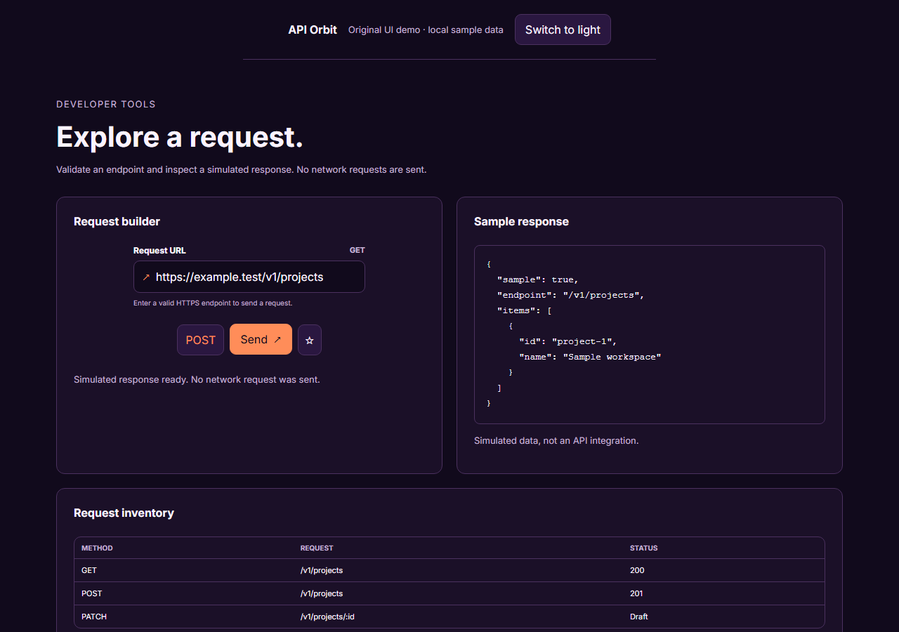
An unofficial, original Postman-inspired interface study with 14 focused specimens supported by the live product and content experience.
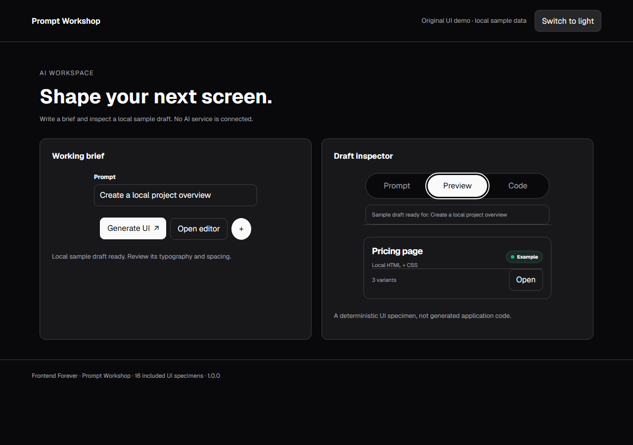
An unofficial, original v0-inspired Prompt Workshop system grounded in 16 retained, evidence-backed interface patterns.
13 focused, original elements for Borderless Ledger.
A high-contrast studio language for a platform that moves between creative production, developer workflows, robotics, research, and enterprise. The system uses a dark stage, warm action color, and compact cross-platform wayfinding without copying Runway's wordmark, content, or media. Responsive previews and 8 evidence-backed interface elements.
An original, unofficial Observable-inspired system for reactive notebooks, executable explanations, and data visualization surfaces. It retains only 11 focused elements supported by Observable's live notebook and chart workflows.
A friendly builder language for moving from prompt to app: vivid purple/green accents, a prominent idea field, artifact type selection, parallel execution, built-in infrastructure, team plans, agent chat, and a clear publish handoff. It is an original study without Replit's logo, pixel font, testimonials, screenshots, or protected copy. Responsive previews and 14 evidence-backed interface elements.