Skip to content
All AI Kits
Design system Paid source11 components

Astro-inspired Cosmic Content

An original, unofficial Astro-inspired system for content-driven framework onboarding, integration choices, performance proof, and documentation-led exploration. It retains only 11 focused elements supported by Astro's live homepage.

Includes DESIGN.md, tokens.json, full CSS, Tailwind v4 token mapping and matching UI specimens. Preview for free; protected guidance and style downloads require Starter or Super. Framework installation and theme support are verified only where listed.

Theme support:
Unverified
Installation:
No verified installation path listed

Delivered component specimen

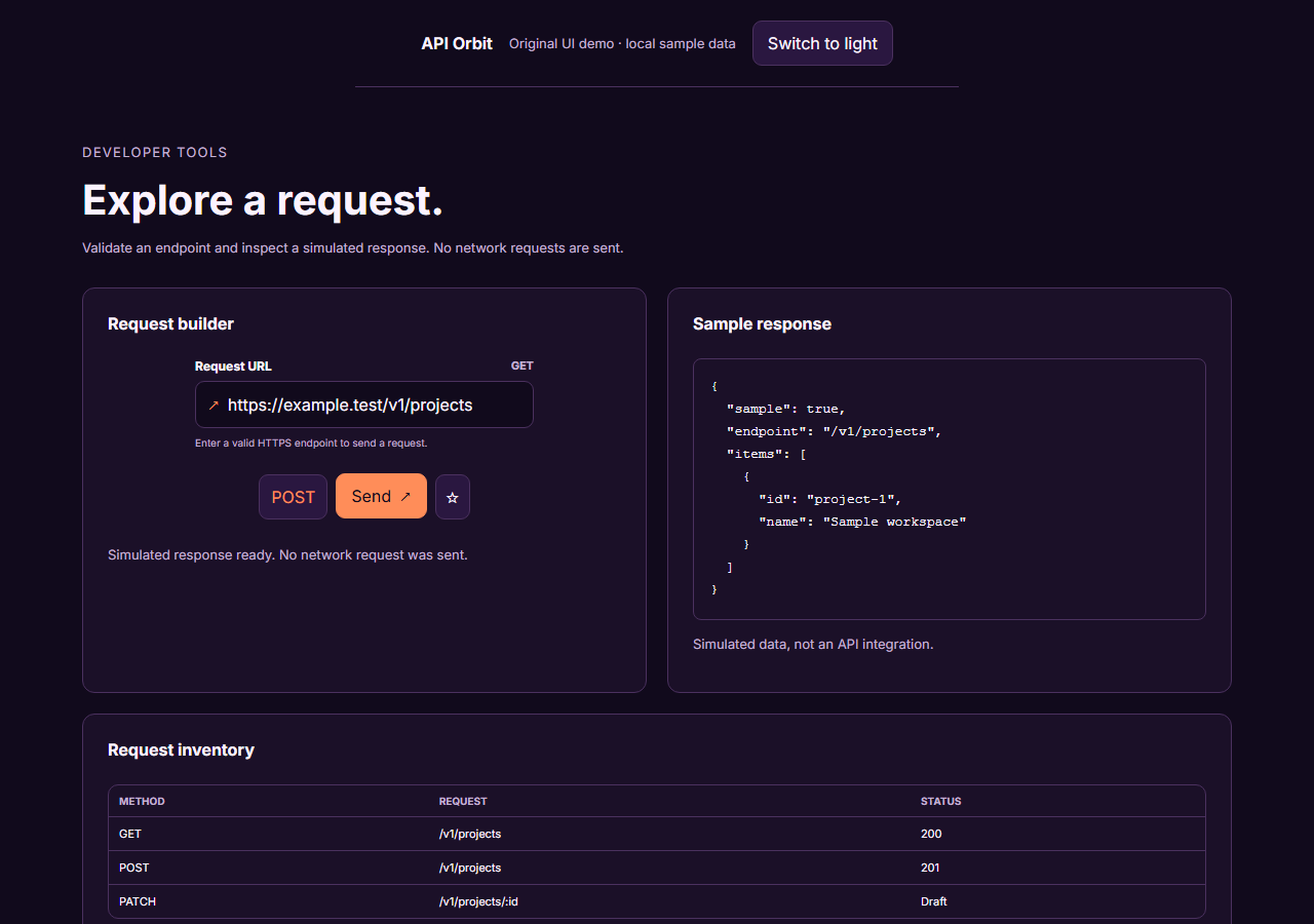
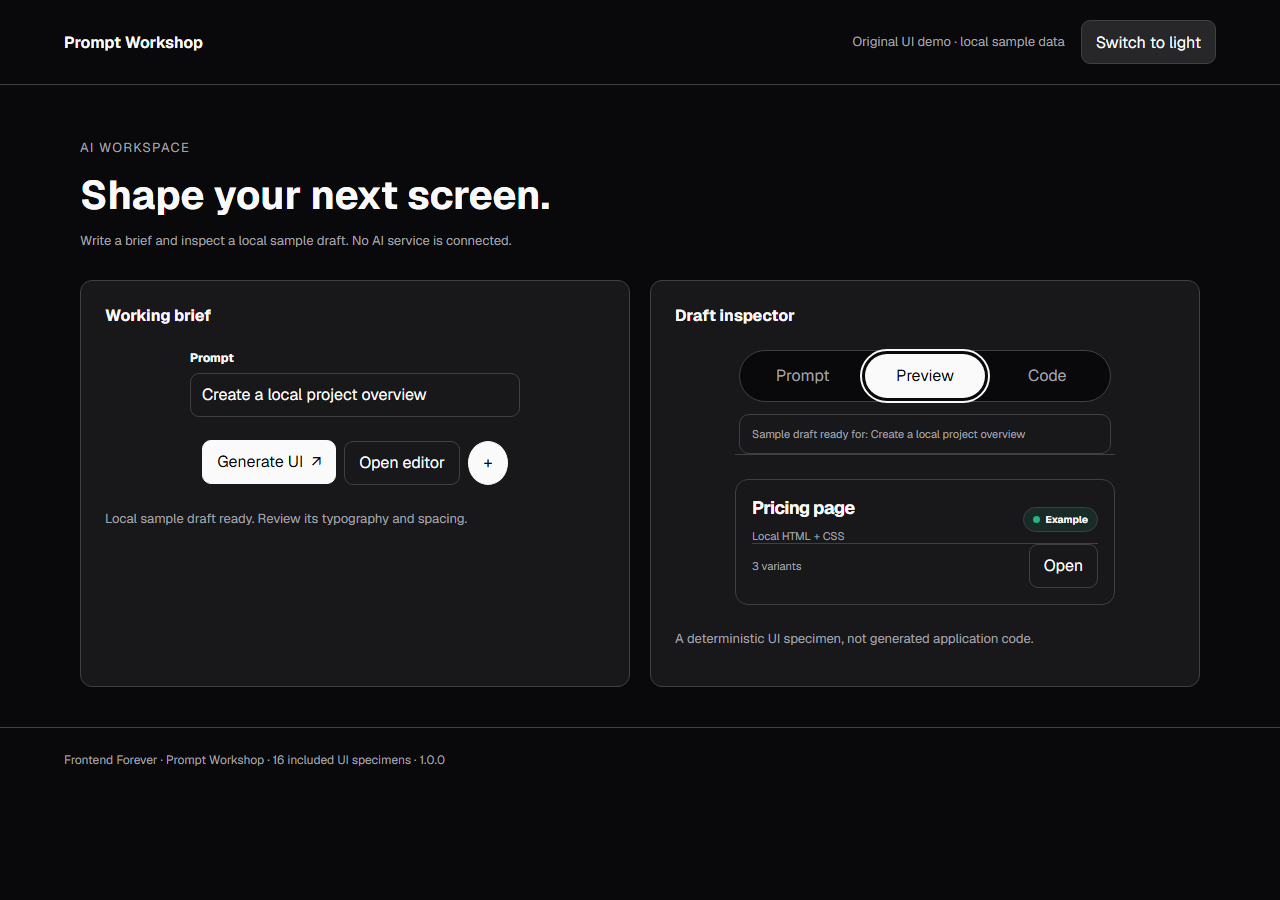
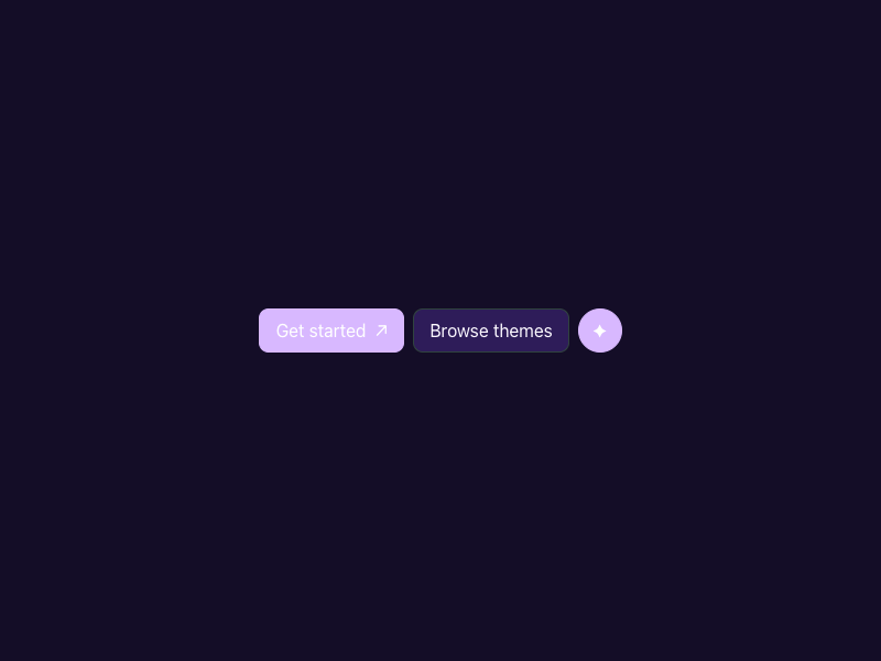
Get started ↗ Browse themes ✦
0
39
Design foundations

Inspect the kit's typography, palette, icons, spacing and motion.

Style identity

Cosmic Content

A content-first framework system that combines a centered onboarding story with soft release context, command proof, integration choices, and performance evidence.

Reference style: Deep indigo and violet atmosphere, white content, rounded controls, and mint fle
Visit website

Typography

Font families

Obviously

Hero and large content headings observed in the current Astro homepage.

Obviously, obviously-fallback, system-ui, sans-serif
Weights
300,700
Sizes
30px,36px,48px
Line height
33px,40px,52.8px
Tracking
0

Fallback: system-ui, sans-serif

Inter

Navigation, body copy, labels, and controls observed in the live site.

Inter, ui-sans-serif, system-ui, sans-serif, Apple Color Emoji, Segoe UI Emoji, sans-serif
Weights
400,500,600,700
Sizes
16px
Line height
24px
Tracking
0

Fallback: ui-sans-serif, system-ui, sans-serif

Code mono

npm create command, code examples, and metric values.

ui-monospace, SFMono-Regular, Menlo, Consolas, monospace
Weights
400,500
Sizes
12px,14px
Line height
18px,22px
Tracking
0,0.02em

Fallback: monospace

Palette

Core colors

Content canvas / light

#f7f3ff

Pale violet documentation field.

Content canvas / dark

#0c0f19

Observed deep navy hero canvas.

Panel / light

#ffffff

Feature and command surface.

Panel / dark

#14192a

Raised content and proof surface.

Ink / light

#1f1734

Readable dark type on pale field.

Ink / dark

#f2f6fa

Observed hero and feature text.

Violet action / light

#7e48d8

Primary CTA and selected integration.

Violet action / dark

#a78bfa

High-contrast action on dark.

Island mint

#a9f7d2

Framework flexibility and performance signal.

Muted lavender

#c3b3e7

Supporting copy on dark.

Hairline

#30433e

Quiet panel separation.

Type scale

Responsive hierarchy

RoleSizeWeightLine heightTracking
Hero desktop48px70052.8px—
Hero mobile30px70033px—
Lead section36px30040px—
Body16px40024px—
UI16px60024px—
Command13px50020px—

Spacing & shape

Layout rhythm

Density
Base unit
Max width
Section gap
Card padding
Element gap

Iconography

Brand-authored SVG mark, chevrons, external-link cues, and compact utility glyphs.

1.5px to 2px when outlined; use currentColor. stroke · 14px / 16px / 24px

Use currentColor, pair symbols with labels for important actions, and preserve optical alignment.

System metrics

Radius

Sm 6pxValue 6pxMd 10pxValue 10pxLg 16px

Spacing

1 4pxValue 4px2 8pxValue 8px3 12px

Motion

Fast 200msValue 200msStandard 500msValue 500msEasing ease-out

Guidelines

Do

  • Let the content promise lead before the framework implementation details.
  • Use the release badge as context, not as the primary action.
  • Keep performance values labeled with exact percentages and explanatory text.
  • Make framework integration choices keyboard-selectable and announce the active choice.

Don't

  • ×Do not make every section a gradient or pill.
  • ×Do not use a chart without readable labels and a text alternative.
  • ×Do not hide the project creation command below a decorative hero.
  • ×Do not copy Astro wording, logo geometry, screenshots, or proprietary assets.

Imagery

Prefer original abstract gradients, CSS metric bars, and framework-neutral diagrams. Do not ship Astro's logo, brand illustrations, or copied page imagery.

Layout

Center the hero and command first, then branch into feature cards, performance comparison, and integration choices. At 390px preserve one vertical content axis and keep the menu explicit.

Assigned collection

Cosmic Content Interface Elements

11 published components in collection order

Components

Built from the same system

These working component previews are supplied with the kit. Open a component to inspect its code; the reference screenshots show the original website.

Open collection
Get started ↗ Browse themes ✦
0
39
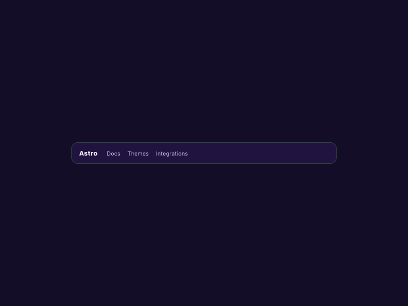
Astro Docs Themes Integrations
0
47
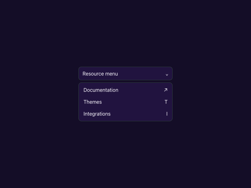
Resource menu ⌄ Documentation ↗ Themes T Integrations I
0
37
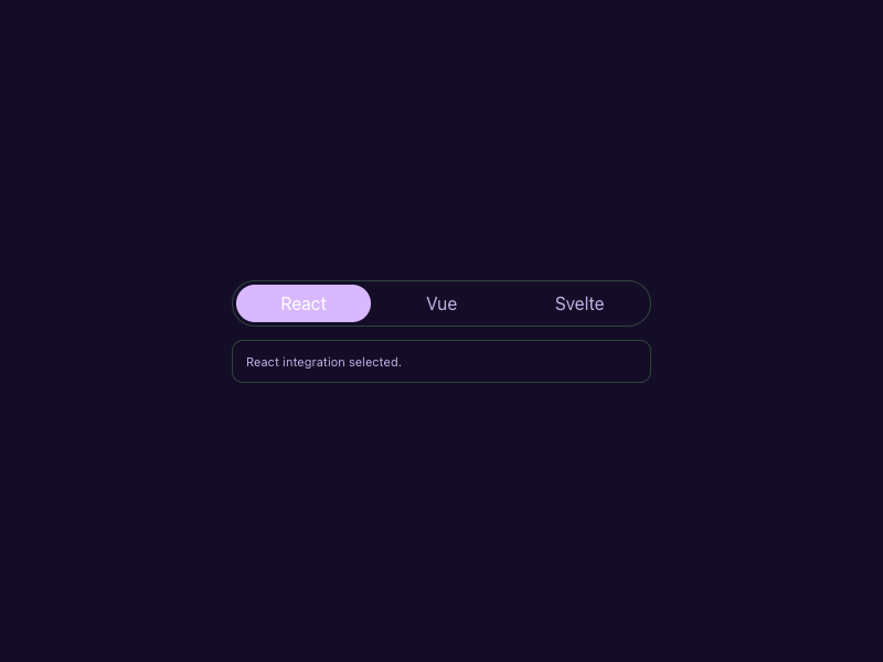
React Vue Svelte React integration selected.
0
47
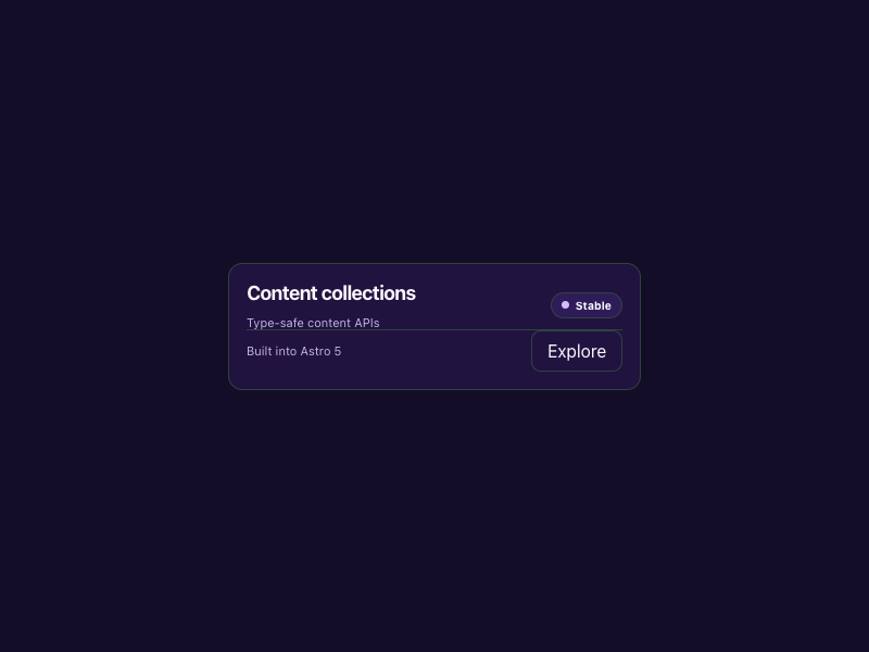
Content collections Type-safe content APIs Stable Built into Astro 5 Explore
0
40
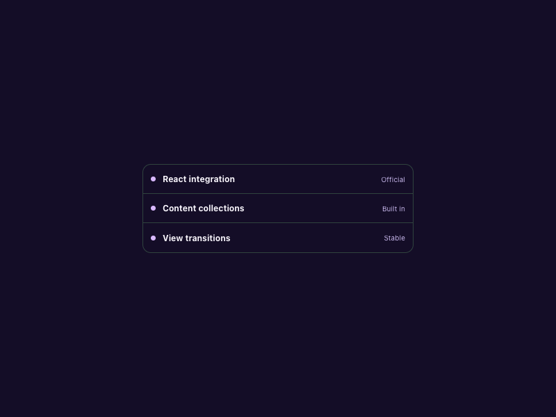
React integration Official Content collections Built in View transitions Stable
0
40
Astro 5 Stable Adapter
0
43
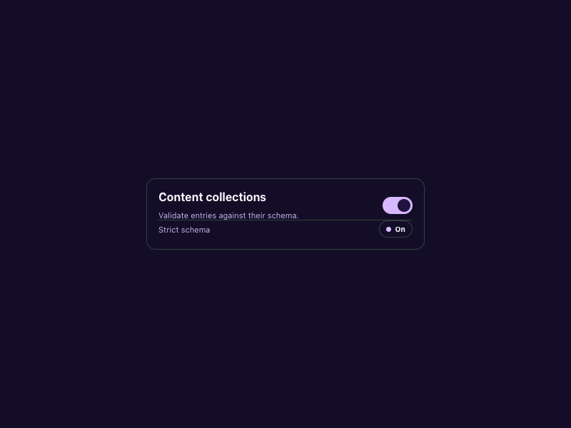
Content collections Validate entries against their schema. Strict schema On
0
34
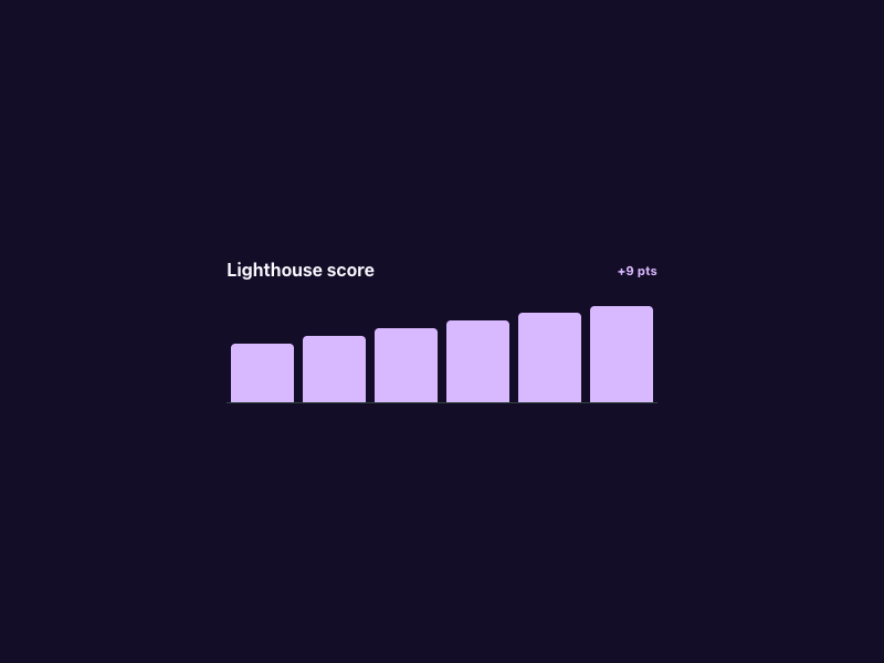
Lighthouse score +9 pts
0
44
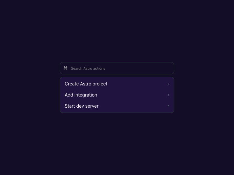
⌘ Create Astro project C Add integration I Start dev server D
0
48
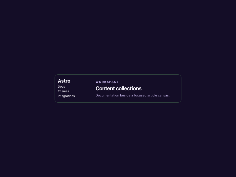
Astro Docs Themes Integrations Workspace Content collections Documentation beside a focused article canvas.
0
36

More AI Kits

Published AI Kit Protected source files for Starter and Super members
Astro-inspired Cosmic Content AI Kit - Frontend Forever