

Skip to content
All AI Kits
Design system Paid source9 components

Arc-inspired Calm Spaces

An unofficial, original Arc-inspired product system with 9 evidence-backed elements for Harbor's focused workflow language.

Includes DESIGN.md, tokens.json, full CSS, Tailwind v4 token mapping and matching UI specimens. Preview for free; protected guidance and style downloads require Starter or Super. Framework installation and theme support are verified only where listed.

Theme support:
Unverified
Installation:
No verified installation path listed

Delivered component specimen

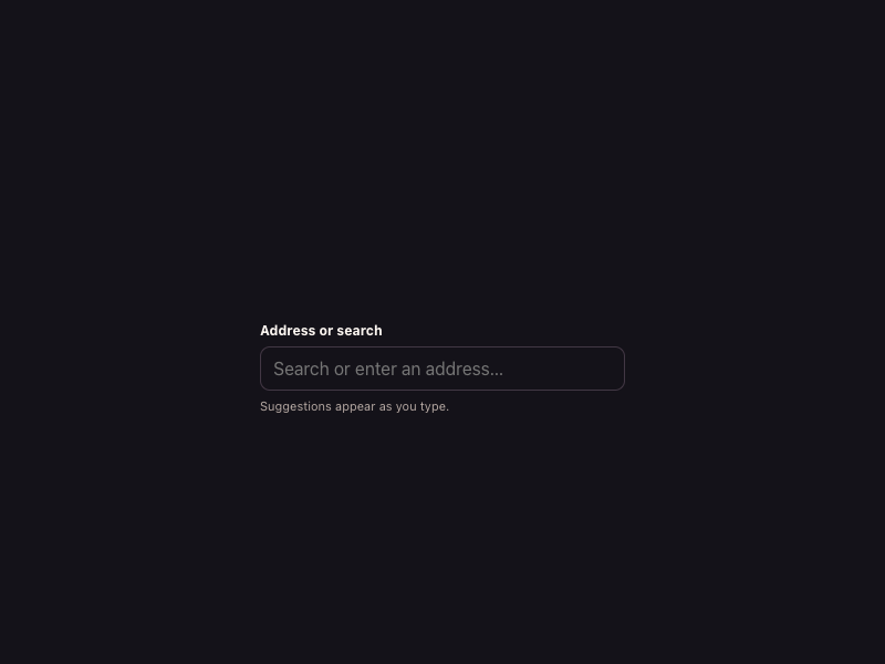
Address or search Suggestions appear as you type.
0
37
Design foundations

Inspect the kit's typography, palette, icons, spacing and motion.

Style identity

Calm Spaces

An original browser surface inspired by Arc's current clean-and-calm language: warm paper-like canvases, soft typographic shapes, contextual Spaces and Profiles, and deliberate split or stacked browsing layouts.

Reference style: warm light with a quiet dark companion
Visit website

Typography

Font families

Marlin

Observed Arc body and navigation family for calm interface copy and utility labels.

Marlin, -apple-system, system-ui, Segoe UI, Roboto, sans-serif
Weights
400–800
Sizes
13–48px
Line height
1.0–1.6
Tracking
-0.04em to 0

Fallback: -apple-system, system-ui, Segoe UI, Roboto, sans-serif

Marlin Soft SQ

Observed rounded headline and hero display variant.

Marlin Soft SQ, Marlin, InterVariable, sans-serif
Weights
400, 500, 700, 900
Sizes
28–72px
Line height
0.96–1.2
Tracking
-0.06em to -0.02em

Fallback: Marlin, InterVariable, sans-serif

ABC Favorit Mono

Observed technical labels, product metadata, and small navigation accents.

ABC Favorit Mono, Space Mono, ui-monospace, monospace
Weights
400, 500, 700
Sizes
10–14px
Line height
1.3–1.6
Tracking
0.02em–0.08em

Fallback: Space Mono, ui-monospace, monospace

InterVariable

Observed support family for responsive utility and product UI states.

InterVariable, Inter, system-ui, sans-serif
Weights
400–700 variable
Sizes
12–20px
Line height
1.3–1.6
Tracking
0

Fallback: Inter, system-ui, sans-serif

Palette

Core colors

Warm paper

#fffcec

Observed Arc page canvas

Ink

#1b1b1b

Primary copy on light surfaces

White surface

#ffffff

Raised content and browser frame

Soft sand

#f3efe3

Secondary surface and space rail

Coral accent

#ff8f66

Primary interaction and warm emphasis

Sky accent

#6f7cff

Secondary context and selected space

Leaf signal

#5ec698

Privacy or healthy state

Type scale

Responsive hierarchy

RoleSizeWeightLine heightTracking
Soft display72px7000.96-0.06em
Hero mobile42px7001.0-0.05em
Section heading44px7001.05-0.045em
Product heading24px7001.2-0.03em
Body16px4001.550
Interface label13px5001.350.01em
Mono metadata11px5001.450.06em

Spacing & shape

Layout rhythm

Density
low-density, calm, and context-first
Base unit
4px
Max width
1160px
Section gap
112px
Card padding
24px
Element gap
10px

Iconography

Soft geometric outline icons with playful colored context marks

1.5px stroke · 16px / 20px / 24px / 28px

Use rounded joins and generous optical whitespace. Pair space/profile symbols with labels and preserve a low-noise rail. The pack uses original CSS symbols rather than Arc's protected artwork.

System metrics

Radius

Control 8pxCard 14pxBrowser frame 22pxHero media 32pxPill 999px

Spacing

1 4px2 8px3 12px4 16px6 24px

Motion

Context switch 120msPanel transition 220msReveal 520msEase cubic-bezier(0.22, 0.8, 0.28, 1)

Elevation

Quiet surface

0 1px 0 rgba(27,27,27,.05)

Default separation on warm paper

Split frame

0 16px 40px rgba(36,32,39,.14)

Focused browser panel and split-view frame

Focus ring

0 0 0 3px rgba(255,143,102,.34)

Keyboard focus and selected context

Surfaces & shape

Paper canvas

#fffcec

Warm primary page background

Browser surface

#ffffff

Focused web content panel

Space rail

#f3efe3

Persistent context navigation

Dark calm

#17141b

Explicit dark theme background

Guidelines

Do

  • Make browsing context visible through Spaces, Profiles, or a quiet side rail.
  • Use warm surfaces and rounded geometry to reduce visual noise.
  • Let Split View become a deliberate stacked layout on narrow screens.
  • Keep privacy and security copy legible without alarmist styling.
  • Use mono labels sparingly for context metadata and technical detail.

Don't

  • ×Do not copy Arc or Dia logos, source screenshots, or proprietary page copy.
  • ×Do not use a dense dashboard as a stand-in for browser context.
  • ×Do not fill every surface with gradients or shadows.
  • ×Do not hide the current Space or Profile state.
  • ×Do not let two-column desktop layouts overflow on mobile.

Imagery

Use original CSS browser frames, paired panes, abstract calm color fields, and small context icons. Avoid live Arc/Dia screenshots, product logos, and downloaded campaign images.

Layout

Use 1160px maximum width with 24px desktop and 16px mobile gutters. Keep the browser or paired panes visually primary; collapse split layouts to a stacked reading order below 720px and maintain a persistent context cue.

Assigned collection

Arc-inspired Interface Elements

9 published components in collection order

Components

Built from the same system

These working component previews are supplied with the kit. Open a component to inspect its code; the reference screenshots show the original website.

Open collection
Address or search Suggestions appear as you type.
0
37
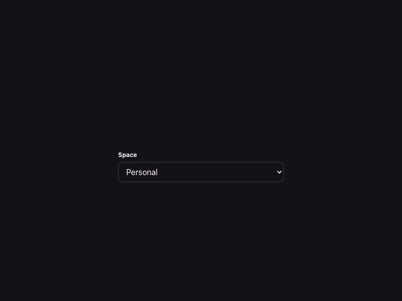
Space Personal Work Research
0
37
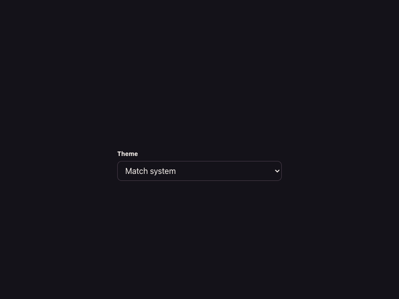
Theme Match system Light Dark
0
42
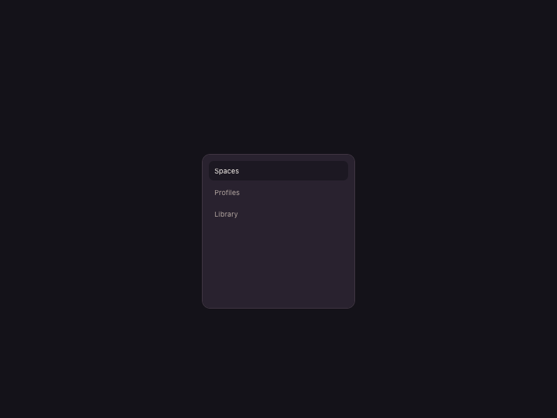
Spaces Profiles Library Space Personal 12 open tabs
0
39
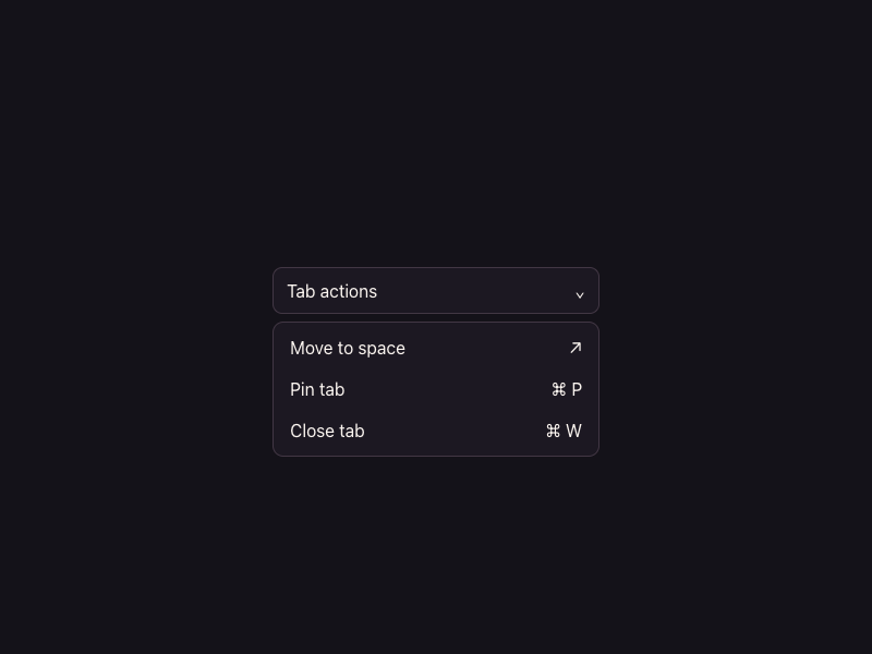
Tab actions ⌄ Move to space ↗ Pin tab ⌘ P Close tab ⌘ W
0
56
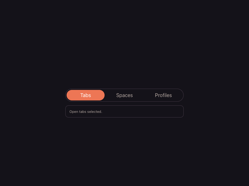
Tabs Spaces Profiles Open tabs selected.
0
45
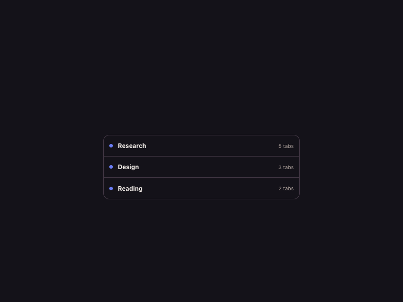
Research 5 tabs Design 3 tabs Reading 2 tabs
0
37
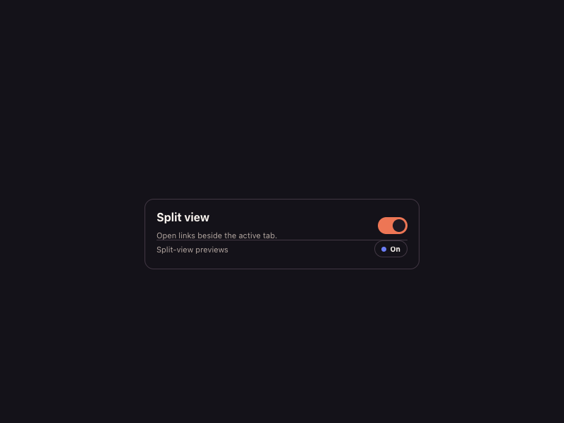
Split view Open links beside the active tab. Split-view previews On
0
35
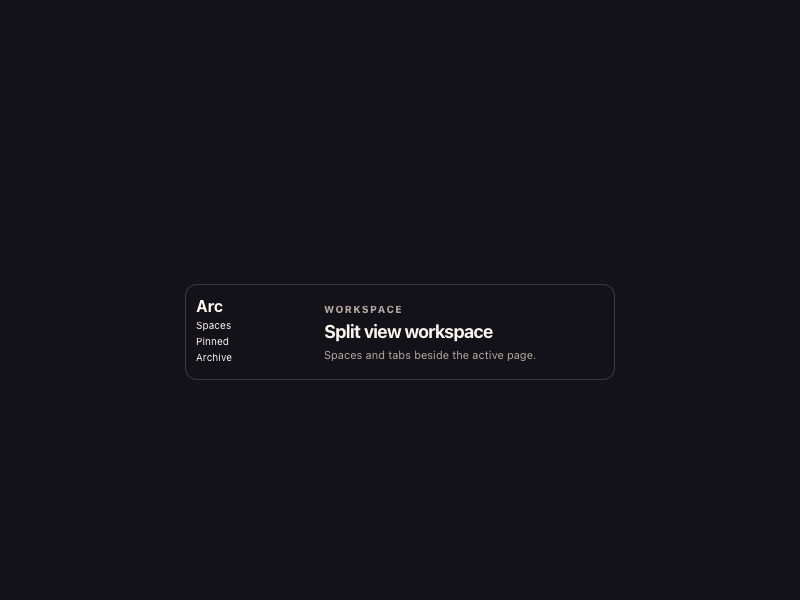
Arc Spaces Pinned Archive Workspace Split view workspace Spaces and tabs beside the active page.
0
38

More AI Kits

Published AI Kit Protected source files for Starter and Super members
Arc-inspired Calm Spaces AI Kit - Frontend Forever