Skip to content
All AI Kits
Design system Pro AI Kit40 components

Vercel-inspired Frontend Cloud

An unofficial Vercel-inspired system for precise developer platforms: adaptive neutral surfaces, compact operational UI, and production-ready elements across every Frontend Forever category.

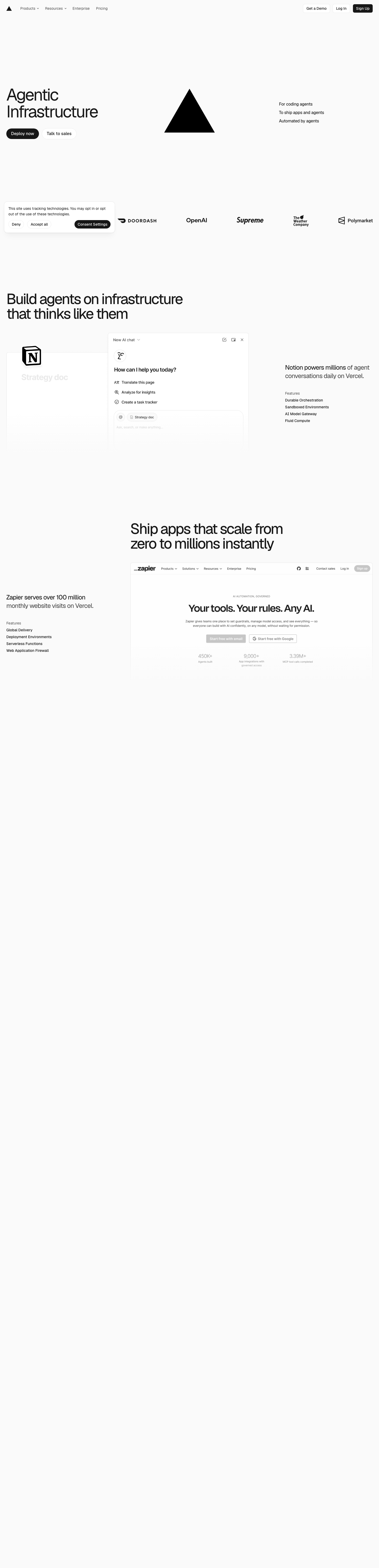
Desktop · 1440 × 5956
Vercel homepage — desktop reference

Foundations

The visual decisions behind the system

A public overview of the typography, palette, icon language, spacing, shape, and motion used throughout this AI Kit.

Style identity

Vercel-inspired Frontend Cloud

Precision interface architecture built from monochrome planes, hairline grids, compact operational controls, and rare semantic color. The system moves between a bright marketing canvas and a dense dark product surface while preserving one typographic and spatial rhythm.

adaptive light and dark theme
Visit website

Typography

Font families

Geist

Display, heading, navigation, controls, and body copy

Geist, Arial, sans-serif
Weights
400, 500, 600
Sizes
12–76px
Line height
0.96–1.65
Tracking
-0.065em to 0

Fallback: Arial, ui-sans-serif, system-ui, sans-serif

Geist Mono

Code, metrics, timestamps, command output, and technical metadata

Geist Mono, SFMono-Regular, Consolas, monospace
Weights
400, 500, 600
Sizes
11–16px
Line height
1.35–1.6
Tracking
-0.02em to 0.08em

Fallback: SFMono-Regular, Consolas, Liberation Mono, monospace

Geist Pixel

Rare decorative technical labels and diagram accents

Geist Pixel, Geist, sans-serif
Weights
400
Sizes
12–24px
Line height
1.0–1.25
Tracking
0 to 0.08em

Fallback: Geist, Arial, sans-serif

Palette

Core colors

Black Canvas

#000000

Dark page canvas and inverse primary button

Dark Surface

#0A0A0A

Primary dark card and code-panel surface

Raised Dark

#1A1A1A

Hover, selected row, and raised control surface

Dark Border

#2A2A2A

Hairline structure on dark backgrounds

Dark Text

#EDEDED

Primary text and inverted action fill

Muted Dark

#A1A1A1

Secondary text, helper copy, and inactive navigation

White Canvas

#FFFFFF

Light page canvas and elevated surfaces

Light Surface

#FAFAFA

Quiet alternate sections and light cards

Light Border

#EAEAEA

Hairline structure on light backgrounds

Light Text

#1D1D1F

Primary copy on light surfaces

Link Blue

#0070F3

Links, focus, and active navigation only

Ready Green

#17C964

Healthy deployment and success states

Attention Amber

#F5A623

Warnings and pending operational states

Failure Red

#EE0000

Destructive actions and failed states
Type scale

Responsive hierarchy

RoleSizeWeightLine heightTracking
Display76px4000.96-0.065em
Hero mobile38px4001.02-0.05em
Section heading48px4501.04-0.055em
Product heading24px6001.2-0.025em
Body large18px4001.6-0.01em
Body16px4001.550
Interface label14px5001.4-0.01em
Metadata12px5001.450.02em

Spacing & shape

Layout rhythm

Density
compact with spacious marketing sections
Base unit
4px
Max width
1200px
Section gap
96px
Card padding
24px
Element gap
8px

Iconography

Crisp geometric outline icons

1.5px stroke · 16px / 20px / 24px

Use SVG with currentColor, square optical bounds, rounded joins, and labels for unfamiliar actions. Filled icons are reserved for status dots and the triangular product mark.

System metrics

Radius

Compact 6pxControl 8pxPanel 12pxMarketing frame 16pxLarge media 24px

Spacing

1 4px2 8px3 12px4 16px5 20px

Motion

Fast 150msControl 180msNormal 200msReveal 500msEase cubic-bezier(0.2, 0.8, 0.2, 1)

Elevation

Floating menu

0 12px 36px rgba(0, 0, 0, 0.18)

Command palettes, account menus, and contextual popovers

Modal overlay

0 24px 80px rgba(0, 0, 0, 0.32)

Dialog surfaces above the product shell

Focus glow

0 0 0 3px rgba(50, 145, 255, 0.28)

Keyboard focus around interactive controls

Surfaces & shape

Dark canvas

#000000

Marketing hero and dark product background

Dark panel

#0A0A0A

Cards, terminal frames, and operational panels

Light canvas

#FFFFFF

Documentation and light marketing sections

Light panel

#FAFAFA

Quiet feature groups and secondary content

Guidelines

Do

  • Use one-pixel borders and shared grid lines before introducing shadows.
  • Keep hero type light in weight, tightly tracked, and aligned to the same content rail as the product preview.
  • Use blue, green, amber, and red only for semantic meaning.
  • Pair code and metrics with Geist Mono and tabular numerals.
  • Let dense product UI use 8px rhythm while marketing sections breathe at 64–96px intervals.
  • Design light and dark modes as equal systems with explicit surface and contrast decisions.

Don't

  • ×Do not decorate neutral surfaces with ambient gradients or unrelated color.
  • ×Do not apply large radii or heavy shadows to every card.
  • ×Do not use bold display typography as the default hierarchy mechanism.
  • ×Do not rely on color alone for deployment, warning, or failure states.
  • ×Do not shrink code below 12px; allow horizontal scrolling instead.
  • ×Do not break content-rail alignment with floating sections that share no structural edge.

Imagery

Product-first compositions use real interface frames, terminal output, deployment graphs, and precise technical diagrams. Screenshots stay sharp, top-aligned, and contained by a quiet border; avoid lifestyle photography and decorative mockups that do not explain the product.

Layout

Center content in a 1200px rail with 24px desktop and 16px mobile gutters. Marketing sections use visible horizontal rules and occasional 48px grid lines. Split heroes collapse below 900px, dense grids step from four columns to two and one, and code surfaces scroll instead of compressing.

Concept

A complete visual language, ready to inspect.

Use the file tree to move between the full reference preview, implementation guidance, portable tokens, and framework-ready styles. Each surface stays focused, so you can understand the system before copying code.

Assigned collection

Vercel-inspired Interface Elements

40 published components in collection order

Components

Built from the same system

Production-ready specimens from this AI Kit's approved collection.

Open collection
Deploy now ↗ Create project +
0
36
Email address We’ll send a secure sign-in link.
0
50
Preview environments Create a URL for every change.
0
49
Framework preset Next.js Astro Remix Choose the framework used by this project.
0
43
New project Deploy from Git Repository URL Deploy project ↗ Connect a repository to begin.
0
54
Deploy window Next available production slot.
0
46
↑ Upload build archive ZIP or TGZ up to 100 MB No file selected.
0
40
Memory 2 GB Allocated per function instance.
0
46
▲ Vercel Products Resources Enterprise Pricing Log in Sign up
0
46
▲ acme / northstar Overview Deployments Analytics Settings Overview northstar-web Production is healthy.
0
58
Deployment actions ⌄ Open deployment ↗ Redeploy ⌘ R Remove deployment ⌫
0
41
Overview Deployments Domains Production · northstar-web
0
45
Projects / northstar-web / Settings
0
55
← 1 2 3 … 12 → Page 1 of 12
0
46
northstar-web Updated 2 minutes ago Ready main · Production Open project
0
48
Global delivery Enabled Serverless Functions Enabled Web Analytics Setup
0
36
Deployment Branch Status northstar-web main Ready docs preview Building
0
42
Remove this deployment? This deployment will no longer be available at its preview URL. Cancel Remove deployment This action cannot be undone.
0
46
northstar-web Activity × Build deployed 2m Domain connected 1h Environment updated Yesterday
0
45
i Preview deployments let you review changes before they reach production.
0
33
! Build needs attention The VERCEL_ENV variable is missing. ×
0
45
Deploying northstar-web 72% Optimizing edge assets
0
42
Ready Building Error
0
45
Deployment settings Preview deployments Create a URL for every pull request. Automatic previews Enabled
0
44
✓ Build 2 Preview 3 Production
0
43
Frontend cloud Ship with confidence Preview every change before production. 1 of 3 slides ← →
0
46
Deployment window Choose a date ▣ Run on Saturday, August 15, 2026 · UTC
0
48
Traffic 4.28M ↗ 18.2% Last 7 days Requests
0
37
Workspace plan Pro Current $20 / member / month Unlimited deployments Collaborative previews Observability and analytics Start with Pro Billed monthly · cancel anytime.
0
40
▲ Check your email Enter verification code Six-digit code Sent to you@company.com Verify code
0
44
✓ Latest deployment northstar-web Ready Branch main Created 2 min ago Production is healthy. The latest deployment passed every check. View deployment View logs
0
42
Project actions northstar-web ⌘ K ⌕ Suggested Open project ↵ Deploy build D View logs L
0
32
Is the production preview ready? Yes—build 9f4ad2 passed in 42 seconds. Send
0
47
CD Build deployed main · 2m ago Live PR Preview URL created feature/checkout · 18m ago Open
0
55
▲ Analytics Project add-on Web Analytics Privacy-friendly traffic insights for every deployment. Free Add to project ↗
0
48
Deployments 128 ↗ 12.4% Requests 4.28M Last 30 days Uptime 99.98% Operational
0
74
▲ Vercel Workspace Overview Projects Domains Settings Help ↗ Overview ⌘ K Project overview Ship with confidence Deploy fast, inspect every build, and keep the team aligned. Production Operational northstar-web Last deployment 2 minutes ago · main
0
37

More like this

Postman-inspired API Orbit

An unofficial, original Postman-inspired interface study with 14 focused specimens supported by the live product and content experience.

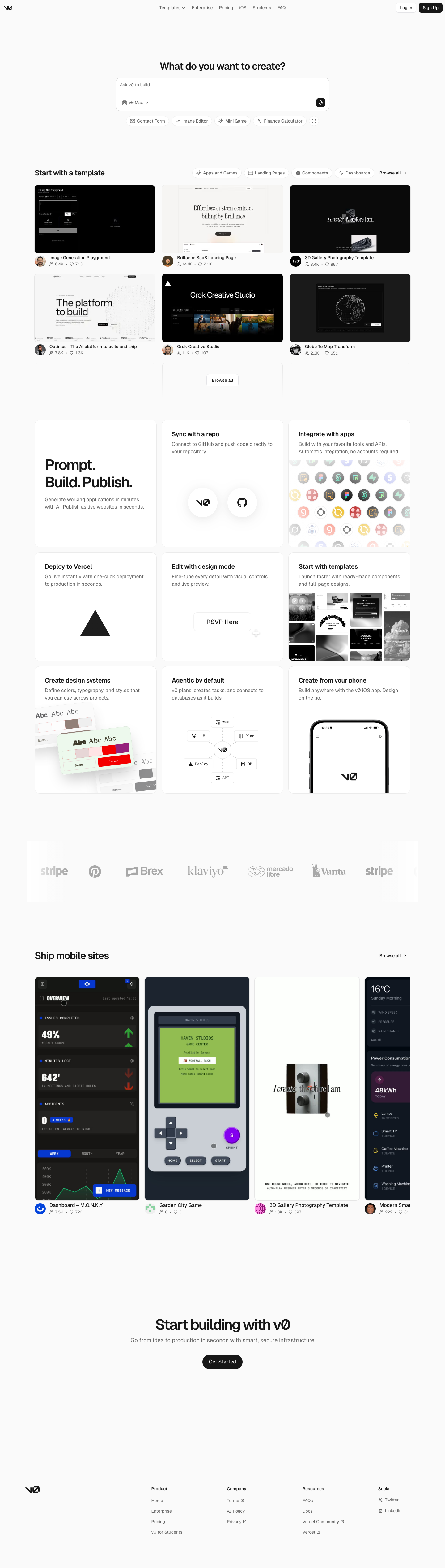
v0-inspired Prompt Workshop

An unofficial, original v0-inspired Prompt Workshop system grounded in 17 retained, evidence-backed interface patterns.

Borderless Ledger — Wise-inspired AI Kit

13 focused, original elements for Borderless Ledger; categories are retained only when supported by the live reference. Published flags remain disabled.

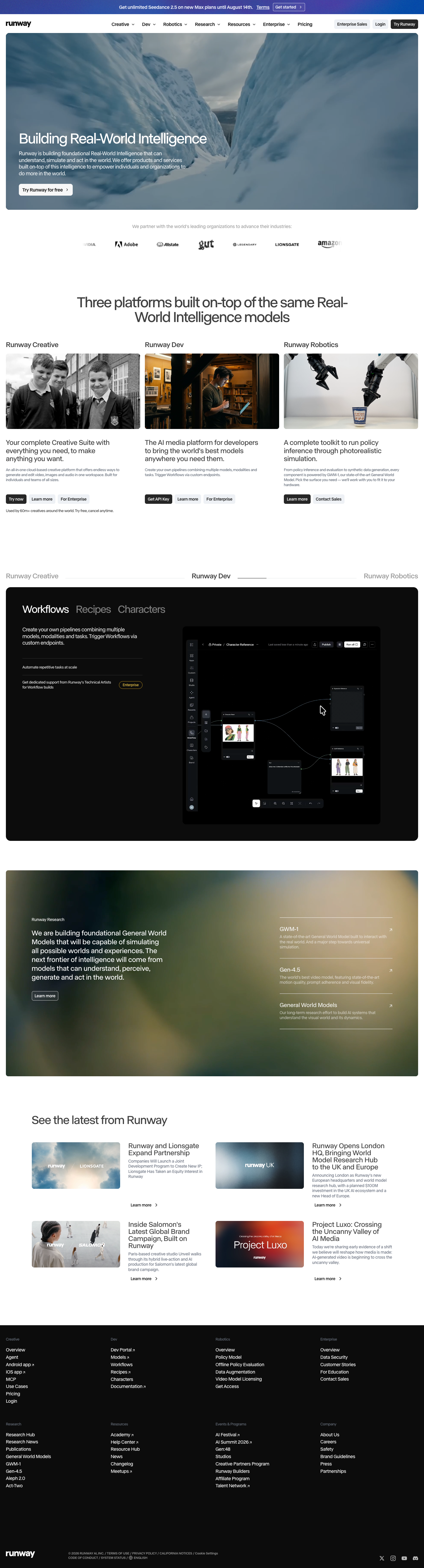
Runway-inspired Real-World Studio

A high-contrast studio language for a platform that moves between creative production, developer workflows, robotics, research, and enterprise. The system uses a dark stage, warm action color, and compact cross-platform wayfinding without copying Runway's wordmark, content, or media. Responsive previews and 8 evidence-backed interface elements.

Observable-inspired Signal Notebook

An original, unofficial Observable-inspired system for reactive notebooks, executable explanations, and data visualization surfaces. It retains only 11 focused elements supported by Observable's live notebook and chart workflows.

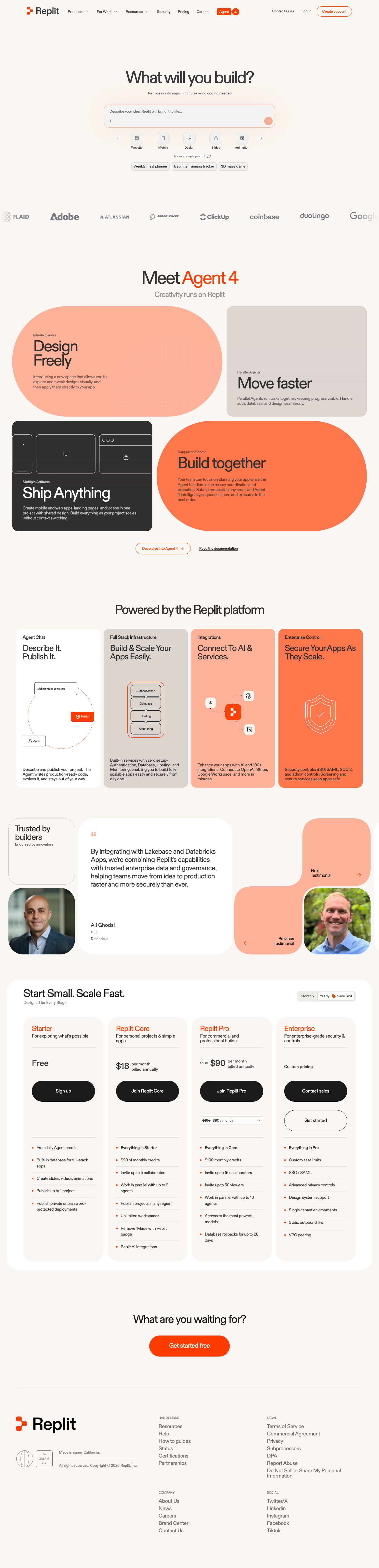
Replit-inspired Build Canvas

A friendly builder language for moving from prompt to app: vivid purple/green accents, a prominent idea field, artifact type selection, parallel execution, built-in infrastructure, team plans, agent chat, and a clear publish handoff. It is an original study without Replit's logo, pixel font, testimonials, screenshots, or protected copy. Responsive previews and 14 evidence-backed interface elements.

Published AI Kit Protected source files for Pro members