Skip to content
All AI Kits
Design system Pro AI Kit13 components

Typeform-inspired Conversational Flows

A bright, editorial form language for asking one useful question at a time, adapting the path, and turning responses into action.

Desktop · 1440 × 8641
Typeform homepage — desktop live reference

Foundations

The visual decisions behind the system

A public overview of the typography, palette, icon language, spacing, shape, and motion used throughout this AI Kit.

Style identity

Typeform-inspired Conversational Flows

A bright, editorial form language for asking one useful question at a time, adapting the path, and turning responses into action.

Warm editorial minimalism, high-contrast purple action, and a conversational rhy theme

Visit website

Typography

Font families

Twklausanne

Primary editorial UI, navigation, question copy, and body text.

Twklausanne 500, Twklausanne, Arial, Helvetica, sans-serif
Weights
350, 400, 500, 600, 700
Sizes
14–72px
Line height
110% headings; 145% body
Tracking
-0.04em headings; -0.01em body

Fallback: Arial, Helvetica, sans-serif

Apercu Pro

Supporting utility and form-builder text observed in the live site font declarations.

Apercu Pro, Arial, Helvetica, sans-serif
Weights
500
Sizes
14–18px
Line height
140%–150%
Tracking
0

Fallback: Arial, Helvetica, sans-serif

Apercu Mono Pro

Eyebrows, progress metadata, and compact response-system cues.

Apercu Mono Pro, ui-monospace, SFMono-Regular, Menlo, monospace
Weights
300, 400, 500
Sizes
11–14px
Line height
120%–145%
Tracking
0.02em

Fallback: ui-monospace, SFMono-Regular, Menlo, monospace

Palette

Core colors

Canvas light

#fffaf2

Primary light page or work field

Canvas dark

#1d1424

Primary dark page or work field

Surface light

#ffffff

Raised content surface in light mode

Surface dark

#271b30

Raised content surface in dark mode

Border

#e7dcd1

Low-contrast separation and control edges

Ink

#251c2a

Primary text and interface content

Muted ink

#766a76

Supporting copy and metadata

Accent

#7352d6

Primary action, selection, or brand signal

Accent strong

#5935b7

Pressed and high-contrast action state

Accent soft

#ece5ff

Tinted selection or supporting surface

Secondary signal

#c1e86c

Collaboration, health, or growth cue

Tertiary signal

#f28f72

Human, warm, or threat cue

Type scale

Responsive hierarchy

RoleSizeWeightLine heightTracking
Hero72px / 44px mobile7000.98 / 1.05-0.055em
Section48px / 34px mobile7001.02 / 1.08-0.045em
Question32px / 26px mobile5001.1-0.03em
Body large20px / 18px mobile5001.45-0.01em
Body16px / 15px mobile5001.50
Mono label12px4001.250.04em

Spacing & shape

Layout rhythm

Density
Focused and conversational; keep one question or one decision in view
Base unit
4px
Max width
1180px marketing; 640px respondent flow
Section gap
96–144px desktop; 64–88px mobile
Card padding
24–32px
Element gap
12–20px

Iconography

Simple rounded line icons with directional arrows and editorial symbols

1.5–2px stroke · 16px / 20px / 24px / 32px

Use currentColor and keep icons secondary to the question or CTA. Preserve a text label for branching, upload, and navigation actions; the pack uses original CSS shapes rather than copied marks.

System metrics

Radius

Pill 999pxControl 8pxCard 16pxPanel 24px

Spacing

1 4px2 8px3 12px4 16px6 24px

Motion

Fast 140ms ease-outQuestion transition 260ms cubic-bezier(.22,.8,.24,1)Chapter reveal 520ms cubic-bezier(.16,1,.3,1)Reduced motion Keep progress and state changes instant and explicit

Elevation

Question card

0 12px 36px rgba(71,42,91,.10)

Lift a focused response surface

Floating action

0 6px 18px rgba(71,42,91,.14)

Separate one primary CTA from warm background

Surfaces & shape

Warm canvas

#fffaf2

Editorial page field

Quiet panel

#f5ede4

Chapter or helper grouping

Ink

#251c2a

Question and response copy

Action

#7352d6

Primary progress and CTA signal

Guidelines

Do

  • Ask one useful question at a time.
  • Use bright action against warm, quiet surfaces.
  • Reveal adaptive logic through progress, branching, and feedback.
  • Carry response insight into follow-up automation.

Don't

  • ×Do not copy protected copy, logos, screenshots, illustrations, or proprietary assets.
  • ×Do not turn a focused specimen into a full dashboard or marketing page.
  • ×Do not make color, motion, or an icon the only way to understand state.
  • ×Do not allow horizontal overflow at 390px.

Imagery

Use CSS-built question cards, response chips, progress marks, branching arrows, and restrained editorial color fields. Avoid real screenshots, Typeform marks, copied photography, or proprietary illustrations. Visuals should clarify asking, adapting, measuring, or activating a response.

Layout

Use a compact navigation, editorial hero, clear ASK / ACT / LEARN chapters, product/form visual moments, template and research proof, analytics, and plan CTA. Keep the respondent path narrower than the marketing grid. At 760px and below, stack chapters and controls, keep one next action per section, and do not make branching logic depend on horizontal scrolling.

Concept

A complete visual language, ready to inspect.

Use the file tree to move between the full reference preview, implementation guidance, portable tokens, and framework-ready styles. Each surface stays focused, so you can understand the system before copying code.

Assigned collection

Typeform-inspired Flow Elements

13 published components in collection order

Components

Built from the same system

Production-ready specimens from this AI Kit's approved collection.

Open collection
Adaptive follow-up Show the next question based on this answer.
0
37
After this answer Qualified lead Needs follow-up End the form
0
30
↑ Upload an answer PDF, DOCX, PNG, or JPG up to 10 MB No file selected.
0
29
Questions Logic Results Questions selected.
0
30
Customer feedback 10-question survey Template Logic included Use
0
26
Form completion 75% Question 6 of 8
0
31
Growth $59 / month Logic branching · response analytics Choose Growth
0
34

More like this

Postman-inspired API Orbit

An unofficial, original Postman-inspired interface study with 14 focused specimens supported by the live product and content experience.

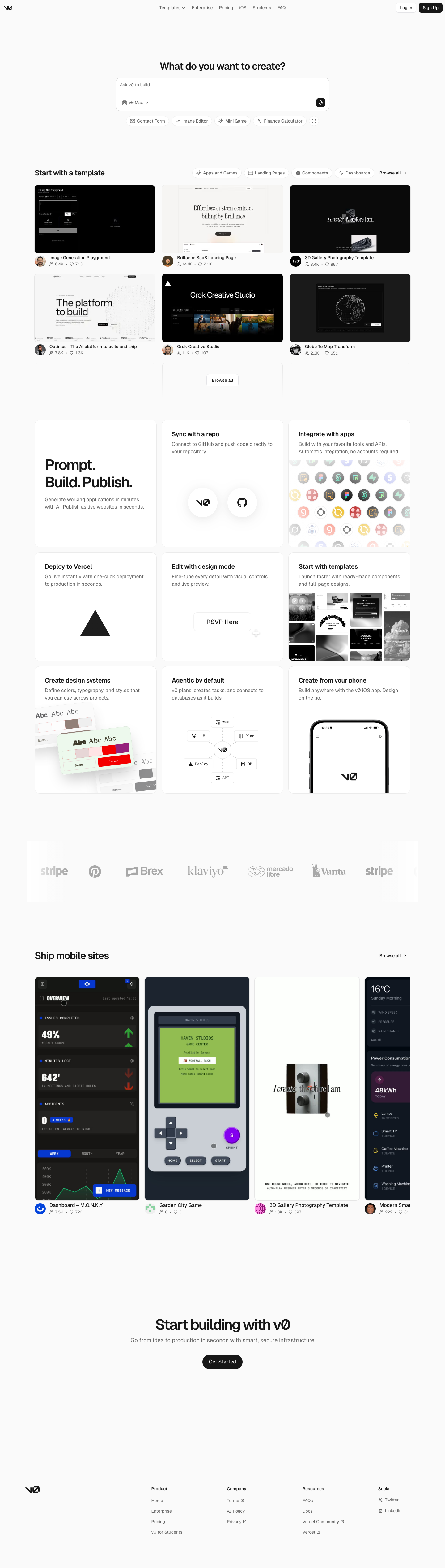
v0-inspired Prompt Workshop

An unofficial, original v0-inspired Prompt Workshop system grounded in 17 retained, evidence-backed interface patterns.

Borderless Ledger — Wise-inspired AI Kit

13 focused, original elements for Borderless Ledger; categories are retained only when supported by the live reference. Published flags remain disabled.

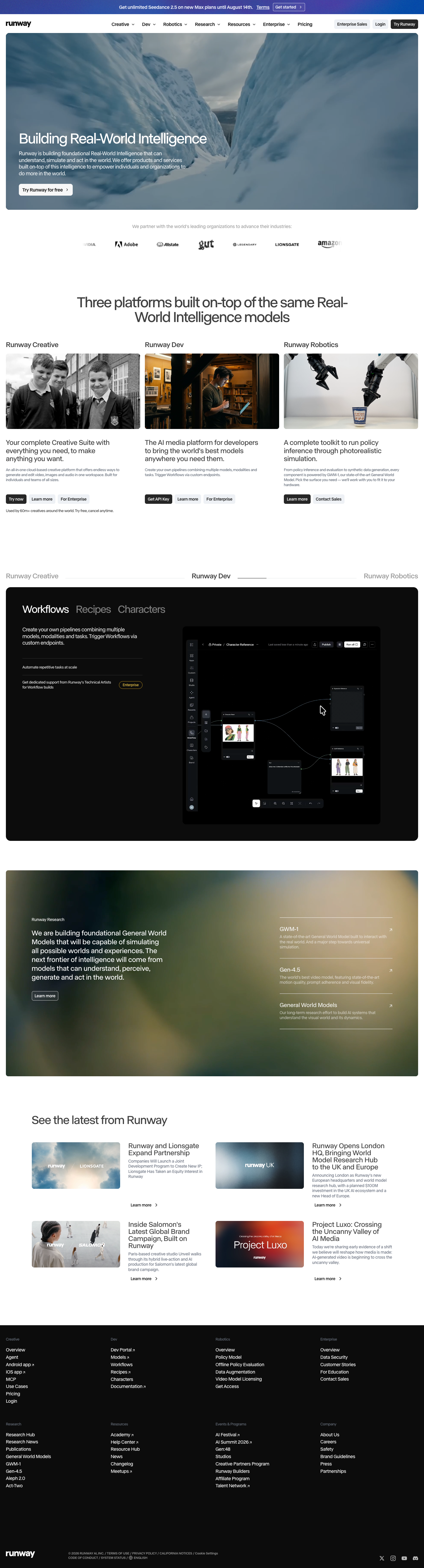
Runway-inspired Real-World Studio

A high-contrast studio language for a platform that moves between creative production, developer workflows, robotics, research, and enterprise. The system uses a dark stage, warm action color, and compact cross-platform wayfinding without copying Runway's wordmark, content, or media. Responsive previews and 8 evidence-backed interface elements.

Observable-inspired Signal Notebook

An original, unofficial Observable-inspired system for reactive notebooks, executable explanations, and data visualization surfaces. It retains only 11 focused elements supported by Observable's live notebook and chart workflows.

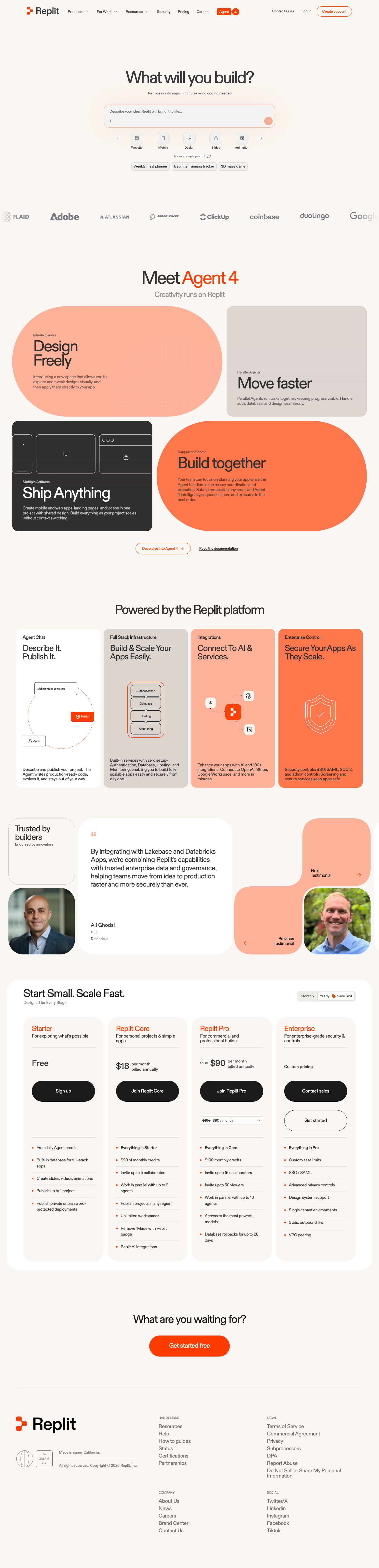
Replit-inspired Build Canvas

A friendly builder language for moving from prompt to app: vivid purple/green accents, a prominent idea field, artifact type selection, parallel execution, built-in infrastructure, team plans, agent chat, and a clear publish handoff. It is an original study without Replit's logo, pixel font, testimonials, screenshots, or protected copy. Responsive previews and 14 evidence-backed interface elements.

Published AI Kit Protected source files for Pro members