Style identity
Utility Craft
A documentation-led utility CSS study where responsive code, token-level control, and examples carry the product story.
Light and dark technical minimalism with code UI and restrained gradients theme8 focused, original elements for Utility Craft; categories are retained only when supported by the live reference. Published flags remain disabled.

Foundations
A public overview of the typography, palette, icon language, spacing, shape, and motion used throughout this AI Kit.
Style identity
A documentation-led utility CSS study where responsive code, token-level control, and examples carry the product story.
Light and dark technical minimalism with code UI and restrained gradients themeTypography
Inter
Primary UI, navigation, copy, and calls to action
inter, "inter Fallback", system-ui, sans-serifFallback: "inter Fallback", system-ui, sans-serif
Plex Mono
Code examples, keyboard hints, and implementation metadata
plexMono, "Plex Mono Fallback", ui-monospace, monospaceFallback: "Plex Mono Fallback", ui-monospace, SFMono-Regular, Menlo, monospace
Palette
canvas / light
#fffffflight page backdrop
surface / light
#f9fafblight card/control surface
border / light
#e5e7eblight hairline separation
text / light
#111827light primary text
muted / light
#4b5563light supporting text
accent / light
#0ea5e9light action signal
accent2 / light
#a855f7light secondary action signal
canvas / dark
#030712dark page backdrop
surface / dark
#111827dark card/control surface
border / dark
#374151dark hairline separation
text / dark
#f9fafbdark primary text
muted / dark
#cbd5e1dark supporting text
accent / dark
#38bdf8dark action signal
accent2 / dark
#c084fcdark secondary action signal
Success
#16a34apositive completion
Warning
#d97706caution
Type scale
| Role | Size | Weight | Line height | Tracking |
|---|---|---|---|---|
| Display | 96px | 400 | 96px | -4.8px |
| Section | 40px | 500 | 40px | -2px |
| Body | 16px | 400 | 24px | 0 |
| Control | 14px | 500 | 20px | -0.01em |
| Code | 13px | 400 | 20px | 0 |
Spacing & shape
Iconography
Use currentColor inline SVG for unfamiliar actions; pair icon-only controls with an accessible name.
System metrics
Radius
Spacing
Motion
Elevation
Soft
0 4px 16px rgba(15,23,42,.08)quiet surface separation
Lifted
0 18px 48px rgba(15,23,42,.14)focused proof surface
Surfaces & shape
Canvas
#ffffff / #030712page backdrop
Surface
#f9fafb / #111827card and control surfaces
Accent
#0ea5e9 / #38bdf8action and status emphasis
Guidelines
Imagery
Prefer original CSS grids, code panels, color swatches, and abstract gradients; do not reuse Tailwind logos, screenshots, or site illustrations.
Layout
A generous documentation container, compact utility navigation, oversized display statement, live code proof, and responsive demo sections that collapse to one readable column.
Concept
Use the file tree to move between the full reference preview, implementation guidance, portable tokens, and framework-ready styles. Each surface stays focused, so you can understand the system before copying code.
Assigned collection
8 published components in collection order
Components
Production-ready specimens from this AI Kit's approved collection.
More like this

An unofficial, original Postman-inspired interface study with 14 focused specimens supported by the live product and content experience.
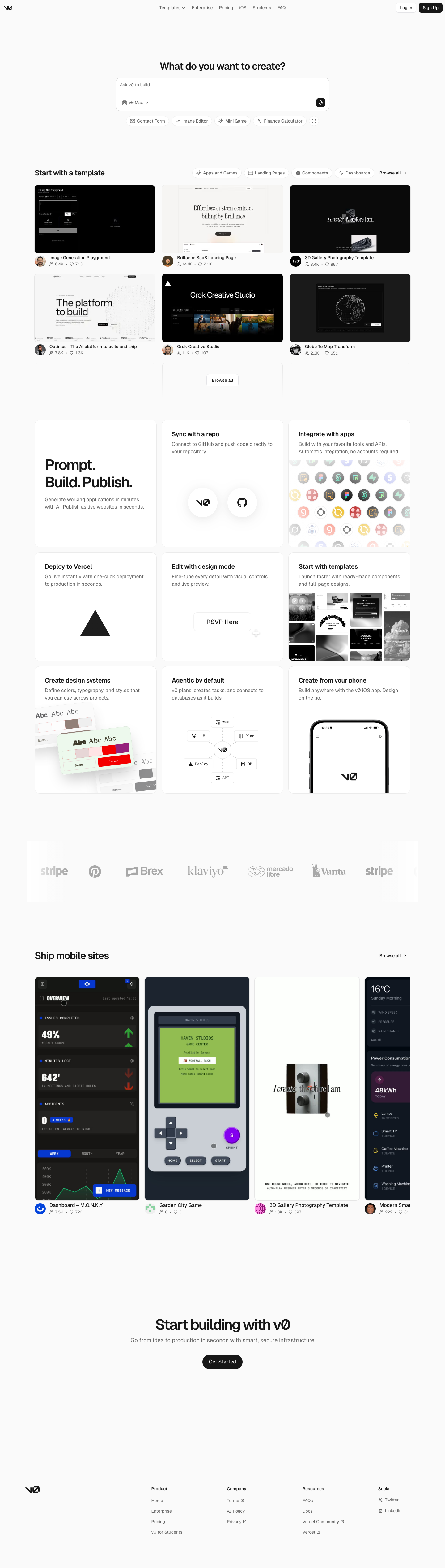
An unofficial, original v0-inspired Prompt Workshop system grounded in 17 retained, evidence-backed interface patterns.

13 focused, original elements for Borderless Ledger; categories are retained only when supported by the live reference. Published flags remain disabled.
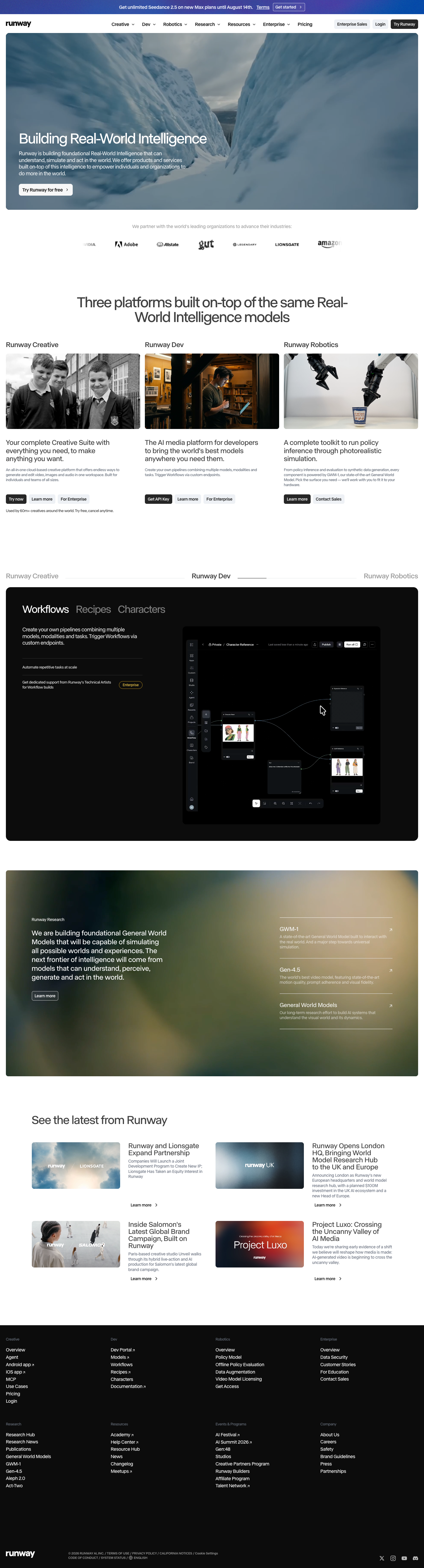
A high-contrast studio language for a platform that moves between creative production, developer workflows, robotics, research, and enterprise. The system uses a dark stage, warm action color, and compact cross-platform wayfinding without copying Runway's wordmark, content, or media. Responsive previews and 8 evidence-backed interface elements.

An original, unofficial Observable-inspired system for reactive notebooks, executable explanations, and data visualization surfaces. It retains only 11 focused elements supported by Observable's live notebook and chart workflows.
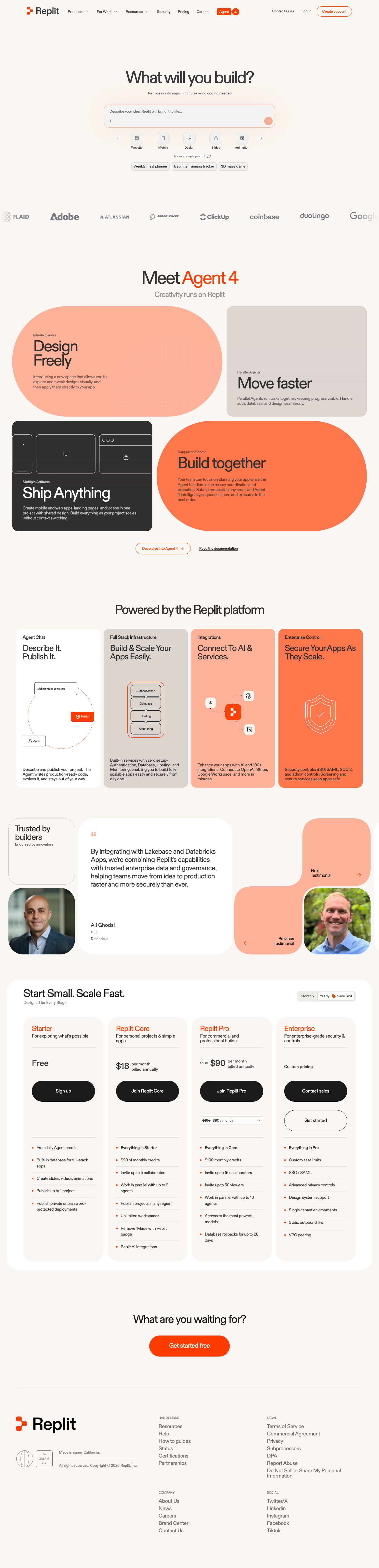
A friendly builder language for moving from prompt to app: vivid purple/green accents, a prominent idea field, artifact type selection, parallel execution, built-in infrastructure, team plans, agent chat, and a clear publish handoff. It is an original study without Replit's logo, pixel font, testimonials, screenshots, or protected copy. Responsive previews and 14 evidence-backed interface elements.