Skip to content
All AI Kits
Design system Pro AI Kit13 components

Superhuman-inspired Focus Suite

An unofficial, original Superhuman-inspired product system with 13 evidence-backed elements for Focusline's focused workflow language.

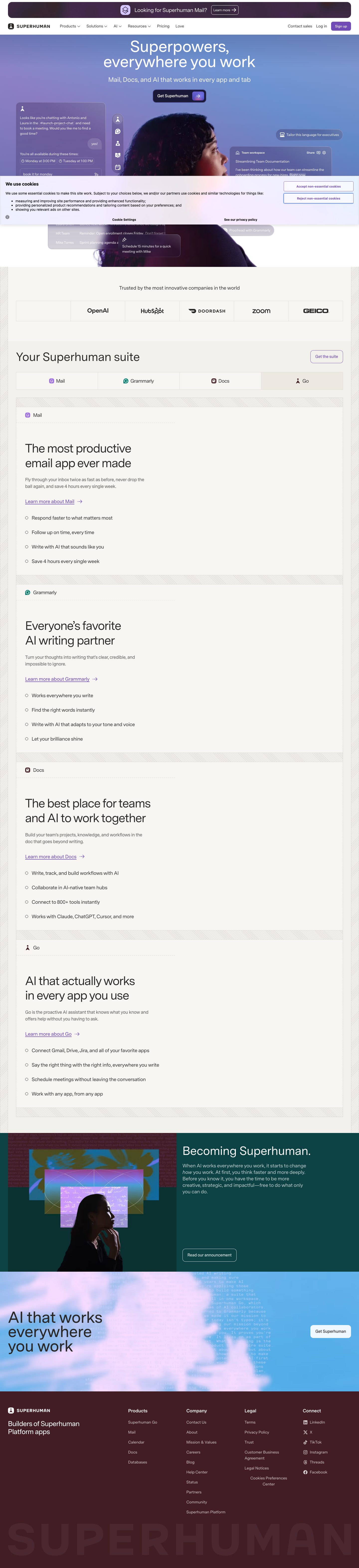
Desktop · 1440 × 6286
Superhuman homepage — desktop reference

Foundations

The visual decisions behind the system

A public overview of the typography, palette, icon language, spacing, shape, and motion used throughout this AI Kit.

Style identity

Focus Suite

An original work suite shaped by Superhuman's current Mail, Grammarly, Docs, and Go story: warm high-contrast surfaces, fast writing flows, compact message states, and proactive AI beside the active context.

light-first with an expressive dark companion theme

Visit website

Typography

Font families

Super Sans VF

Observed Superhuman family for body copy, navigation, hero, product headings, controls, and message content.

Super Sans VF, system-ui, -apple-system, Segoe UI, Roboto, sans-serif
Weights
100–900 variable; observed body 460 and display 540
Sizes
12–64px
Line height
1.0–1.6
Tracking
0 to -0.04em

Fallback: system-ui, -apple-system, Segoe UI, Roboto, sans-serif

Super Serif VF

Observed expressive editorial option for campaign accents and long-form statements.

Super Serif VF, Georgia, serif
Weights
100–900 variable
Sizes
24–72px
Line height
0.98–1.2
Tracking
-0.04em to 0

Fallback: Georgia, serif

Super Sans Mono VF

Observed technical metadata and compact product detail family.

Super Sans Mono VF, SFMono-Regular, ui-monospace, monospace
Weights
100–900 variable
Sizes
11–14px
Line height
1.35–1.6
Tracking
0.02em–0.08em

Fallback: SFMono-Regular, ui-monospace, monospace

Palette

Core colors

Paper

#fffefd

Observed light page canvas

Ink

#292827

Primary message and body text

Quiet panel

#f1efed

Grouped navigation, metadata, and secondary content

Dark canvas

#101112

Explicit dark theme background

Coral action

#ff6b5f

Primary action and contextual emphasis

Warm signal

#ffb26b

Scheduling and proactive assistant state

Healthy

#5dd5a2

Complete or ready state

AI violet

#a89cff

Go assistant and contextual AI accent

Type scale

Responsive hierarchy

RoleSizeWeightLine heightTracking
Hero64px5400.96-0.04em
Hero mobile42px5401.0-0.035em
Section heading40px5401.06-0.03em
Product heading26px4601.30
Body16px4601.50
Interface label14px5401.350
Metadata12px4601.450.03em

Spacing & shape

Layout rhythm

Density
highly efficient product core with spacious suite storytelling
Base unit
4px
Max width
1200px
Section gap
96px
Card padding
20px
Element gap
8px

System metrics

Radius

Control 8pxMessage 12pxPanel 18pxSuite frame 28pxPill 999px

Spacing

1 4px2 8px3 12px4 16px5 20px

Motion

Shortcut response 120msControl 180msReveal 420msEase cubic-bezier(0.2, 0.8, 0.2, 1)

Elevation

Thread

0 1px 0 rgba(41,40,39,.06)

Default message and task separation

Context panel

0 14px 34px rgba(27,22,22,.14)

Assistant, schedule, and focused side panel

Focus ring

0 0 0 3px rgba(255,107,95,.34)

Keyboard focus and active composition

Surfaces & shape

Paper canvas

#fffefd

Light-first suite background

Quiet group

#f1efed

Navigation and secondary content

Dark canvas

#101112

Dark theme background

Dark raised

#27292a

Selected and grouped content in dark mode

Guidelines

Do

  • Keep the active message or document thread as the visual anchor.
  • Make quick actions and keyboard paths discoverable without adding chrome.
  • Use coral for the next action and violet for contextual AI, not for every status.
  • Let Mail, Docs, and AI feel like one suite through shared spacing and type.
  • Expose unread, priority, and schedule states with text plus color.

Don't

  • ×Do not reproduce Superhuman logos, source UI screenshots, customer marks, or proprietary copy.
  • ×Do not turn an inbox specimen into a full analytics dashboard.
  • ×Do not hide the assistant context behind an unexplained icon.
  • ×Do not use a saturated accent for long blocks of body copy.
  • ×Do not sacrifice keyboard focus visibility for visual minimalism.

Imagery

Use original message rows, assistant bubbles, writing surfaces, and abstract warm/coral shapes. Avoid bundled product screenshots, portraits, customer logos, and downloaded campaign photography.

Layout

Use a 1200px rail with 24px desktop and 16px mobile gutters. Keep message density high in product specimens, while suite sections breathe at 64–96px. Collapse side panels below 760px and keep the active thread first in reading order.

Concept

A complete visual language, ready to inspect.

Use the file tree to move between the full reference preview, implementation guidance, portable tokens, and framework-ready styles. Each surface stays focused, so you can understand the system before copying code.

Assigned collection

Superhuman-inspired Interface Elements

13 published components in collection order

Components

Built from the same system

Production-ready specimens from this AI Kit's approved collection.

Open collection
Send email ↗ Schedule ↗
0
29
To Subject Compose message
0
33
Inbox Calendar Docs Inbox Split inbox 6 priority messages
0
26
Message actions ⌄ Reply R Snooze H Move to trash ⌫
0
23
Mail Calendar Docs Mail selected.
0
20
Maya Chen 2 min Linear 12 min Patrick Collison 1 hr
0
25
Split Inbox Group newsletters outside priority. Automatic split On
0
19
Snooze until Monday · 8:00 AM
0
21
⌘ Compose email C Snooze thread H Open split inbox S
0
27
Draft a concise follow-up. Ready: Thanks again—should we reconnect Tuesday? Send
0
21

More like this

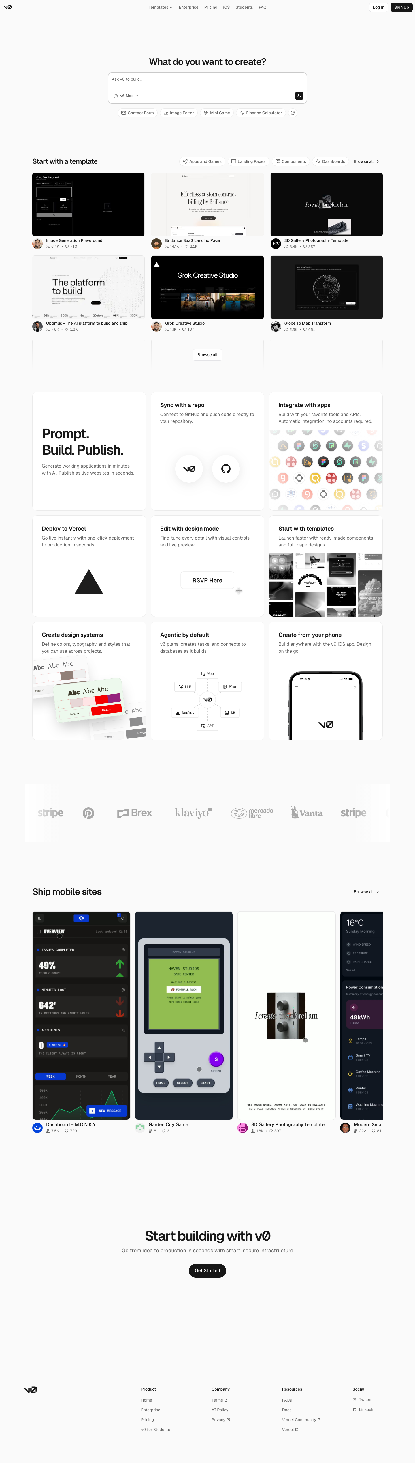
Postman-inspired API Orbit

An unofficial, original Postman-inspired interface study with 14 focused specimens supported by the live product and content experience.

v0-inspired Prompt Workshop

An unofficial, original v0-inspired Prompt Workshop system grounded in 17 retained, evidence-backed interface patterns.

Borderless Ledger — Wise-inspired AI Kit

13 focused, original elements for Borderless Ledger; categories are retained only when supported by the live reference. Published flags remain disabled.

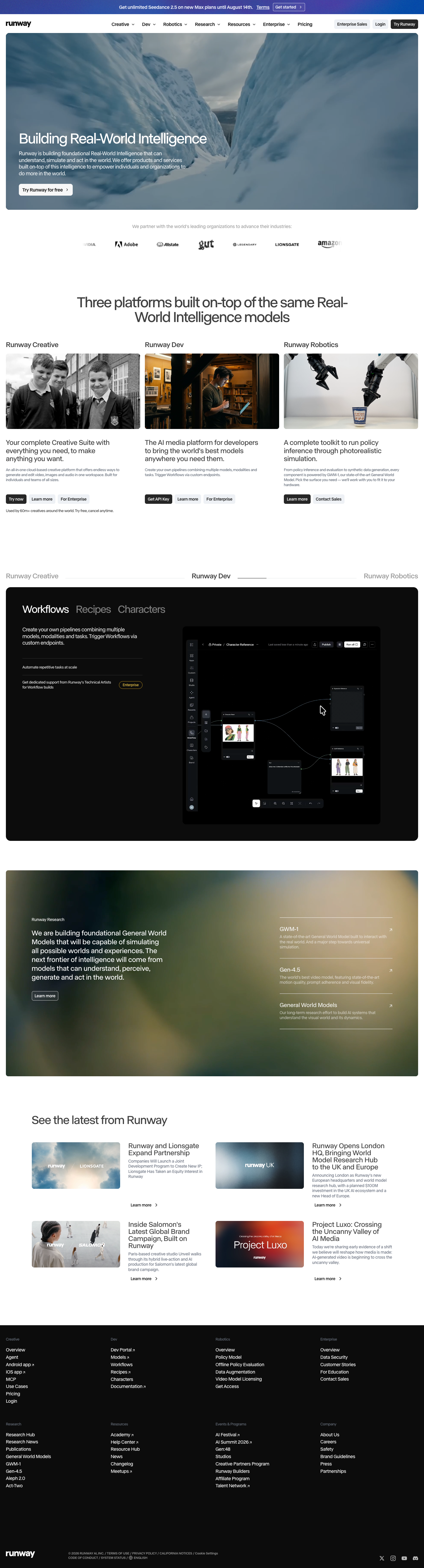
Runway-inspired Real-World Studio

A high-contrast studio language for a platform that moves between creative production, developer workflows, robotics, research, and enterprise. The system uses a dark stage, warm action color, and compact cross-platform wayfinding without copying Runway's wordmark, content, or media. Responsive previews and 8 evidence-backed interface elements.

Observable-inspired Signal Notebook

An original, unofficial Observable-inspired system for reactive notebooks, executable explanations, and data visualization surfaces. It retains only 11 focused elements supported by Observable's live notebook and chart workflows.

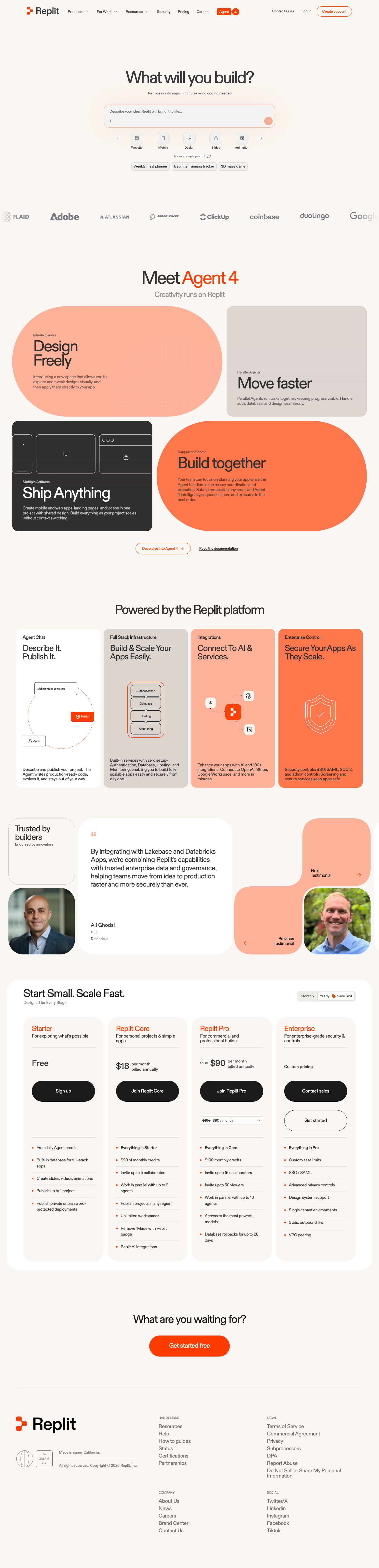
Replit-inspired Build Canvas

A friendly builder language for moving from prompt to app: vivid purple/green accents, a prominent idea field, artifact type selection, parallel execution, built-in infrastructure, team plans, agent chat, and a clear publish handoff. It is an original study without Replit's logo, pixel font, testimonials, screenshots, or protected copy. Responsive previews and 14 evidence-backed interface elements.

Published AI Kit Protected source files for Pro members
Superhuman-inspired Focus Suite AI Kit - Frontend Forever