Skip to content
All AI Kits
Design system Pro AI Kit17 components

Slack-inspired Collaboration System

An unofficial, original Slack-inspired product system built around conversation-led collaboration and agent workflows, responsive proof surfaces, and 17 research-selected elements.

Desktop · 1440 × 11545
Slack homepage — desktop reference

Foundations

The visual decisions behind the system

A public overview of the typography, palette, icon language, spacing, shape, and motion used throughout this AI Kit.

Style identity

Slack-inspired Collaboration System

A conversation-first system shaped by Slack's current AI work platform page: an aubergine signal, editorial display type, living product proof, and workflows that keep people and agents in one thread.

Human conversation meets agent workflow: aubergine, lilac, warm neutrals, and fr theme
Visit website

Typography

Font families

Salesforce Sans

Observed Slack body, navigation, controls, and utility copy

Salesforce-Sans, system-ui, -apple-system, BlinkMacSystemFont, Segoe UI, Roboto, Helvetica Neue, Arial, Noto Sans, sans-serif
Weights
400, 500, 600, 700
Sizes
14px utility; 15–16px body; 18px control; 24px card title
Line height
1.45 body; normal controls
Tracking
Neutral body tracking; compact utility labels

Fallback: system-ui, -apple-system, Segoe UI, Roboto, Arial, sans-serif

Salesforce Avant-Garde

Observed Slack display and section headlines

Salesforce-Avant-Garde, system-ui, -apple-system, BlinkMacSystemFont, Segoe UI, Roboto, Helvetica Neue, Arial, sans-serif
Weights
500, 600, 700
Sizes
40px section; 58–64px hero display
Line height
1.05–1.12 display
Tracking
Slightly tight, approximately -0.02em

Fallback: system-ui, -apple-system, Segoe UI, Arial, sans-serif

Palette

Core colors

Canvas

#fbf8ff

Soft lavender page field behind conversation stories

Ink

#241b2d

Primary headings and body copy

Aubergine signal

#611f69

Observed Slack brand signal for navigation and primary actions

Action violet

#6546d7

Original pack action color for tabs, buttons, and focus

Surface

#ffffff

Conversation cards and input surfaces

Lilac panel

#f1ecff

Selected tabs, AI proof, and secondary panels

Conversation coral

#e85b76

Unread, human, and secondary signal

Dark canvas

#17101f

Explicit dark mode workspace field

Dark surface

#22162c

Dark conversation cards and composer

Positive

#2f9b76

Automation complete and presence state

Type scale

Responsive hierarchy

RoleSizeWeightLine heightTracking
Utility14px70018px0.05em
Body16px4001.50
Control15px4001.40
Card title28px6001.05-0.04em
Section title58px6001.08-0.02em
Hero display64px7001.12-0.012em

Spacing & shape

Layout rhythm

Density
Moderate and conversational; enough rhythm for scanning without losing thread context
Base unit
4px
Max width
1180px content rail
Section gap
96px desktop / 70px mobile
Card padding
18–22px
Element gap
8–16px

System metrics

Radius

Control pill 999pxConversation card 18pxComposer 16pxWorkspace mark 8px

Spacing

Base unit 4pxMessage gap 8pxCard padding 18–22pxSection gap 96pxPage gutter 24px mobile / 48px desktop

Motion

Fast 150ms ease-outThread lift 180ms cubic-bezier(.2,.8,.2,1)Story reveal 500ms for staged product proofReduced motion Disable transforms and auto-play behavior under prefers-reduced-motion

Elevation

Conversation card

0 12px 40px rgba(36,27,45,.06)

Separate proof cards from a lavender story band

Command menu

0 16px 38px rgba(36,27,45,.14)

Keep an open menu above a busy thread

Surfaces & shape

Page

#fbf8ff / #17101f

Light and dark canvas

Conversation

#ffffff / #22162c

Messages, cards, and composer

AI tint

#f1ecff / #2d1d39

Search answers, tabs, and automation proof

Guidelines

Do

  • Keep one thread or workflow as the focal point of each specimen.
  • Use human labels and short status messages next to agent actions.
  • Make tabs, menus, commands, and composer states keyboard visible.
  • Use lilac or aubergine surfaces to distinguish context from action.

Don't

  • ×Do not turn the kit into a generic admin dashboard.
  • ×Do not use Slack logos, customer marks, proprietary screenshots, or copied copy.
  • ×Do not hide a workflow behind an unlabeled icon-only control.
  • ×Do not let decorative gradients overpower the conversation hierarchy.

Imagery

Use original conversation windows, avatar initials, abstract message blocks, and subtle data shapes. Avoid Slack logos, customer logos, screenshots, and copied campaign assets.

Layout

Use a wide editorial hero, a proof rail, tabbed Knowledge/People/Process/Platform storytelling, then focused cards for search, huddles, workflows, and integrations. Collapse rails to one column below 900px.

Concept

A complete visual language, ready to inspect.

Use the file tree to move between the full reference preview, implementation guidance, portable tokens, and framework-ready styles. Each surface stays focused, so you can understand the system before copying code.

Assigned collection

Slack-inspired Collaboration System Elements

17 published components in collection order

Components

Built from the same system

Production-ready specimens from this AI Kit's approved collection.

Open collection
Post update ↗ Schedule +
0
17
Do not disturb Pause notifications until tomorrow morning.
0
18
Teammate email Send invite
0
22
Slack Threads Huddles Later
0
22
Message actions ⌄ Reply in thread R Save for later S Delete message ⌫
0
21
Threads Mentions Reactions Threads selected.
0
30
Q3 launch plan #product-launch Saved Saved 2 hours ago Open
0
19
Confirm launch date Done Share QA notes In progress Notify support Todo
0
25
✓ Draft 2 Review 3 Post
0
21
Canvas Launch plan Keep decisions and owners together. 1 of 3 slides ← →
0
21
Business+ $15 / user / month SAML SSO · audit logs Choose Business+
0
32
⌘ Compose message M Jump to channel J Set status S
0
27
Can someone review the launch copy? I’ll take it and reply before 3 PM. Send
0
17
MC Mentioned you #product-launch · 2m ago Unread LO Huddle ended #design · 17m ago 24 min
0
19
Slack Threads Channels Later Workspace Channel workspace Conversations beside the active message stream.
0
20

More like this

Postman-inspired API Orbit

An unofficial, original Postman-inspired interface study with 14 focused specimens supported by the live product and content experience.

v0-inspired Prompt Workshop

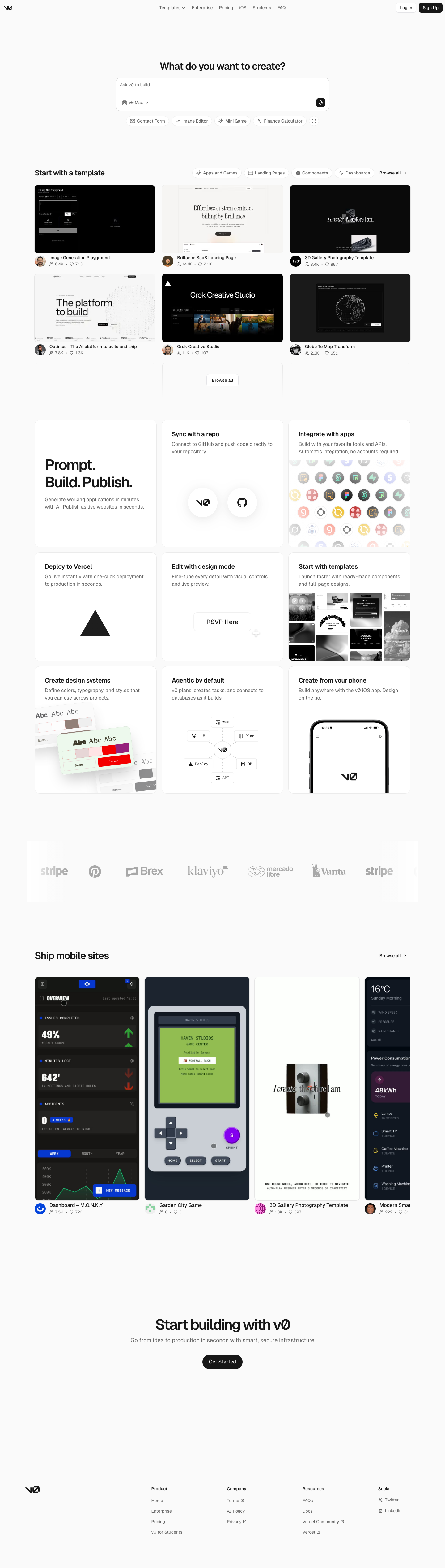
An unofficial, original v0-inspired Prompt Workshop system grounded in 17 retained, evidence-backed interface patterns.

Borderless Ledger — Wise-inspired AI Kit

13 focused, original elements for Borderless Ledger; categories are retained only when supported by the live reference. Published flags remain disabled.

Runway-inspired Real-World Studio

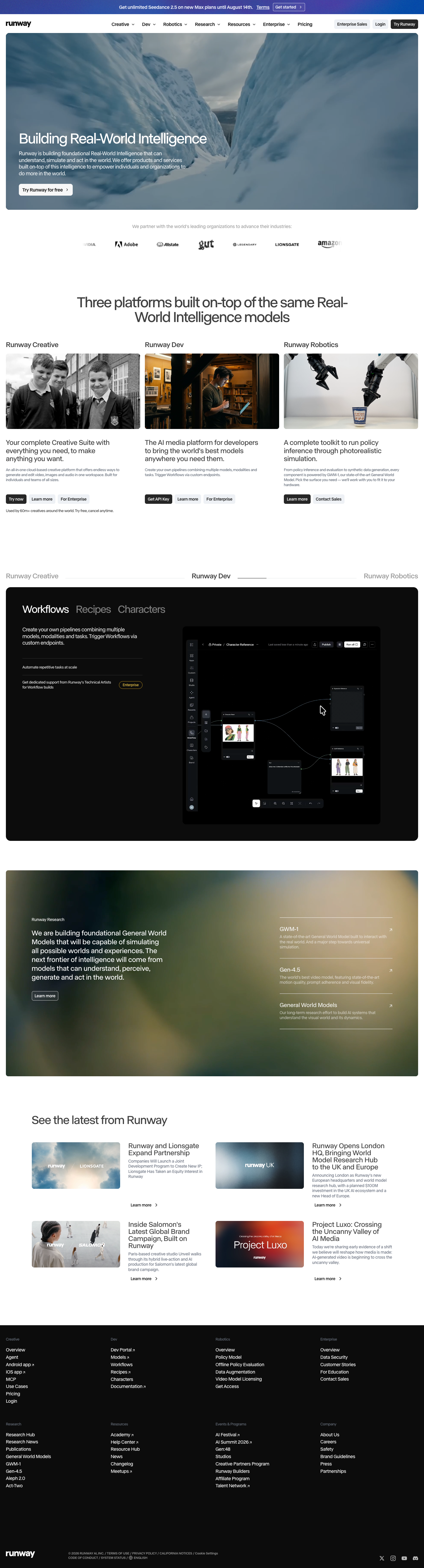
A high-contrast studio language for a platform that moves between creative production, developer workflows, robotics, research, and enterprise. The system uses a dark stage, warm action color, and compact cross-platform wayfinding without copying Runway's wordmark, content, or media. Responsive previews and 8 evidence-backed interface elements.

Observable-inspired Signal Notebook

An original, unofficial Observable-inspired system for reactive notebooks, executable explanations, and data visualization surfaces. It retains only 11 focused elements supported by Observable's live notebook and chart workflows.

Replit-inspired Build Canvas

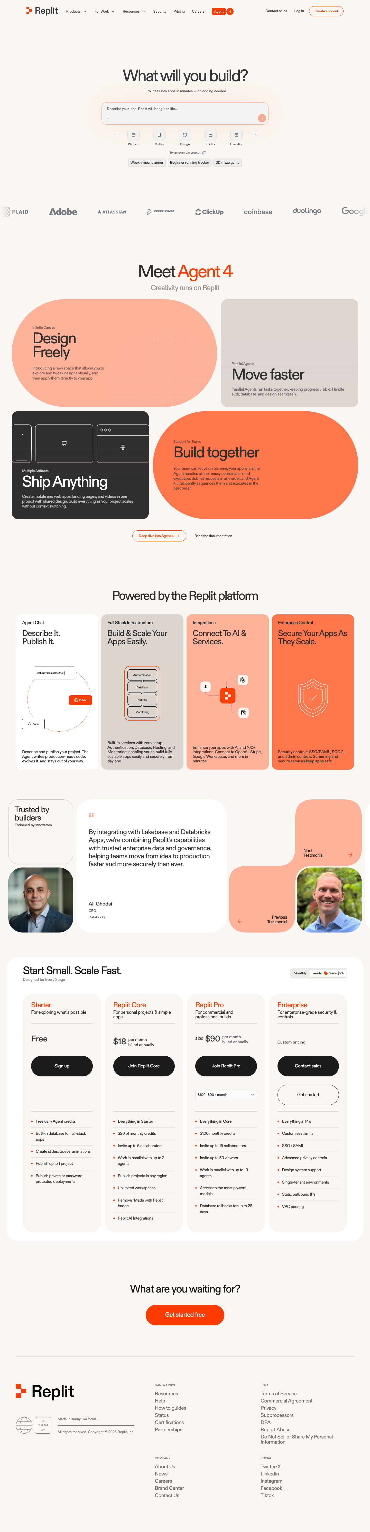
A friendly builder language for moving from prompt to app: vivid purple/green accents, a prominent idea field, artifact type selection, parallel execution, built-in infrastructure, team plans, agent chat, and a clear publish handoff. It is an original study without Replit's logo, pixel font, testimonials, screenshots, or protected copy. Responsive previews and 14 evidence-backed interface elements.

Published AI Kit Protected source files for Pro members
Slack-inspired Collaboration System AI Kit - Frontend Forever