Style identity
Nightline Cloud
An unofficial original system for a repository becoming a visible, healthy service graph.
Dark, cinematic infrastructure canvas with violet editorial type, warm secondary themeAn unofficial, original Railway-inspired design system for a repository becoming a visible, healthy service graph. Fourteen focused elements for a concrete product workflow.

Foundations
A public overview of the typography, palette, icon language, spacing, shape, and motion used throughout this AI Kit.
Style identity
An unofficial original system for a repository becoming a visible, healthy service graph.
Dark, cinematic infrastructure canvas with violet editorial type, warm secondary themeTypography
Inter
Interface, navigation, and body copy
Inter, -apple-system, BlinkMacSystemFont, "Segoe UI", sans-serifFallback: system-ui, "Segoe UI", sans-serif
IBM Plex Serif
Large editorial product headings
"IBM Plex Serif", Georgia, Cambria, "Times New Roman", serifFallback: Georgia, serif
JetBrains Mono
Runtime metrics, commands, and technical labels
"JetBrains Mono", ui-monospace, SFMono-Regular, monospaceFallback: ui-monospace, SFMono-Regular, monospace
Palette
Night canvas
#11101aPrimary dark page background
Night surface
#1a1725Service panels and cards
Violet
#a887ffPrimary action and selected state
Deep violet
#5b3d96Action contrast and active detail
Warm peach
#f09b8fSecondary chapter accent
Runtime green
#43df9aHealthy/deployed state
Dark border
#393047Canvas and card boundaries
Light canvas
#f7f5fbExplicit light-mode background
Light surface
#ffffffLight-mode elevated surface
Light text
#211a2bLight-mode primary copy
Muted text
#8e8598Supporting metadata
Alert amber
#e6a04dDegraded or pending state
Type scale
| Role | Size | Weight | Line height | Tracking |
|---|---|---|---|---|
| Hero | clamp(2.5rem, 7vw, 5.5rem) | 600 | 0.98 | -0.06em |
| Section heading | clamp(2rem, 4.5vw, 4rem) | 600 | 1.02 | -0.05em |
| Product heading | 24px | 600 | 1.2 | -0.03em |
| Body large | 18px | 400 | 1.6 | -0.01em |
| Body | 16px | 400 | 1.55 | 0 |
| Interface | 14px | 500 | 1.4 | -0.01em |
| Technical | 12px | 500 | 1.45 | 0.02em |
Spacing & shape
Iconography
Use an icon only when it explains deploy, network, scale, or observability; always pair ambiguous symbols with text.
System metrics
Radius
Spacing
Motion
Elevation
Boundary
1px neutral border with one-step surface shiftDefault cards and product frames
Floating
0 12px 36px rgba(0, 0, 0, .18)Menus and command surfaces
Modal
0 24px 80px rgba(0, 0, 0, .32)Dialogs and blocking confirmation
Surfaces & shape
Canvas
#f7f5fb / #11101aPage background in light / dark mode
Surface
#ffffff / #1a1725Cards, controls, and product frames
Raised
#f0ecf7 / #231e31Selected rows, nested panels, and focus context
Guidelines
Imagery
Use original service maps, command panels, log excerpts, telemetry lines, and connected nodes. Avoid live Railway screenshots, mountains, customer marks, or proprietary illustrations.
Layout
Use a dark full-bleed canvas with a short serif headline, a strong deploy action, and a contained service preview. Long sections can alternate subtle tinted panels with a vertical workflow spine; collapse to one column on small screens.
Concept
Use the file tree to move between the full reference preview, implementation guidance, portable tokens, and framework-ready styles. Each surface stays focused, so you can understand the system before copying code.
Assigned collection
14 published components in collection order
Components
Production-ready specimens from this AI Kit's approved collection.
More like this

An unofficial, original Postman-inspired interface study with 14 focused specimens supported by the live product and content experience.
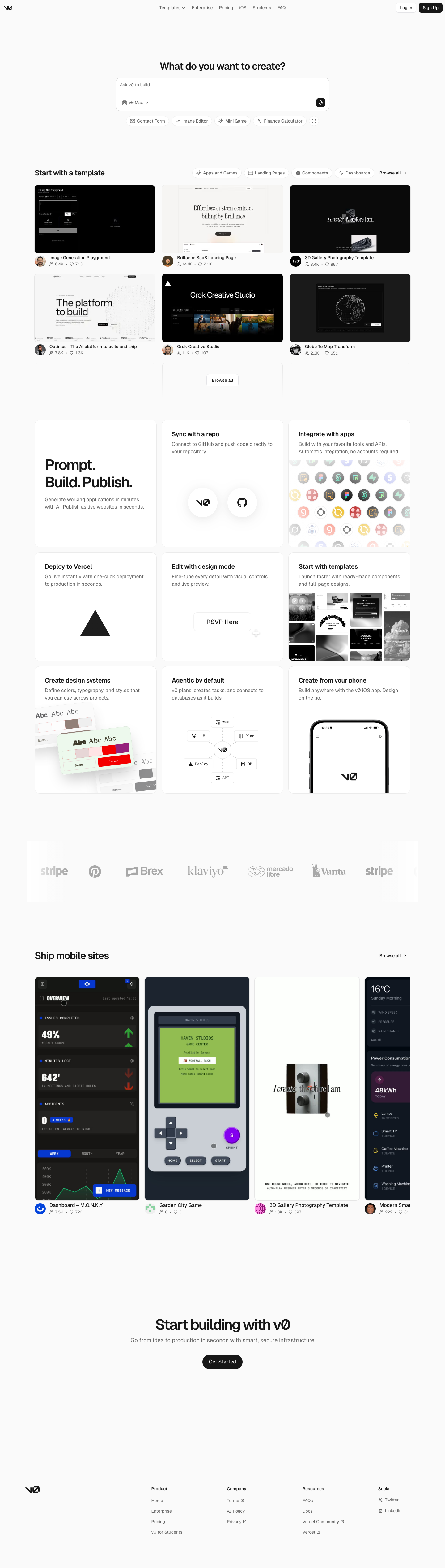
An unofficial, original v0-inspired Prompt Workshop system grounded in 17 retained, evidence-backed interface patterns.

13 focused, original elements for Borderless Ledger; categories are retained only when supported by the live reference. Published flags remain disabled.
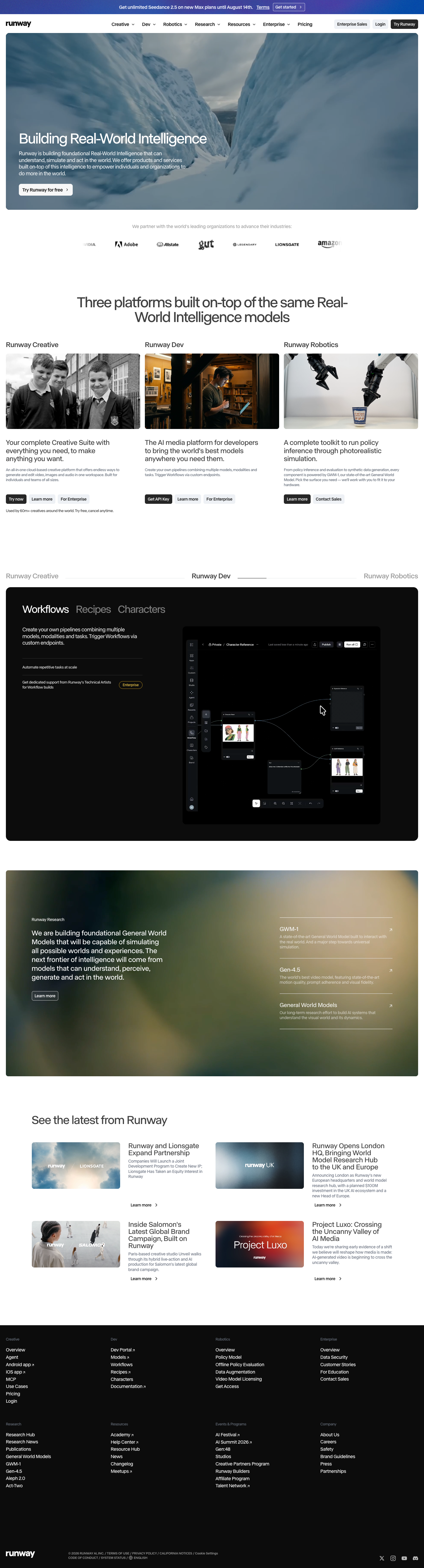
A high-contrast studio language for a platform that moves between creative production, developer workflows, robotics, research, and enterprise. The system uses a dark stage, warm action color, and compact cross-platform wayfinding without copying Runway's wordmark, content, or media. Responsive previews and 8 evidence-backed interface elements.

An original, unofficial Observable-inspired system for reactive notebooks, executable explanations, and data visualization surfaces. It retains only 11 focused elements supported by Observable's live notebook and chart workflows.
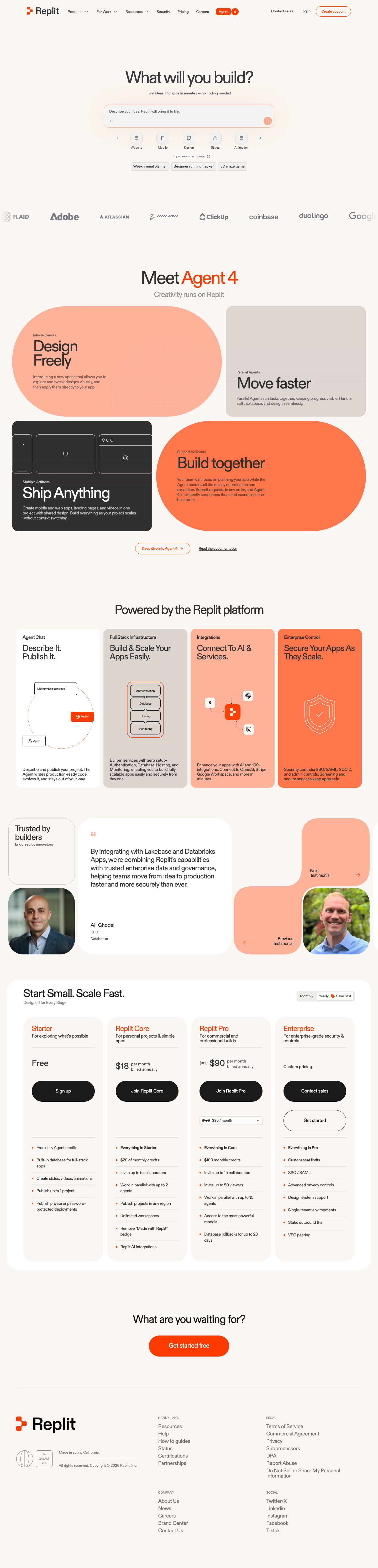
A friendly builder language for moving from prompt to app: vivid purple/green accents, a prominent idea field, artifact type selection, parallel execution, built-in infrastructure, team plans, agent chat, and a clear publish handoff. It is an original study without Replit's logo, pixel font, testimonials, screenshots, or protected copy. Responsive previews and 14 evidence-backed interface elements.