Skip to content
All AI Kits
Design system Pro AI Kit9 components

OpenAI-inspired Model Lab

An unofficial, original OpenAI-inspired interface study with 9 focused specimens supported by the live product and content experience.

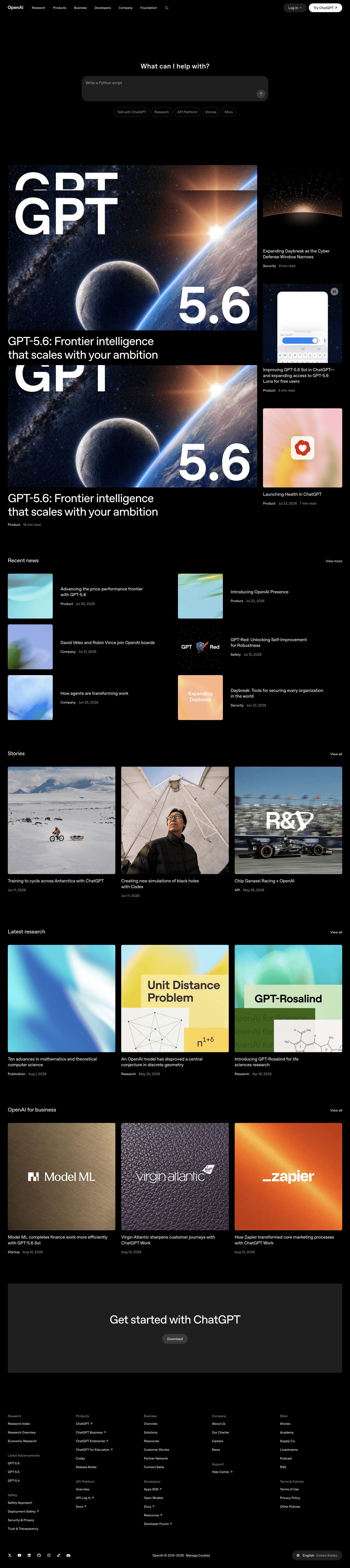
Desktop · 1440 × 6459
OpenAI homepage — desktop reference

Foundations

The visual decisions behind the system

A public overview of the typography, palette, icon language, spacing, shape, and motion used throughout this AI Kit.

Style identity

OpenAI-inspired Model Lab

A prompt-first AI platform language: black canvas, warm white type, rounded composer controls, restrained content grids, and concise routes into research, products, stories, and developer work.

dark-first editorial canvas with explicit light fallback theme
Visit website

Typography

Font families

OpenAI Sans

hero question, navigation, product cards, body copy, and controls

OpenAI Sans, Arial, sans-serif
Weights
300, 400, 500, 600, 700
Sizes
12–76px
Line height
0.96–1.65
Tracking
-0.055em to 0

Fallback: Arial, ui-sans-serif, system-ui, sans-serif

System monospace

developer labels, dates, code-adjacent metadata, and compact technical values

ui-monospace, SFMono-Regular, Menlo, Consolas, monospace
Weights
400, 500
Sizes
11–14px
Line height
1.35–1.5
Tracking
0 to 0.04em

Fallback: SFMono-Regular, Menlo, Consolas, monospace

Palette

Core colors

Black canvas

#060607

primary page and prompt canvas

White ink

#f7f7f2

primary inverse text

Dark surface

#101012

composer, footer, and content blocks

Raised dark

#1b1b1e

hover, active, and card surfaces

Dark border

#2c2c31

quiet structure

Muted ink

#a6a69f

secondary copy and metadata

Model lime

#b9e93d

selected pathway and rare semantic accent

Lime highlight

#d4fa65

focus and active emphasis

Violet signal

#9b8cff

secondary research/product accent

Success

#8bd36d

complete state

Warning

#e2ad54

attention state

Danger

#ed7067

error state

Type scale

Responsive hierarchy

RoleSizeWeightLine heightTracking
Prompt hero72px5000.98-0.06em
Prompt mobile34px5001.04-0.045em
Section40px5001.0-0.045em
Card title20px5001.22-0.025em
Body16px4001.550
Pathway label13px5001.350
Metadata11px5001.40.03em

Spacing & shape

Layout rhythm

Density
spacious prompt surface followed by compact editorial grids
Base unit
4px
Max width
1440px with 32px gutters
Section gap
88–144px
Card padding
16–24px
Element gap
8–16px

Iconography

minimal line symbols, rounded control glyphs, and restrained monochrome marks

1.5px with round joins stroke · 16px / 20px / 24px

Use icon-only actions only when the accessible name is explicit; keep the composer arrow and pathway marks quiet so the prompt remains the focal point.

System metrics

Radius

pathway pill 999pxcontrol 12pxcard 16pxcomposer 22pxmedia 24px

Spacing

micro 4pxpathway gap 8pxcontrol inset 12pxcard inset 20pxgrid gap 24px

Motion

control 140ms ease-outpathway 180ms cubic-bezier(.2,.8,.2,1)content reveal 420ms cubic-bezier(.2,.8,.2,1)reduced motion remove transforms and autoplay movement

Elevation

flat

1px border; no shadow

composer

0 16px 40px rgba(0,0,0,.28)

menu

0 18px 56px rgba(0,0,0,.36)

focus

0 0 0 3px rgba(185,233,61,.3)

Surfaces & shape

black canvas

#060607

prompt and page ground

composer surface

#101012

input and prompt container

raised surface

#1b1b1e

cards and active pathways

light canvas

#fbfbfa

explicit light mode fallback

light surface

#ffffff

light cards and controls

light border

#dedfda

light structural rule

Guidelines

Do

  • Let one prompt or question dominate the first viewport.
  • Use pathway pills as a clear route into a larger product ecosystem.
  • Keep black and warm white as the primary palette with rare semantic color.
  • Make content cards readable as dated, labeled links.

Don't

  • ×Do not reproduce source marks, photography, or page copy.
  • ×Do not turn the prompt composer into a full chat transcript.
  • ×Do not add colorful gradients to the black canvas without product meaning.
  • ×Do not hide the active pathway in color alone.

Imagery

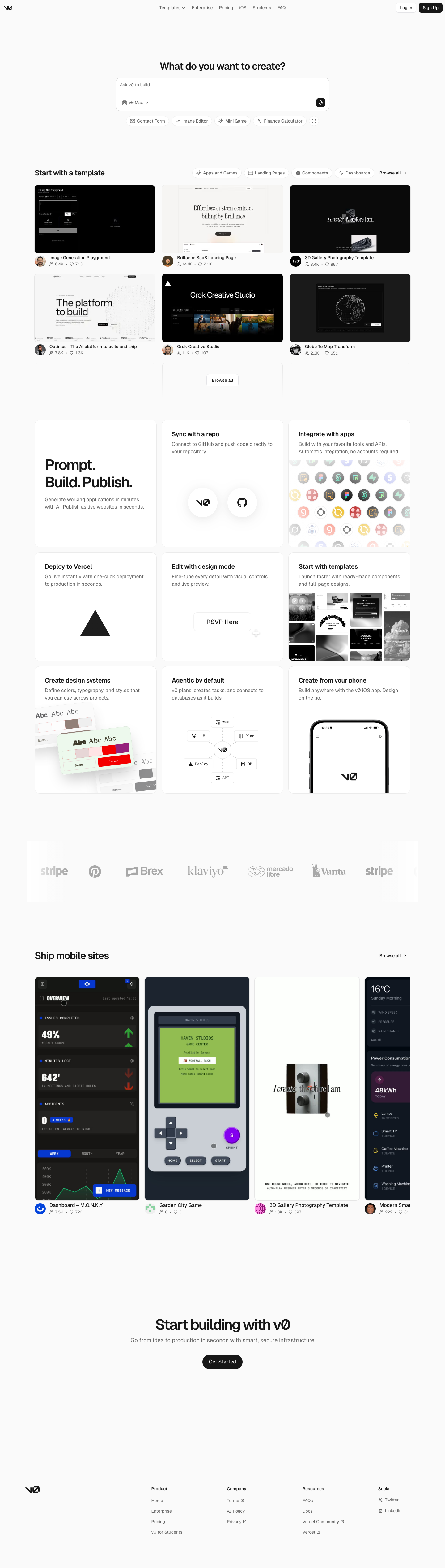
Use original abstract model diagrams, editorial cards, and quiet image placeholders that explain a product or research story. Do not reuse source marks, photography, live cards, or page imagery.

Layout

Treat the prompt composer as the first anchor, then use a long editorial rail with consistent left edges. Keep the global header quiet, allow content grids to step from three columns to one, and preserve 44px controls on mobile.

Concept

A complete visual language, ready to inspect.

Use the file tree to move between the full reference preview, implementation guidance, portable tokens, and framework-ready styles. Each surface stays focused, so you can understand the system before copying code.

Assigned collection

OpenAI-inspired Model Lab Elements

9 published components in collection order

Components

Built from the same system

Production-ready specimens from this AI Kit's approved collection.

Open collection
Run evaluation ↗ View results ▶
0
53
Evaluation name
0
72
OpenAI Playground Evaluations Models
0
76
Run actions ⌄ Open results ↗ Duplicate run ⌘ D Delete run ⌫
0
51
Runs Traces Scorers Runs selected.
0
63
Support quality gpt-5.5 · 500 samples Complete 92.4% pass rate Results
0
58
support-quality-042 92.4% safety-regression-018 Review tool-use-011 Running
0
64
Why did this evaluation case fail? The response omitted the required citation. Send
0
58
EV Evaluation completed support-quality · 3m ago 92.4% QK Trace flagged tool-use · 12m ago Review
0
66

More like this

Postman-inspired API Orbit

An unofficial, original Postman-inspired interface study with 14 focused specimens supported by the live product and content experience.

v0-inspired Prompt Workshop

An unofficial, original v0-inspired Prompt Workshop system grounded in 17 retained, evidence-backed interface patterns.

Borderless Ledger — Wise-inspired AI Kit

13 focused, original elements for Borderless Ledger; categories are retained only when supported by the live reference. Published flags remain disabled.

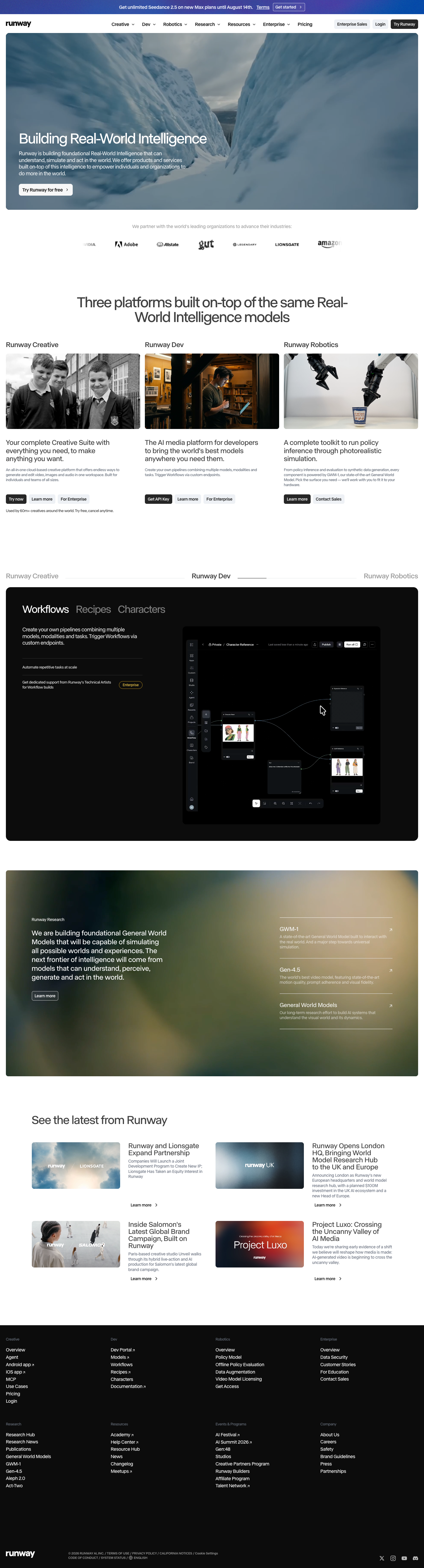
Runway-inspired Real-World Studio

A high-contrast studio language for a platform that moves between creative production, developer workflows, robotics, research, and enterprise. The system uses a dark stage, warm action color, and compact cross-platform wayfinding without copying Runway's wordmark, content, or media. Responsive previews and 8 evidence-backed interface elements.

Observable-inspired Signal Notebook

An original, unofficial Observable-inspired system for reactive notebooks, executable explanations, and data visualization surfaces. It retains only 11 focused elements supported by Observable's live notebook and chart workflows.

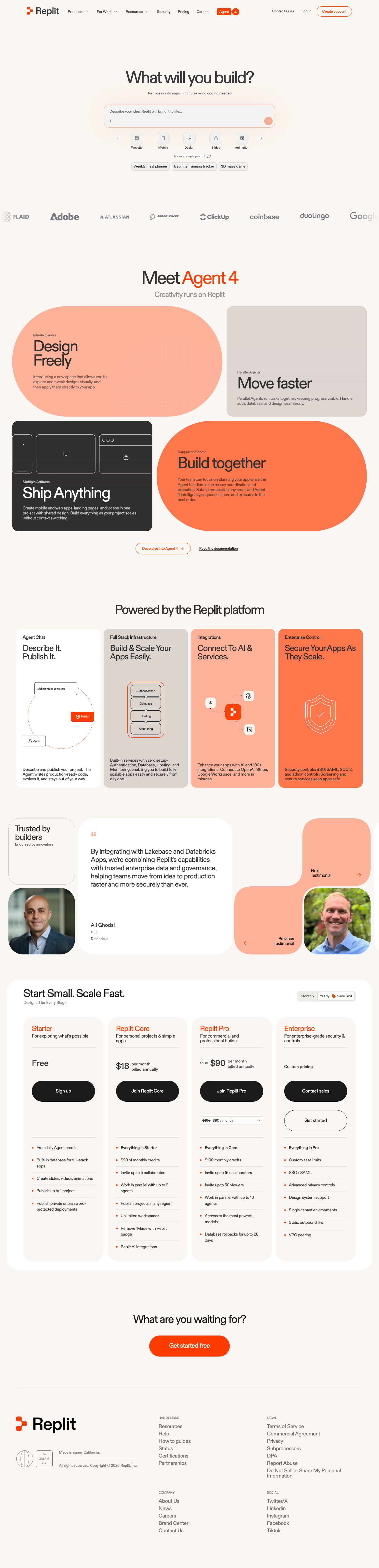
Replit-inspired Build Canvas

A friendly builder language for moving from prompt to app: vivid purple/green accents, a prominent idea field, artifact type selection, parallel execution, built-in infrastructure, team plans, agent chat, and a clear publish handoff. It is an original study without Replit's logo, pixel font, testimonials, screenshots, or protected copy. Responsive previews and 14 evidence-backed interface elements.

Published AI Kit Protected source files for Pro members
OpenAI-inspired Model Lab AI Kit - Frontend Forever