Skip to content
All AI Kits
Design system Pro AI Kit14 components

1Password-inspired Access Vault

An unofficial, original 1Password-inspired interface study with 14 focused specimens supported by the live product and content experience.

Desktop · 1440 × 7505
1Password homepage — desktop reference

Foundations

The visual decisions behind the system

A public overview of the typography, palette, icon language, spacing, shape, and motion used throughout this AI Kit.

Style identity

1Password-inspired Access Vault

A calm access-management language: cool blue-violet trust cues, a restrained white canvas, dark security product panels, and conversion paths that move from human access to machine and AI-agent governance.

adaptive light and dark; cool access-management palette theme

Visit website

Typography

Font families

Agile Sans Variable

display, body, navigation, controls, and product storytelling

Agile Sans Variable, Arial, sans-serif
Weights
200–700
Sizes
12–76px
Line height
1.0–1.6
Tracking
-0.04em to 0

Fallback: Arial, ui-sans-serif, system-ui, sans-serif

Agile Mono Variable

credential labels, policy values, metadata, and technical access details

Agile Mono Variable, SFMono-Regular, Consolas, monospace
Weights
200–700
Sizes
11–15px
Line height
1.3–1.55
Tracking
0 to 0.04em

Fallback: SFMono-Regular, Menlo, Consolas, monospace

Palette

Core colors

Midnight canvas

#111525

dark access product canvas

Cloud canvas

#f7f8fe

light page background

White surface

#ffffff

hero and product cards

Blue-violet raised

#eff1ff

selected cards and switcher states

Ink

#17203b

primary copy

Slate

#65718d

secondary copy and helper text

Access blue

#4775e9

primary actions and trust cues

Bright access blue

#6c93ff

hover and selected states

Lavender signal

#9a71e8

AI-agent and secondary product emphasis

Success

#2e9e7a

healthy access and completed review

Warning

#d4992f

review or policy attention

Danger

#d65b68

blocked or revoked access

Type scale

Responsive hierarchy

RoleSizeWeightLine heightTracking
Hero70px6000.96-0.055em
Hero mobile44px6001.0-0.045em
Section44px6001.04-0.04em
Product title24px6001.15-0.025em
Body17px4001.550
Interface14px6001.35-0.01em
Policy metadata12px5001.40.02em

Spacing & shape

Layout rhythm

Density
airy trust-building sections with compact security controls
Base unit
4px
Max width
1200px
Section gap
80–128px
Card padding
20–28px
Element gap
12–20px

Iconography

simple geometric line icons with filled security/status accents

1.5px with rounded caps stroke · 16px / 20px / 24px

Keep icons quiet beside explicit labels; use a single original vault mark for the pack and do not reproduce the source mark.

System metrics

Radius

control 8pxcard 14pxproduct panel 20pxhero media 28pxpill 999px

Spacing

micro 4pxcontrol gap 8pxfield gap 12pxcontrol inset 16pxcard inset 24px

Motion

control 150ms ease-outcard 220ms cubic-bezier(.2,.8,.2,1)reveal 480ms cubic-bezier(.2,.8,.2,1)reduced motion remove transforms and delayed reveals

Elevation

flat card

1px border; no shadow

product panel

0 24px 64px rgba(23,32,59,.14)

menu

0 16px 48px rgba(17,21,37,.2)

focus

0 0 0 3px rgba(71,117,233,.28)

Surfaces & shape

light canvas

#f7f8fe

page background

white surface

#ffffff

hero and capability cards

raised light

#eff1ff

switcher and selected controls

dark canvas

#111525

access product panel

dark surface

#1a2036

credential rows and panels

dark raised

#252e4c

hover and active states

Guidelines

Do

  • Make trust visible through labels, scope, and explicit access states.
  • Use blue-violet sparingly against generous white space.
  • Keep human, machine, and AI-agent language in the same hierarchy.
  • Make sensitive actions deliberate and reversible where possible.

Don't

  • ×Do not reproduce source marks or vault screenshots.
  • ×Do not make every card glow or float.
  • ×Do not hide access scope in icon-only controls.
  • ×Do not treat a generic pricing grid as the product story.

Imagery

Use original vault diagrams, permission graphs, abstract identity cards, and geometric access signals. Avoid the source site’s mark, product screenshots, customer vehicle imagery, and proprietary campaign photography.

Layout

Keep announcement, navigation, mode switcher, hero, capability cards, trust proof, and conversion footer in one 1200px rail. Use a two-column hero and four-up capability grid on wide screens; stack cards and make actions full-width below 700px.

Concept

A complete visual language, ready to inspect.

Use the file tree to move between the full reference preview, implementation guidance, portable tokens, and framework-ready styles. Each surface stays focused, so you can understand the system before copying code.

Assigned collection

1Password-inspired Access Vault Elements

14 published components in collection order

Components

Built from the same system

Production-ready specimens from this AI Kit's approved collection.

Open collection
Authorize access ↗ Use passkey ⌘
0
56
Require security review Hold access requests until an owner approves them.
0
53
Shared item Start review
0
69
1Password Items Vaults Watchtower
0
51
All items Favorites Watchtower Vault Employee 42 secure items
0
61
Credential actions ⌄ Reveal password ⌘ R Copy username ⌘ C Move to trash ⌫
0
50
Production API key Engineering vault Shared Rotated 3 days ago Review
0
48
Update shared credential? Everyone with access will use the new password after this change. Cancel Update credential
0
48
! Shared credential is expiring Rotate the production API key within 3 days. ×
0
66
Healthy Expiring Compromised
0
49
Sharing policy Require approval for shared credentials. Access review Required
0
48
Business $8 / user / month Vault policies · activity reporting Choose Business
0
61
Email address Continue with email
0
60

More like this

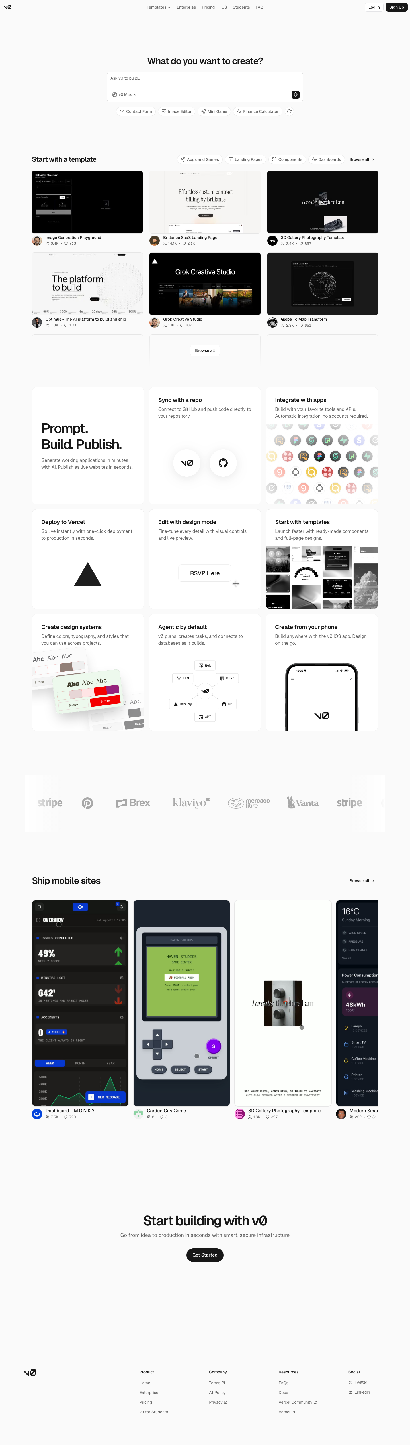
Postman-inspired API Orbit

An unofficial, original Postman-inspired interface study with 14 focused specimens supported by the live product and content experience.

v0-inspired Prompt Workshop

An unofficial, original v0-inspired Prompt Workshop system grounded in 17 retained, evidence-backed interface patterns.

Borderless Ledger — Wise-inspired AI Kit

13 focused, original elements for Borderless Ledger; categories are retained only when supported by the live reference. Published flags remain disabled.

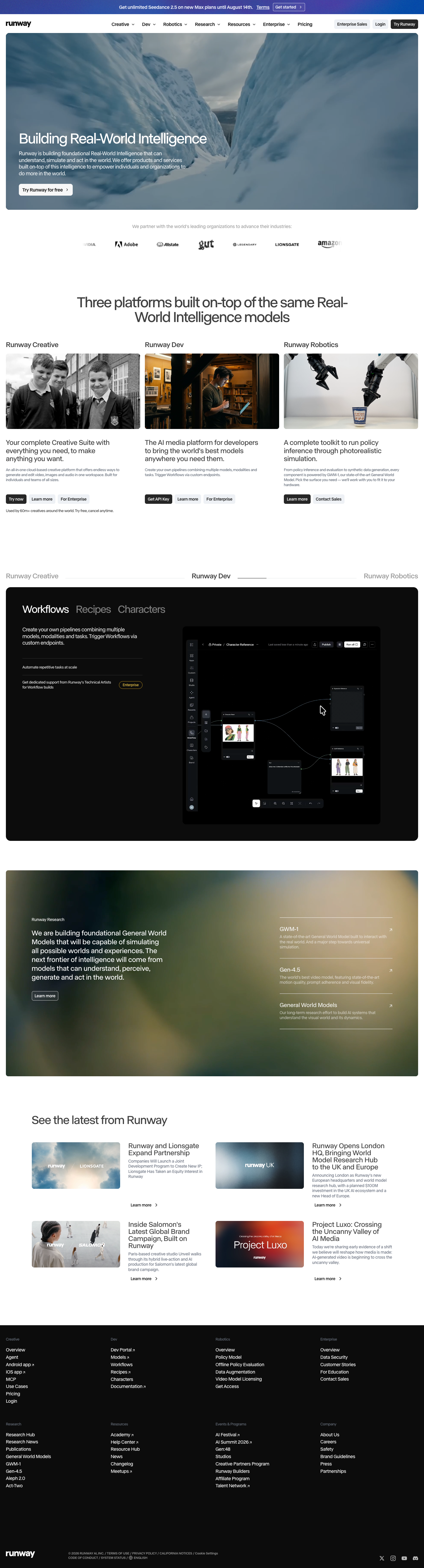
Runway-inspired Real-World Studio

A high-contrast studio language for a platform that moves between creative production, developer workflows, robotics, research, and enterprise. The system uses a dark stage, warm action color, and compact cross-platform wayfinding without copying Runway's wordmark, content, or media. Responsive previews and 8 evidence-backed interface elements.

Observable-inspired Signal Notebook

An original, unofficial Observable-inspired system for reactive notebooks, executable explanations, and data visualization surfaces. It retains only 11 focused elements supported by Observable's live notebook and chart workflows.

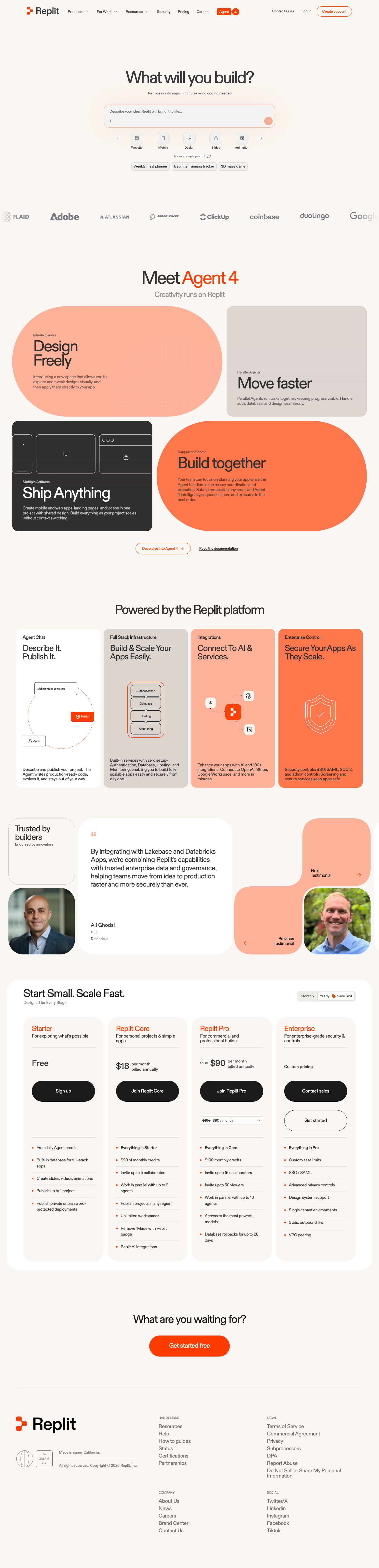
Replit-inspired Build Canvas

A friendly builder language for moving from prompt to app: vivid purple/green accents, a prominent idea field, artifact type selection, parallel execution, built-in infrastructure, team plans, agent chat, and a clear publish handoff. It is an original study without Replit's logo, pixel font, testimonials, screenshots, or protected copy. Responsive previews and 14 evidence-backed interface elements.

Published AI Kit Protected source files for Pro members
1Password-inspired Access Vault AI Kit - Frontend Forever