Skip to content
All AI Kits
Design system Pro AI Kit12 components

Hugging Face-inspired Model Community

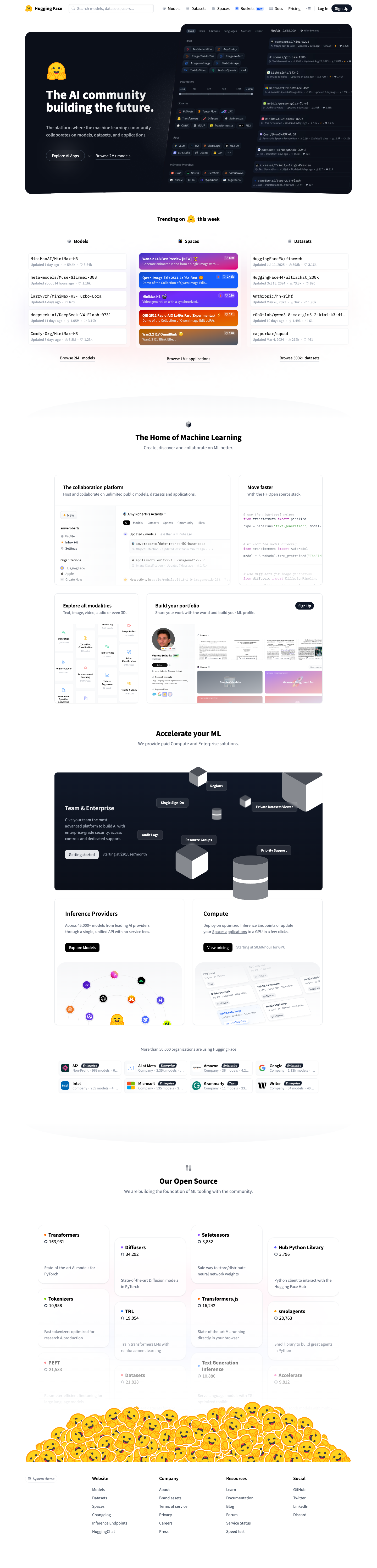
An open model-community language built around search, resource type switching, trending lists, maintainer identity, and clear routes into models, datasets, Spaces, docs, compute, and team plans. It is an original system and does not copy Hugging Face marks, avatars, model names, or source imagery. Responsive previews and 12 evidence-backed interface elements.

Desktop · 1440 × 5986
Hugging Face homepage — desktop reference

Foundations

The visual decisions behind the system

A public overview of the typography, palette, icon language, spacing, shape, and motion used throughout this AI Kit.

Style identity

Hugging Face-inspired Model Community

An open model-community language built around search, resource type switching, trending lists, maintainer identity, and clear routes into models, datasets, Spaces, docs, compute, and team plans. It is an original system and does not copy Hugging Face marks, avatars, model names, or source imagery.

open community discovery with dense metadata and yellow semantic accent theme
Visit website

Typography

Font families

Noto Sans

Community headings, navigation, resource cards, and body copy

Noto Sans, ui-sans-serif, system-ui, sans-serif
Weights
400, 500, 600, 700
Sizes
12–64px
Line height
1.0–1.65
Tracking
-0.04em to 0

Fallback: ui-sans-serif, system-ui, -apple-system, BlinkMacSystemFont, Segoe UI, sans-serif

System monospace

Technical metadata, counts, command cues, and code-like labels

SFMono-Regular, Menlo, Consolas, monospace
Weights
400, 500, 600
Sizes
10–16px
Line height
1.35–1.6
Tracking
0 to 0.04em

Fallback: ui-monospace, SFMono-Regular, Menlo, Consolas, monospace

Palette

Core colors

Dark canvas

#0b0f19

Primary dark page background

Dark surface

#111827

Card, code, and specimen surfaces

Dark raised

#182235

Hover, selected, and raised control surface

Dark border

#27344a

Hairline structure on dark mode

Dark text

#f3f5fa

Primary dark-mode content

Dark muted

#aab4c8

Secondary dark-mode content

Light canvas

#fbfbf8

Primary light page background

Light surface

#ffffff

Light card and specimen surface

Light raised

#f1f2ed

Hover, selected, and raised light surface

Light border

#dedfd7

Hairline structure on light mode

Accent

#ffd21f

Primary action and selected state

Accent secondary

#78a8ff

Focus, secondary action, or supporting signal

Warm

#ff9f68

Attention and editorial emphasis

Ready

#67d7a2

Success, ready, or healthy state

Type scale

Responsive hierarchy

RoleSizeWeightLine heightTracking
Display76px4000.94-0.075em
Hero mobile38px4001.02-0.05em
Section heading48px5001.04-0.06em
Product heading24px6001.2-0.025em
Body large18px4001.6-0.01em
Body16px4001.550
Interface label14px5001.4-0.01em
Metadata12px5001.450.02em

Spacing & shape

Layout rhythm

Density
compact discovery surface with generous section breaks
Base unit
4px
Max width
1200px
Section gap
72–104px
Card padding
18–24px
Element gap
8–14px

Iconography

Heroicons-style inline SVG outlines paired with labels

1.5px stroke · 16px / 20px / 24px

Use compact outline icons for resource types and utility routes, keep them currentColor, and pair unfamiliar symbols with text. Do not reproduce Hugging Face's logo or avatar art.

System metrics

Radius

Compact 6pxControl 8pxPanel 12pxFrame 18pxPill 999px

Spacing

1 4px2 8px3 12px4 16px5 20px

Motion

Fast 150msControl 180msNormal 240msReveal 500msEase cubic-bezier(0.2, 0.8, 0.2, 1)

Elevation

Panel

0 18px 50px rgba(0, 0, 0, 0.18)

Large preview and focused content frame

Overlay

0 24px 80px rgba(0, 0, 0, 0.32)

Menu, dialog, or floating command surface

Focus ring

0 0 0 3px #ffd21f55

Keyboard focus indication

Surfaces & shape

Dark canvas

#0b0f19

Dark-first page and specimen background

Dark panel

#111827

Primary dark content surface

Light canvas

#fbfbf8

Light page and specimen background

Light panel

#ffffff

Primary light content surface

Guidelines

Do

  • Keep search and resource type navigation near the top.
  • Use badges, counts, freshness, and identity to support comparison.
  • Keep yellow accent reserved for actions and highlights.
  • Make dense lists readable at one-column mobile width.

Don't

  • ×Do not copy model names, user avatars, repository copy, or the Hugging Face logo.
  • ×Do not turn discovery into an opaque filter drawer.
  • ×Do not hide the community and open-source story behind generic marketing cards.
  • ×Do not rely on color alone for verification, freshness, or status.

Imagery

Use original abstract modality tiles, resource glyphs, and contributor initials. Avoid downloading live model thumbnails or organization avatars.

Layout

Use a 1200px discovery rail with search-first hierarchy, dense three-column desktop resource sections, and one-column mobile stacking. Keep mega-menu groups readable with explicit headings.

Concept

A complete visual language, ready to inspect.

Use the file tree to move between the full reference preview, implementation guidance, portable tokens, and framework-ready styles. Each surface stays focused, so you can understand the system before copying code.

Assigned collection

Hugging Face-inspired AI Interface Elements

12 published components in collection order

Components

Built from the same system

Production-ready specimens from this AI Kit's approved collection.

Open collection
Explore models ↗ New Space +
0
20
Hugging Face Models Datasets Spaces
0
16
Community menu ⌄ Models M Datasets D Spaces S
0
21
Models Datasets Spaces Models selected.
0
23
Qwen3-8B Text generation model Trending 1.2M downloads View model
0
16
Qwen3-8B Trending FineWeb Dataset FLUX.1 Space
0
19
8B params Text generation Safetensors
0
28
Team $9 / user / month Private models · team roles Choose Team
0
17
Email address Continue with email
0
28
Hugging Face Models Datasets Spaces Workspace Model Hub workspace Resources beside community activity.
0
17

More like this

Postman-inspired API Orbit

An unofficial, original Postman-inspired interface study with 14 focused specimens supported by the live product and content experience.

v0-inspired Prompt Workshop

An unofficial, original v0-inspired Prompt Workshop system grounded in 17 retained, evidence-backed interface patterns.

Borderless Ledger — Wise-inspired AI Kit

13 focused, original elements for Borderless Ledger; categories are retained only when supported by the live reference. Published flags remain disabled.

Runway-inspired Real-World Studio

A high-contrast studio language for a platform that moves between creative production, developer workflows, robotics, research, and enterprise. The system uses a dark stage, warm action color, and compact cross-platform wayfinding without copying Runway's wordmark, content, or media. Responsive previews and 8 evidence-backed interface elements.

Observable-inspired Signal Notebook

An original, unofficial Observable-inspired system for reactive notebooks, executable explanations, and data visualization surfaces. It retains only 11 focused elements supported by Observable's live notebook and chart workflows.

Replit-inspired Build Canvas

A friendly builder language for moving from prompt to app: vivid purple/green accents, a prominent idea field, artifact type selection, parallel execution, built-in infrastructure, team plans, agent chat, and a clear publish handoff. It is an original study without Replit's logo, pixel font, testimonials, screenshots, or protected copy. Responsive previews and 14 evidence-backed interface elements.

Published AI Kit Protected source files for Pro members
Hugging Face-inspired Model Community AI Kit - Frontend Forever