Style identity
Green Runtime
A direct technical system for runtime onboarding that makes installation, built-in tooling, security, and release context easy to scan.
Dark technical minimalism with a confident mint action and cool runtime glow. themeAn original, unofficial Deno-inspired system for runtime onboarding, built-in developer tooling, and security-aware technical marketing surfaces. It retains only 13 focused elements supported by Deno's live landing-page workflows.

Foundations
A public overview of the typography, palette, icon language, spacing, shape, and motion used throughout this AI Kit.
Style identity
A direct technical system for runtime onboarding that makes installation, built-in tooling, security, and release context easy to scan.
Dark technical minimalism with a confident mint action and cool runtime glow. themeTypography
Inter
Body, navigation, hero headings, controls, and release labels observed on the live Deno homepage.
Inter, ui-sans-serif, system-ui, -apple-system, Segoe UI, Roboto, Helvetica Neue, Arial, Noto Sans, sans-serifFallback: ui-sans-serif, system-ui, -apple-system, Segoe UI, Roboto, Arial, sans-serif
Runtime mono
Install commands, package names, version values, and utility labels.
ui-monospace, SFMono-Regular, Menlo, Consolas, Monaco, Liberation Mono, monospaceFallback: monospace
Palette
Runtime canvas / light
#f1faf5Soft green documentation field.
Runtime canvas / dark
#0a100fPrimary near-black runtime surface.
Panel / light
#ffffffInstall and feature card surface.
Panel / dark
#111a17Raised command or feature surface.
Ink / light
#12201aReadable dark copy on the light field.
Ink / dark
#edfff3High-contrast runtime copy.
Runtime mint / light
#238f61Primary install action and success.
Runtime mint / dark
#8cf2b2Primary action and focus on dark.
Cool blue
#6ab7ffSecondary tool and link signal.
Warm warning
#f3c06eRelease or caution state.
Hairline
#30433eQuiet panel and list separation.
Type scale
| Role | Size | Weight | Line height | Tracking |
|---|---|---|---|---|
| Hero desktop | 72px | 700 | 79.2px | — |
| Hero mobile | 39.25px | 700 | 43.175px | — |
| Section desktop | 36px | 700 | 39.6px | — |
| Body | 16px | 400 | 24px | — |
| Utility | 14px | 600 | 20px | — |
| Command | 13px | 500 | 20px | — |
Spacing & shape
Iconography
Use currentColor, pair symbols with labels for important actions, and preserve optical alignment.
System metrics
Radius
Spacing
Motion
Guidelines
Imagery
Prefer original CSS glows, terminal shapes, and simple diagrams. Do not use Deno logos, screenshots, live-site illustrations, or proprietary assets.
Layout
Lead with one direct runtime promise, a two-action group, and an install proof block. Split explanation and tooling on desktop; stack them in reading order at 390px.
Concept
Use the file tree to move between the full reference preview, implementation guidance, portable tokens, and framework-ready styles. Each surface stays focused, so you can understand the system before copying code.
Assigned collection
13 published components in collection order
Components
Production-ready specimens from this AI Kit's approved collection.
More like this

An unofficial, original Postman-inspired interface study with 14 focused specimens supported by the live product and content experience.
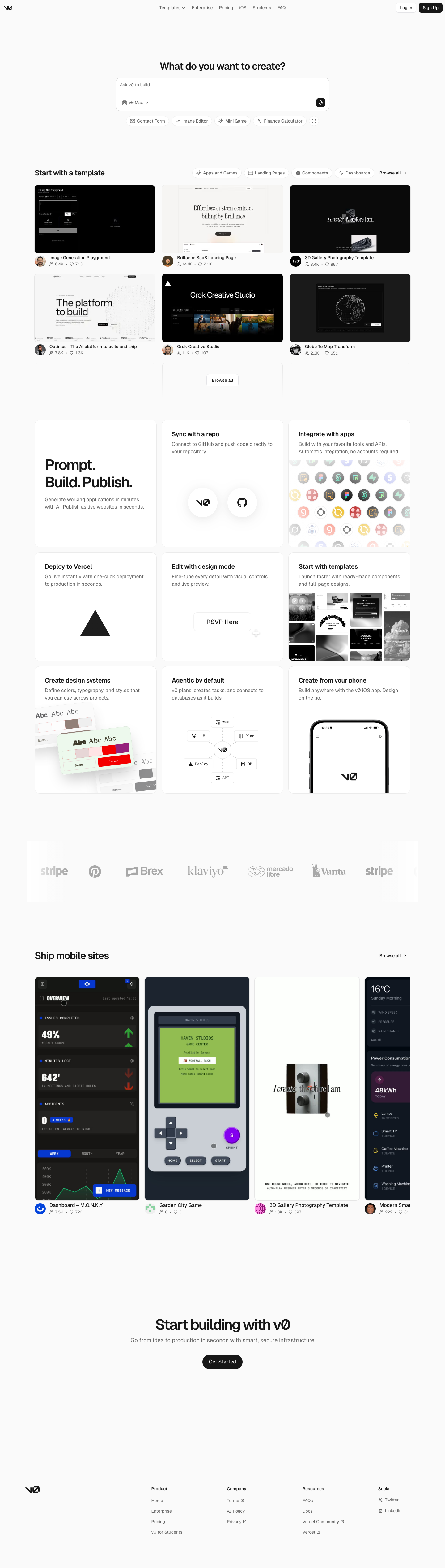
An unofficial, original v0-inspired Prompt Workshop system grounded in 17 retained, evidence-backed interface patterns.

13 focused, original elements for Borderless Ledger; categories are retained only when supported by the live reference. Published flags remain disabled.
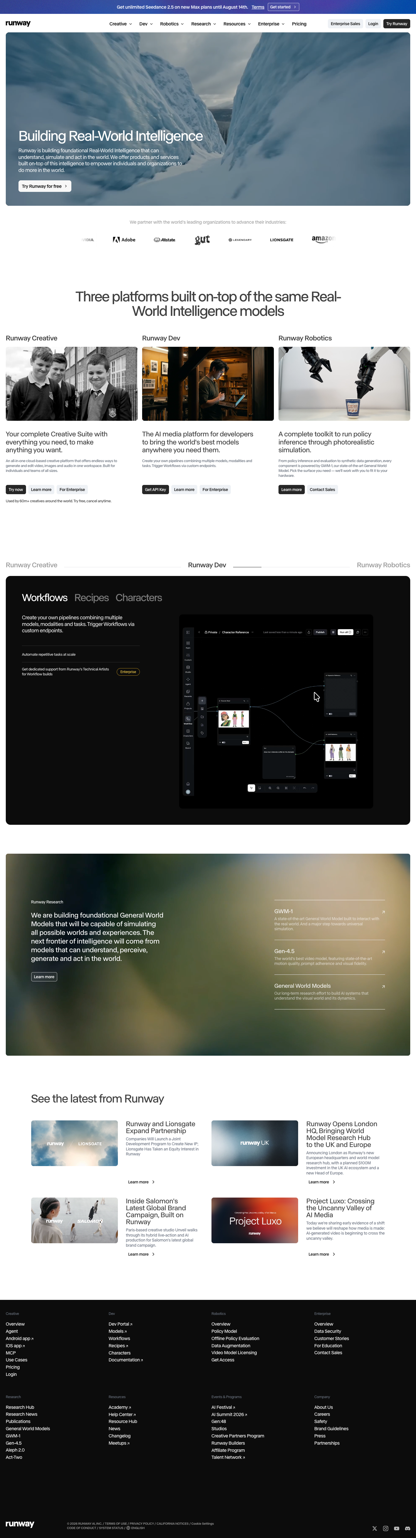
A high-contrast studio language for a platform that moves between creative production, developer workflows, robotics, research, and enterprise. The system uses a dark stage, warm action color, and compact cross-platform wayfinding without copying Runway's wordmark, content, or media. Responsive previews and 8 evidence-backed interface elements.

An original, unofficial Observable-inspired system for reactive notebooks, executable explanations, and data visualization surfaces. It retains only 11 focused elements supported by Observable's live notebook and chart workflows.
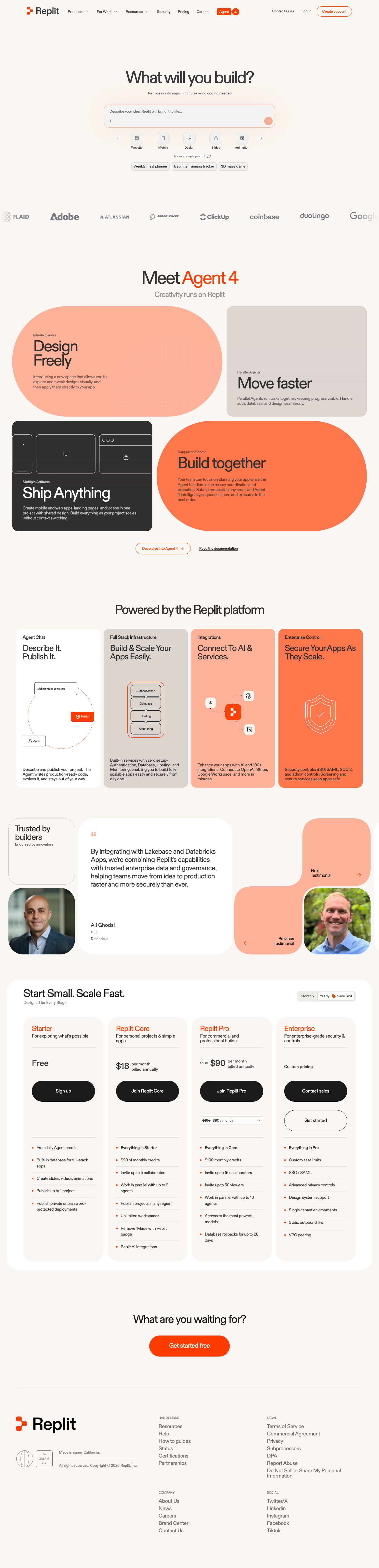
A friendly builder language for moving from prompt to app: vivid purple/green accents, a prominent idea field, artifact type selection, parallel execution, built-in infrastructure, team plans, agent chat, and a clear publish handoff. It is an original study without Replit's logo, pixel font, testimonials, screenshots, or protected copy. Responsive previews and 14 evidence-backed interface elements.