Style identity
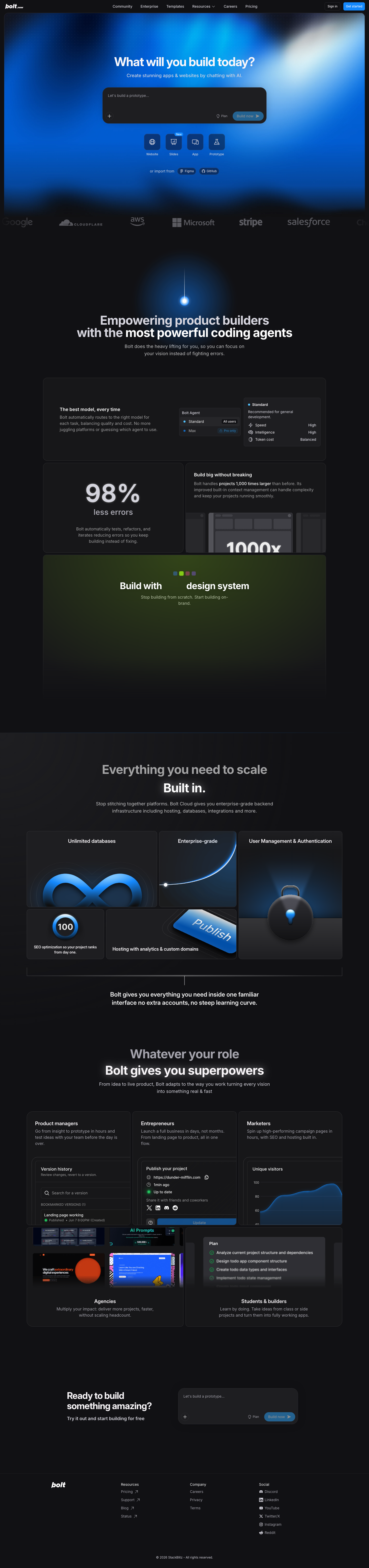
Bolt-inspired Build Lab
A chat-led build launcher that lets a visitor choose the target, provide context, and move into a tested, hosted result.
Dark-first AI builder with a blue/cyan atmospheric signal, a heavy rounded compo themeAn unofficial, original Bolt-inspired Build Lab system grounded in 17 retained, evidence-backed interface patterns.
Foundations
A public overview of the typography, palette, icon language, spacing, shape, and motion used throughout this AI Kit.
Style identity
A chat-led build launcher that lets a visitor choose the target, provide context, and move into a tested, hosted result.
Dark-first AI builder with a blue/cyan atmospheric signal, a heavy rounded compo themeTypography
Inter
Navigation, body copy, controls, and product explanations
Inter, ui-sans-serif, system-ui, sans-serifFallback: ui-sans-serif, system-ui, -apple-system, BlinkMacSystemFont, Segoe UI, sans-serif
Inter Display
Large hero and section headlines
"Inter Display", Inter, ui-sans-serif, system-ui, sans-serifFallback: Inter, ui-sans-serif, system-ui, sans-serif
Palette
canvas
#f4f8ffPage canvas in light mode
surface
#ffffffRaised content surface in light mode
surface-dark
#202126Raised content surface in dark mode
text
#14161dPrimary readable text
muted
#667085Supporting copy and metadata
border
#d8e2f2Quiet dividers and control outlines
accent
#2f8cffPrimary action or active state
accent-secondary
#18d5c4Secondary signal or gradient stop
dark-canvas
#171719Page canvas in dark mode
dark-text
#f9f6f9Primary readable text in dark mode
Type scale
| Role | Size | Weight | Line height | Tracking |
|---|---|---|---|---|
| display-xl | clamp(44px, 7vw, 94px) | 700 | 0.98–1.08 | -0.06em |
| display-lg | clamp(32px, 5vw, 64px) | 700 | 1.0–1.12 | -0.05em |
| heading | 24–32px | 600 | 1.2–1.35 | -0.035em |
| body | 14–16px | 400 | 1.45–1.6 | normal |
| label | 11–13px | 600 | 1.3–1.45 | 0.01em |
| technical | 10–12px | 500 | 1.45–1.7 | normal |
Spacing & shape
Iconography
Use compact outline symbols next to text for imports, model routing, speed, and build status; never rely on color alone.
System metrics
Radius
Spacing
Motion
Elevation
composer
0 24px 70px rgba(0,0,0,.32)Hero prompt focus
panel
0 18px 50px rgba(0,0,0,.2)Capability surfaces
Surfaces & shape
light-canvas
#f4f8ffQuiet page background
light-surface
#ffffffCards and form surfaces
dark-canvas
#171719Dark page background
dark-surface
#202126Dark cards and console surfaces
Guidelines
Imagery
Use original abstract geometry, code-like lines, gradients, and browser/runtime framing only when they clarify the workflow. Never copy reference screenshots, logos, customer imagery, template thumbnails, or proprietary illustrations.
Layout
Use a centered max-width shell, clear section rhythm, one dominant task per specimen, and a single-column fallback at 520–760px. Keep tables and runtime rows scroll-safe.
Concept
Use the file tree to move between the full reference preview, implementation guidance, portable tokens, and framework-ready styles. Each surface stays focused, so you can understand the system before copying code.
Assigned collection
16 published components in collection order
Components
Production-ready specimens from this AI Kit's approved collection.
More like this

An unofficial, original Postman-inspired interface study with 14 focused specimens supported by the live product and content experience.
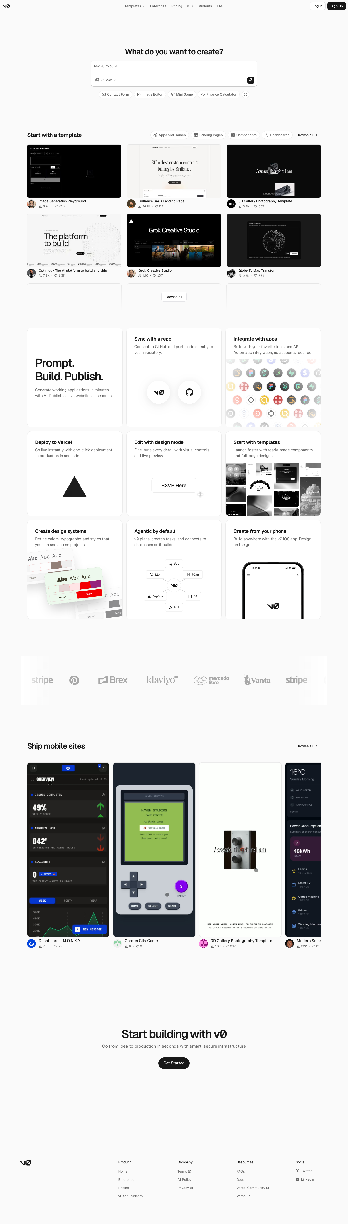
An unofficial, original v0-inspired Prompt Workshop system grounded in 17 retained, evidence-backed interface patterns.

13 focused, original elements for Borderless Ledger; categories are retained only when supported by the live reference. Published flags remain disabled.
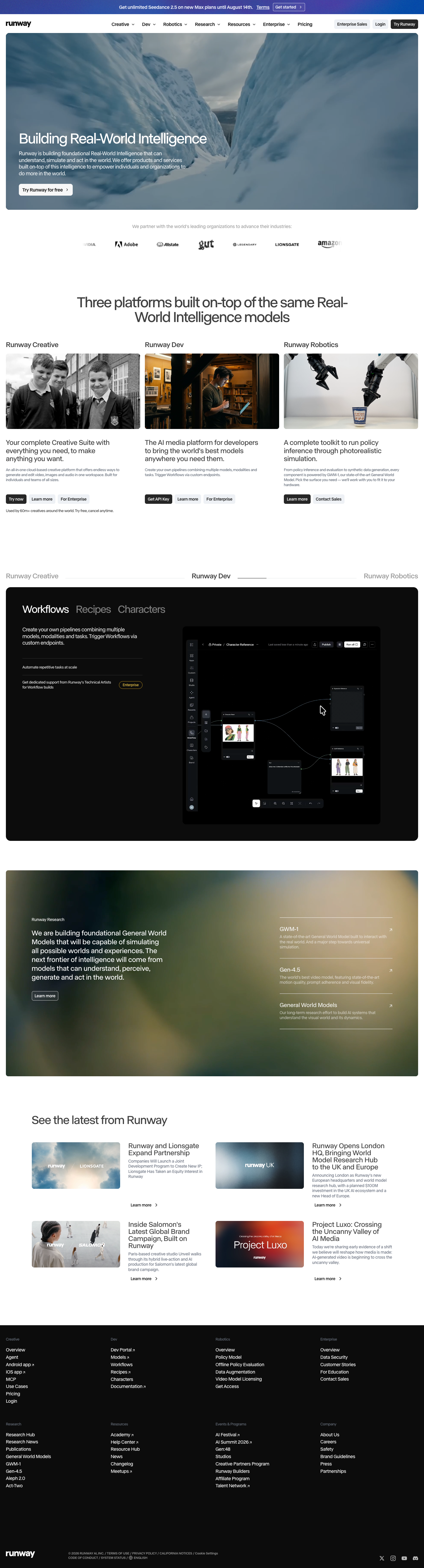
A high-contrast studio language for a platform that moves between creative production, developer workflows, robotics, research, and enterprise. The system uses a dark stage, warm action color, and compact cross-platform wayfinding without copying Runway's wordmark, content, or media. Responsive previews and 8 evidence-backed interface elements.

An original, unofficial Observable-inspired system for reactive notebooks, executable explanations, and data visualization surfaces. It retains only 11 focused elements supported by Observable's live notebook and chart workflows.
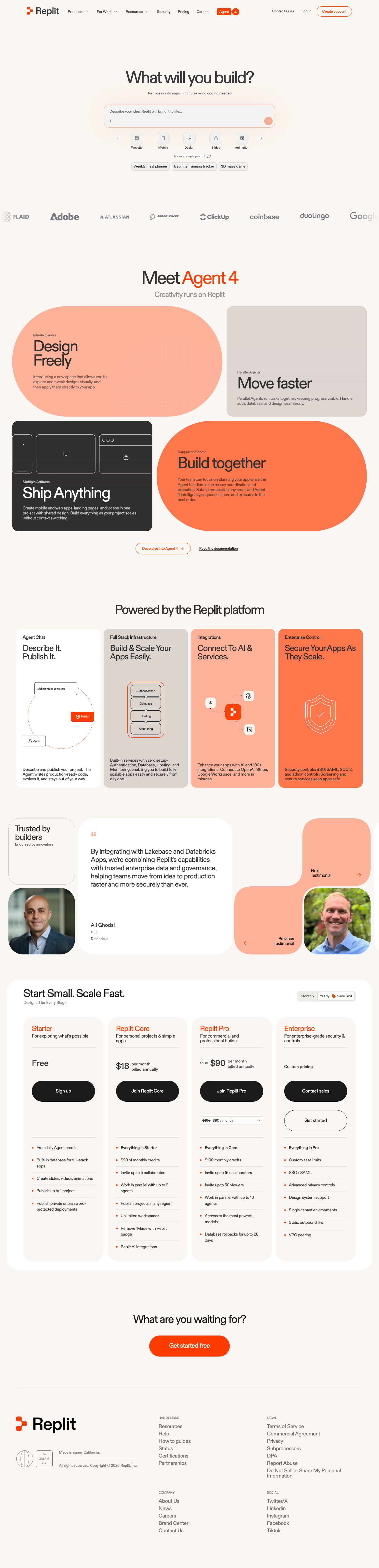
A friendly builder language for moving from prompt to app: vivid purple/green accents, a prominent idea field, artifact type selection, parallel execution, built-in infrastructure, team plans, agent chat, and a clear publish handoff. It is an original study without Replit's logo, pixel font, testimonials, screenshots, or protected copy. Responsive previews and 14 evidence-backed interface elements.