Skip to content
All AI Kits
Design system Pro AI Kit10 components

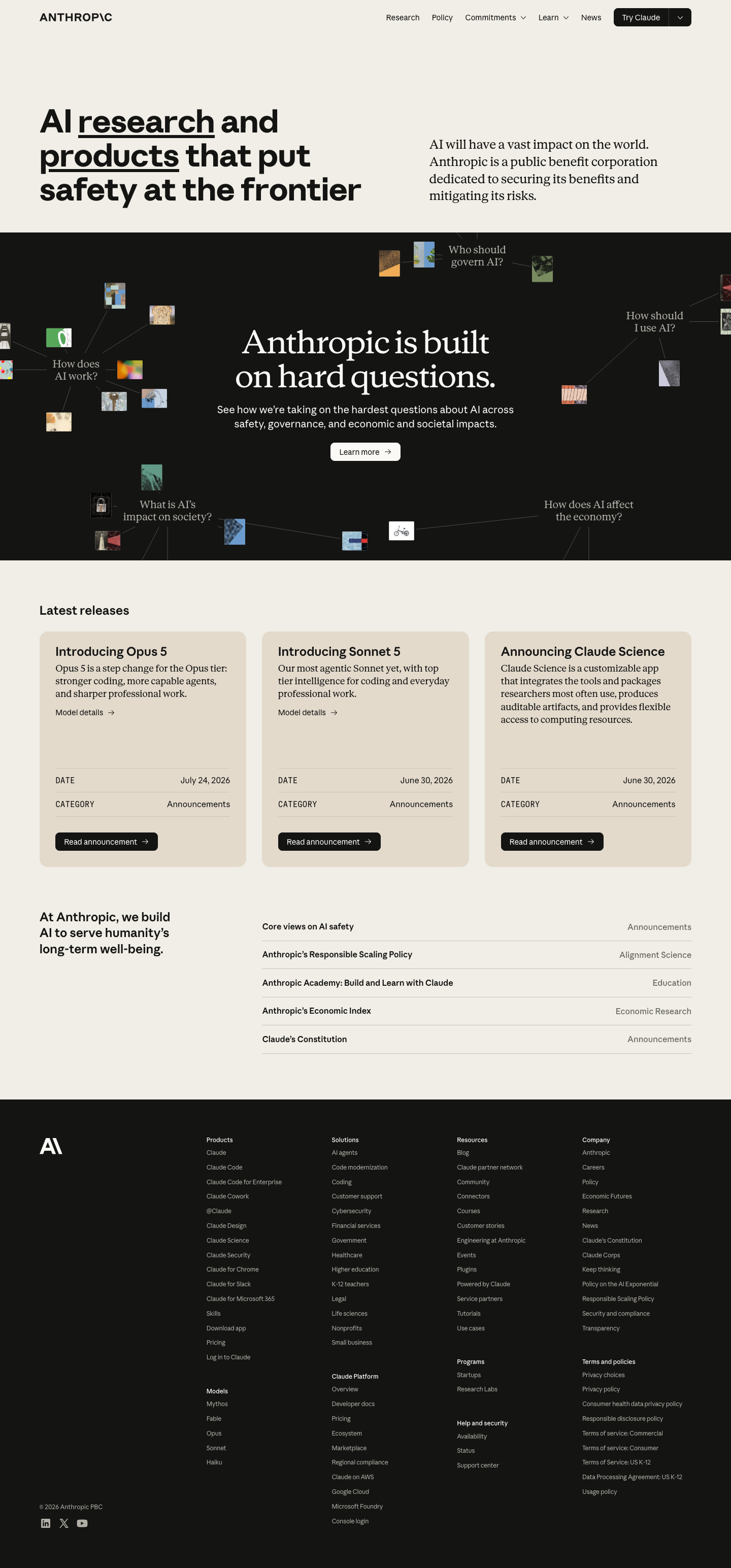
Anthropic-inspired Safety Lab

An unofficial, original Anthropic-inspired interface study with 10 focused specimens supported by the live product and content experience.

Desktop · 1440 × 3089
Anthropic homepage — desktop reference

Foundations

The visual decisions behind the system

A public overview of the typography, palette, icon language, spacing, shape, and motion used throughout this AI Kit.

Style identity

Anthropic-inspired Safety Lab

A calm editorial AI language: warm paper, near-black ink panels, a measured sans/serif pairing, generous margins, and information architecture that makes safety, research, and releases easy to follow.

warm editorial light with high-contrast dark panels and explicit dark mode theme

Visit website

Typography

Font families

Anthropic Sans

navigation, body copy, labels, cards, and interface controls

Anthropic Sans, Arial, sans-serif
Weights
300–800
Sizes
12–76px
Line height
1.0–1.65
Tracking
-0.04em to 0

Fallback: Arial, ui-sans-serif, system-ui, sans-serif

Anthropic Serif

editorial hero statements, long-form explanatory copy, and quiet emphasis

Anthropic Serif, Georgia, serif
Weights
300–800
Sizes
18–72px
Line height
1.0–1.35
Tracking
-0.03em to 0

Fallback: Georgia, Times New Roman, serif

Anthropic Mono

dates, categories, release metadata, and research identifiers

Anthropic Mono, SFMono-Regular, Consolas, monospace
Weights
300–800
Sizes
11–14px
Line height
1.3–1.5
Tracking
0 to 0.05em

Fallback: SFMono-Regular, Menlo, Consolas, monospace

Palette

Core colors

Warm paper

#f5f1ea

light editorial canvas

Soft paper

#fbfaf7

release cards and elevated reading surfaces

Ink

#1b1916

primary editorial text

Ink panel

#161412

hard-questions feature panel and dark canvas

Raised dark

#2c2721

dark card and hover surface

Warm rule

#d9d1c4

editorial dividers

Terracotta

#d9825b

primary action and emphasis

Sage

#6c997f

research/safety secondary signal

Success

#69a47f

healthy or complete state

Warning

#d3a14b

attention state

Danger

#c85d5d

risk/error state

Type scale

Responsive hierarchy

RoleSizeWeightLine heightTracking
Editorial hero72px5000.96-0.055em
Hero mobile40px5001.0-0.04em
Section46px5001.02-0.045em
Release title20px6001.2-0.02em
Body17px4001.580
Category11px7001.350.06em
Date12px5001.40.02em

Spacing & shape

Layout rhythm

Density
low-density editorial reading with compact release metadata
Base unit
4px
Max width
1280px
Section gap
88–144px
Card padding
20–28px
Element gap
12–20px

Iconography

quiet line symbols and small typographic marks suited to editorial navigation

1.5px with rounded joins stroke · 16px / 20px / 24px

Prefer text links and compact arrows over decorative icons; use original symbols for disclosure and status, never the source company’s mark.

System metrics

Radius

control 6pxcard 10pxpanel 16pxmedia 20pxpill 999px

Spacing

micro 4pxlabel gap 8pxcontent gap 16pxcard inset 24pxgrid gap 28px

Motion

link 150ms ease-outsurface 220ms cubic-bezier(.2,.8,.2,1)reveal 480ms cubic-bezier(.2,.8,.2,1)reduced motion remove transforms and delayed transitions

Elevation

editorial card

1px rule; no shadow

dark panel

0 18px 48px rgba(27,25,22,.16)

menu

0 18px 56px rgba(27,25,22,.22)

focus

0 0 0 3px rgba(217,130,91,.28)

Surfaces & shape

paper

#f5f1ea

page canvas

soft paper

#fbfaf7

release cards

ink panel

#161412

hard-question feature

dark surface

#211d19

dark card

warm rule

#d9d1c4

structural divider

terracotta action

#d9825b

primary link and button

Guidelines

Do

  • Let warm paper and black ink do most of the visual work.
  • Use serif for the reflective editorial voice and sans for navigation and metadata.
  • Give each release a category, date, title, and direct action.
  • Keep section transitions spacious and calm.

Don't

  • ×Do not reproduce source marks or live release cards.
  • ×Do not overload the page with SaaS dashboard chrome.
  • ×Do not use a serif face for every label or control.
  • ×Do not signal safety only through terracotta or green color.

Imagery

Use original research diagrams, quiet geometric cards, editorial crops, and abstract safety signals. Avoid source logos, live release artwork, portraits, customer marks, and proprietary campaign assets.

Layout

Use an asymmetrical editorial hero with a broad display column and narrower explanation column. Keep hard-question content as a full-bleed dark panel, then step releases into a balanced card grid that becomes a single reading column on mobile.

Concept

A complete visual language, ready to inspect.

Use the file tree to move between the full reference preview, implementation guidance, portable tokens, and framework-ready styles. Each surface stays focused, so you can understand the system before copying code.

Assigned collection

Anthropic-inspired Safety Lab Elements

10 published components in collection order

Components

Built from the same system

Production-ready specimens from this AI Kit's approved collection.

Open collection
Start safety review ↗ View policy ?
0
23
Anthropic Reviews Policies Evaluations
0
27
Review actions ⌄ Open evidence ↗ Duplicate review ⌘ D Archive review ⌘ A
0
17
Frontier model review Risk protocol v3 In review 8 controls · 2 owners Review
0
25
Model risk assessment Priority Policy evidence Ready Release approval Pending
0
26
In review Evidence ready Blocked
0
12
Risk protocol Require review before publishing. Independent approval Required
0
20
Safety review August 25, 2026 10:30 UTC · Policy team
0
19
SA Risk score updated Protocol 7 · 4m ago Review RK Evidence attached Control 12 · 21m ago Ready
0
17
Anthropic Policies Reviews Reports Workspace Safety review workspace Policies and evaluations beside review navigation.
0
21

More like this

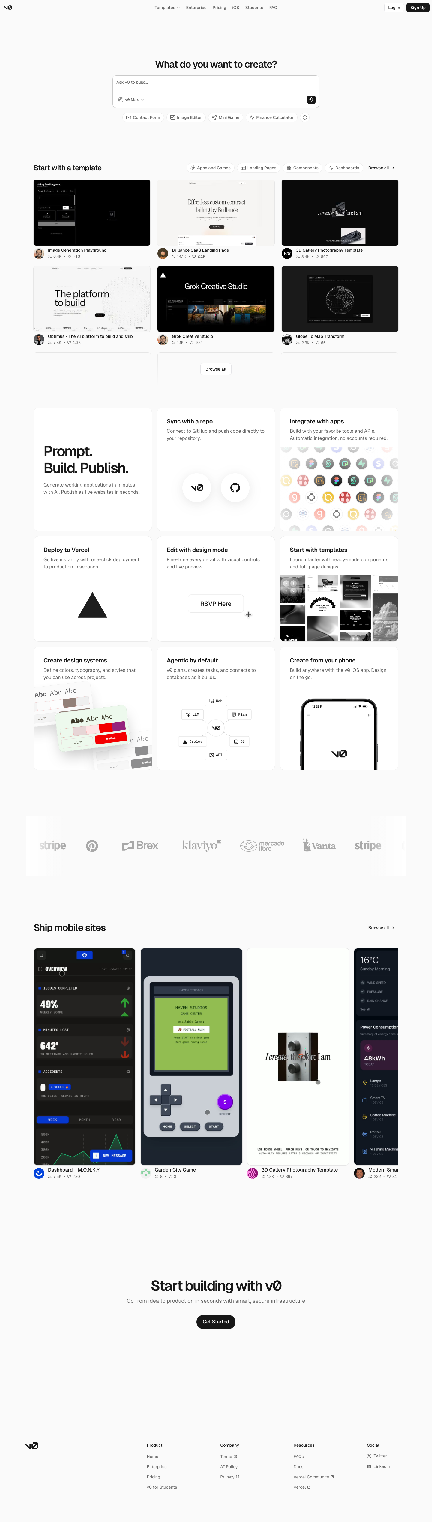
Postman-inspired API Orbit

An unofficial, original Postman-inspired interface study with 14 focused specimens supported by the live product and content experience.

v0-inspired Prompt Workshop

An unofficial, original v0-inspired Prompt Workshop system grounded in 17 retained, evidence-backed interface patterns.

Borderless Ledger — Wise-inspired AI Kit

13 focused, original elements for Borderless Ledger; categories are retained only when supported by the live reference. Published flags remain disabled.

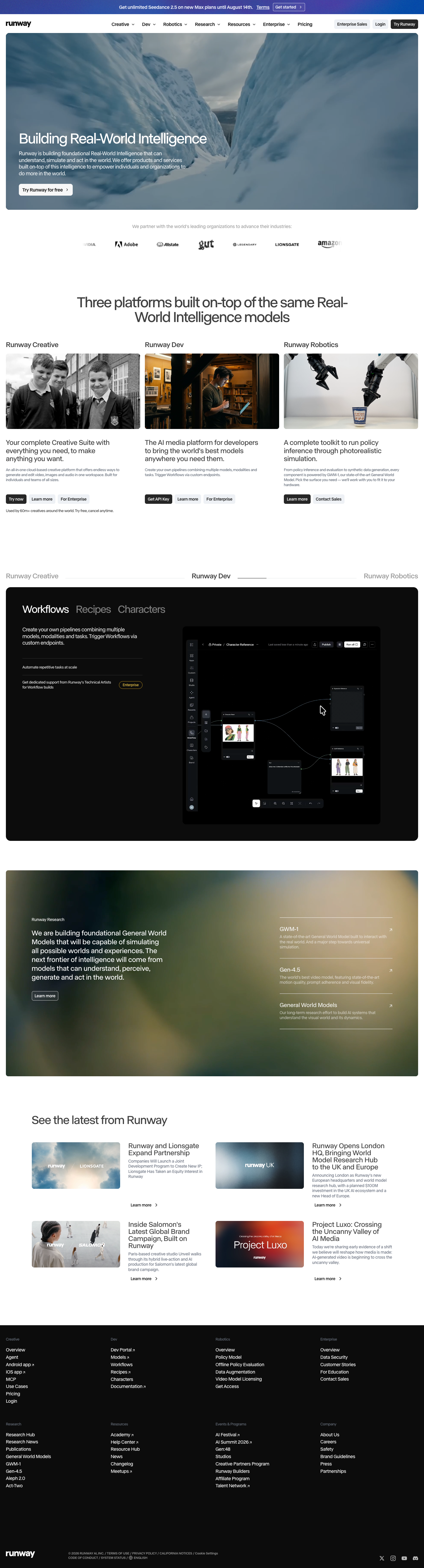
Runway-inspired Real-World Studio

A high-contrast studio language for a platform that moves between creative production, developer workflows, robotics, research, and enterprise. The system uses a dark stage, warm action color, and compact cross-platform wayfinding without copying Runway's wordmark, content, or media. Responsive previews and 8 evidence-backed interface elements.

Observable-inspired Signal Notebook

An original, unofficial Observable-inspired system for reactive notebooks, executable explanations, and data visualization surfaces. It retains only 11 focused elements supported by Observable's live notebook and chart workflows.

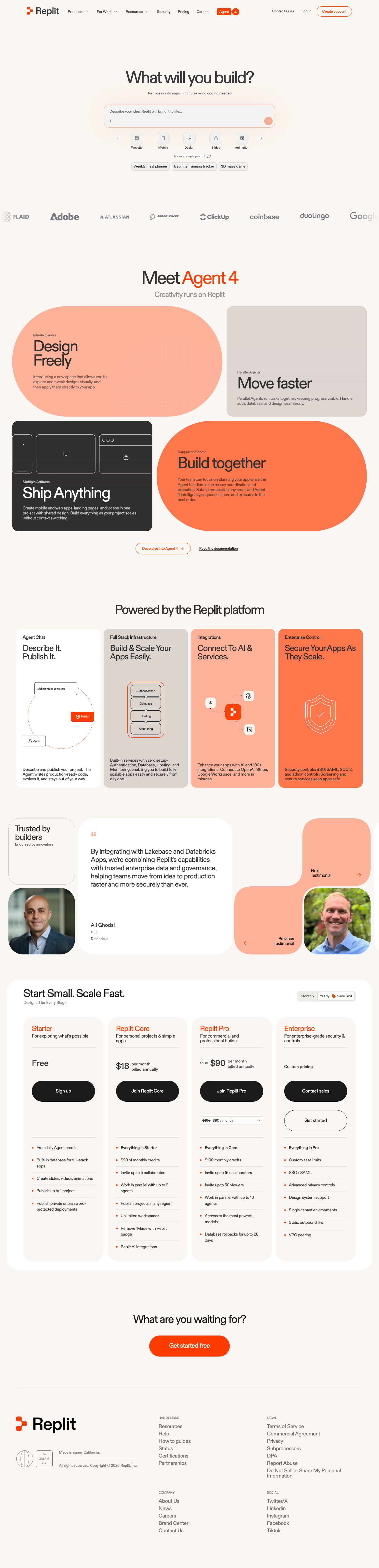
Replit-inspired Build Canvas

A friendly builder language for moving from prompt to app: vivid purple/green accents, a prominent idea field, artifact type selection, parallel execution, built-in infrastructure, team plans, agent chat, and a clear publish handoff. It is an original study without Replit's logo, pixel font, testimonials, screenshots, or protected copy. Responsive previews and 14 evidence-backed interface elements.

Published AI Kit Protected source files for Pro members